Context & Problem
Buying a house is a big deal. This is why you might want to make sure that you have checked all the viable options you can before making the decision to spend multiple-hundred thousand dollars in that big purchase.
Unfortunately, while seeing photos of the place online can give you some idea of what the property is like, lots of the time the actual space of the home still surprises you. Visiting all the places listed online in person is also not an option due to the significant amount of time and energy you need to invest in traveling. With the emergence of new immersive technologies, this problem can be addressed with virtual reality.
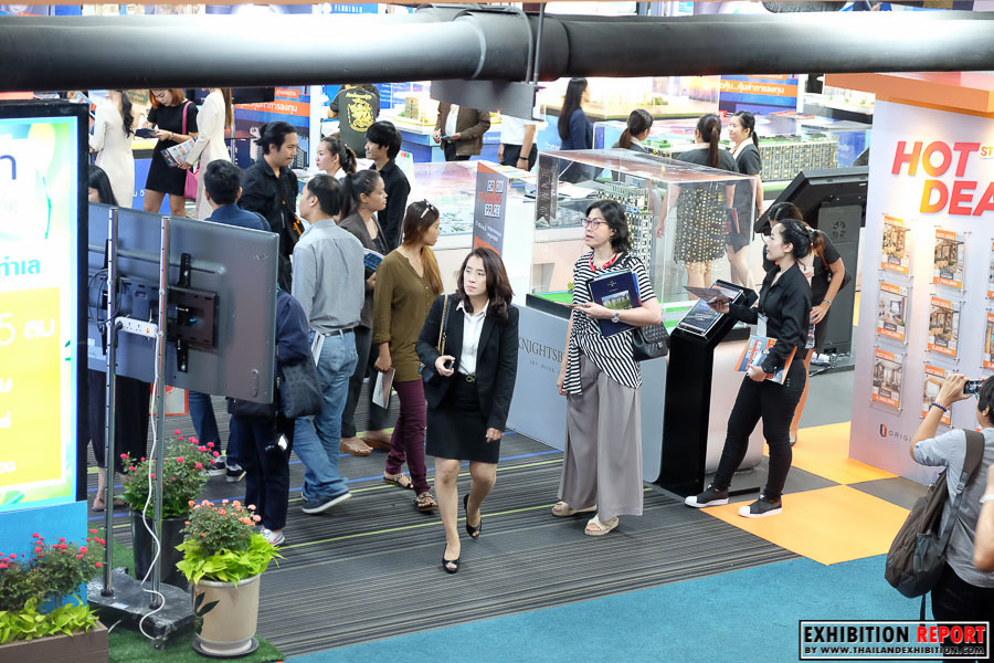
This project is commissioned by Home Buyers Guide through Home Dot Tech, a Thai technology company creating solutions for home buyers. The project was intended to be exhibited in Home Buyers Expo, a major annual event held by Home Buyers Guide.
Overview
Problem
Traveling to different real estate sites available for sale limits the number of options a home buyer could thoroughly consider. While photos can somewhat convey the space of the home, it is hard to understand the space of the place and can often be misleading. This might lead to dissatisfaction with their purchases or missed opportunities.
Approach
Using virtual reality, I designed and develop a VR application that allows home buyers to explore and virtually visit housing sites without spending the time and effort to travel, allowing them to consider more options more thoroughly.
Final Design
Helping home buyers explore more options with a better understanding of the space while also making it easy for first-time VR users to navigate the application.
Visit Properties in 360° View
"I'm considering buying a new house. Let's take a quick look at these various sites before wasting hours traveling there."
- Users can virtually visit houses and condominiums physically located around the country through this VR experience.
- With this 360° view, users can better understand the scale and space of the room than just by looking at photos on screens.
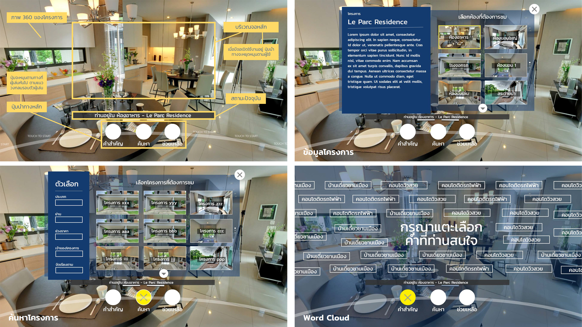
- The status bar above the navigation belt lets users know where they currently are.
- Apart from the unobtrusive navigation belt, this main room display state has no overlaying screens. This is to let users inspect the room freely.
Learn More About the Property
"This place looks nice... I wonder where it is located, how big it exactly is, and ... how much does it cost?"
- Users can touch the Information button on the navigation belt to see more information e.g. description, price, location of the place they are currently in.
- This will show the information about the current site as signs standing and floating inside the room. This design is placed in a way that would not get in the way of users' field of view
- They can also move to other rooms on the same site from the buttons close to their hands.
Explore Options
"What are some other options I have based on my preferences?"
- To move from a house or condominium to another, users can browse through available sites by navigating to the Browse screen from the navigation belt.
- In the Browse screen, users can set filters such as price range, housing style, and property owner brands to fit with their preferences.
- Their search result will then show up as grids and users can teleport to the selected site by tapping the image of the desired site.
Browse by Tags
"I'm just taking a look at what options you have... Show me some features you have to offer."
- Users will see different keyword buttons floating around them with the instruction saying “Please touch the keyword that interests you.”
- This use of all-around display is to leverage the 360° nature of VR and represent the vast variety of sites to visit available in this VR application.
- A user can select a keyword that matches their preferences by touching them and teleport to the place by touching the thumbnail shown for each keyword.
Process Overview
1. Requirements Analysis
- Client Briefing
- Technology Consideration
- Design Constraints
- Design Implications
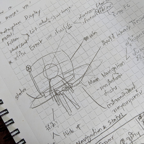
2. Ideation & Design
- Sketching
- Wireframing
- Iterative Feedback
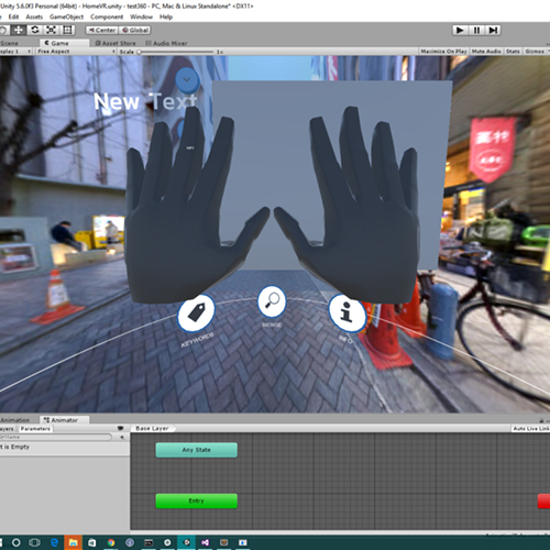
3. Application Development
- Unity 3D
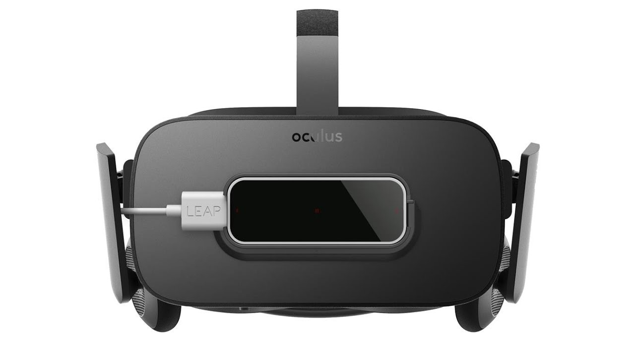
- Oculus Rift
- Leap Motion Controller
- Iterative Feedback
Requirements Analysis
Requirements from the Client
- Home Buyers Expo is a major annual real estate expo held in the national convention center with a large number of visitors.
- Home Buyers Guide had taken 360° photospheres from houses and condominium rooms that are available for sale.
- For the 2017 expo, they wanted to create a VR application to showcase these different sites in 360° views in order to help people easily browse available options in the expo and showcase the potential of virtual reality in the real estate industry.
- The project also needed to be used with Oculus Rift with Leap Motion Controller as the input method.
Distilling Design Implications
From the requirements, I had analyzed the implications that the requirements and the context posed on the interaction design. Below are some of the implications:
User Group
What are they like?
- The target group of the expo where this application was to be exhibited in was adults (approx. age 30–60) who are looking for a new home.
- These people may not be familiar with VR. It was likely that this might be their first VR experience.
- Technology that they are most familiar with are smartphones and the internet.
What does this mean to the design?
- Therefore, the application should be as simple as possible, requiring no prior experience or knowledge about VR.
Context of Use
What is it like?
- Since this application was to be exhibited in an open space in the expo, it was very likely that there would be frequent user switches with only a few minutes’ session per user.
- One plus side of exhibiting in an expo is that there will be staffs monitoring the application and guiding the users.
What does this mean to the design?
- A new user must be able to continue using the app easily regardless of where in the flow did the last user left off.
- The application should leverage familiar UI elements with always-visible affordances and signifiers to get users onboard quickly.
- Public space settings infer that actions or postures required in the application should be physically comfortable to perform in public.
Hardware Consideration
What is it like?
- Leap Motion Controller, while providing intuitive interaction with the user’s own hand as the input, it poses an ergonomic restriction on where to put controls in the program.
- Also, the hand-tracking capability of Leap Motion Controller is not 100% accurate. It sometimes cannot detect specific hand gestures or the detection is not stable.
- Another limitation is the screen resolution of Oculus Rift. Though the overall image can be seen relatively clearly, details such as small text can be hard to read.
What does this mean to the design?
- Unlike remote-style controllers where the interaction can be like pointing laser pointers to the distant object, VR applications using leap motion controllers need to have all the controls placed within reach of users’ arm.
- The design should not rely on accurate movements of the hand, e.g., there should be enough space between each control point.
- Text should be significantly larger than those in traditional UIs.
Design Ideation
Designing the Navigation
Choosing the Interaction Method
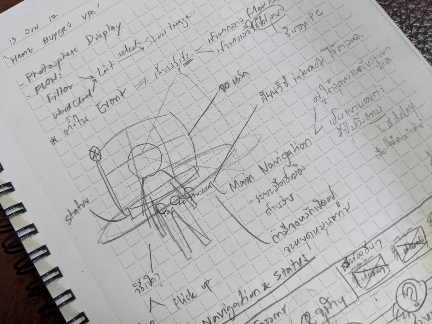
- While brainstorming, I considered multiple interaction techniques such as hand gestures (detecting hand poses), hand movements (flicks), and virtual buttons.
- Although there are myriads of interaction techniques through Leap Motion Controller and virtual reality, using hand gestures requires some learning which seems to be inappropriate in this context.
- Also, unreliable detection of gestures and movements might make the experience worse.
- Though this group of target users might not be familiar with VR experiences, they are familiar with computers and smartphones.
- Leveraging design patterns from these known platforms that users are familiar with could help minimize learning time.
- Also, interaction modes should be consistent across the application to make it easy to learn.
As a result, I designed the application to utilize only one mode of interaction: pressing buttons. which users are most familiar with and also do not require a sophisticated—and potentially unreliable—detection mechanism.
The Navigation Belt
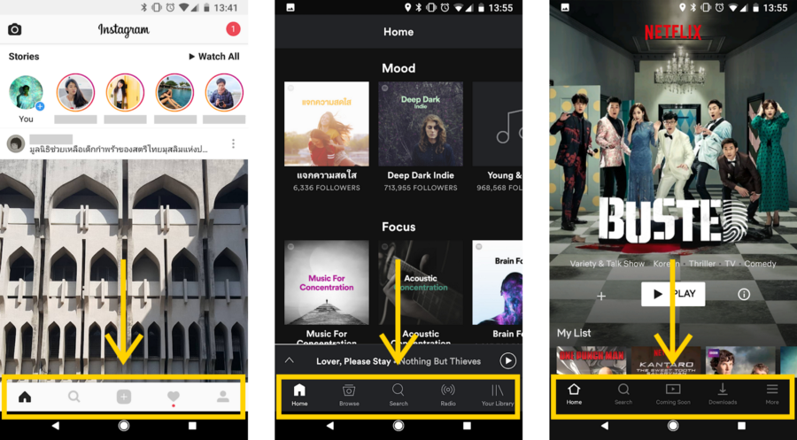
The navigation belt is a circle that floats around the users’ waist. Like how navigation bars of mobile apps are placed at the bottom of the screen, the navigation buttons for this VR application was also placed at the bottom of the field of view of the user.
On the belt are the buttons that serve as the primary navigation menu. This belt is visible and will follow the user at all times while they are using the app to enhance the discoverability of possible actions in the app. This is to make sure that the user immediately gets what this app can do from looking at the menu buttons. Moreover, because it circles around the user’s waist, it is easy for them to reach the buttons on the belt with the hand.
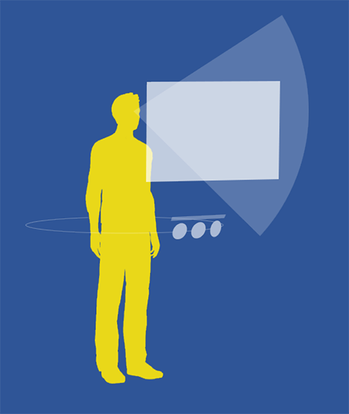
- Building upon the navigation belt concept mentioned above, in the actual application, the buttons on the belt were also designed to follow the users’ head direction with a little delay.
- This kind of motion is to make sure that the users do not miss the navigation menu. The delay also is to signify that these buttons are not stuck with the user’s field of view and, hence, are interactable.
- In order not to get in the way of users’ field of view while still being visible enough to provide signifiers, the belt was strategically placed just right below the field of view of the user’s straight gaze.
- What users have to do to find the navigation menu is just look around a bit—a behavior that can be expected from VR users—unlike some current solutions of navigation menu which place them at the nadir or the zenith of the virtual world which can be difficult to notice.
User Flow
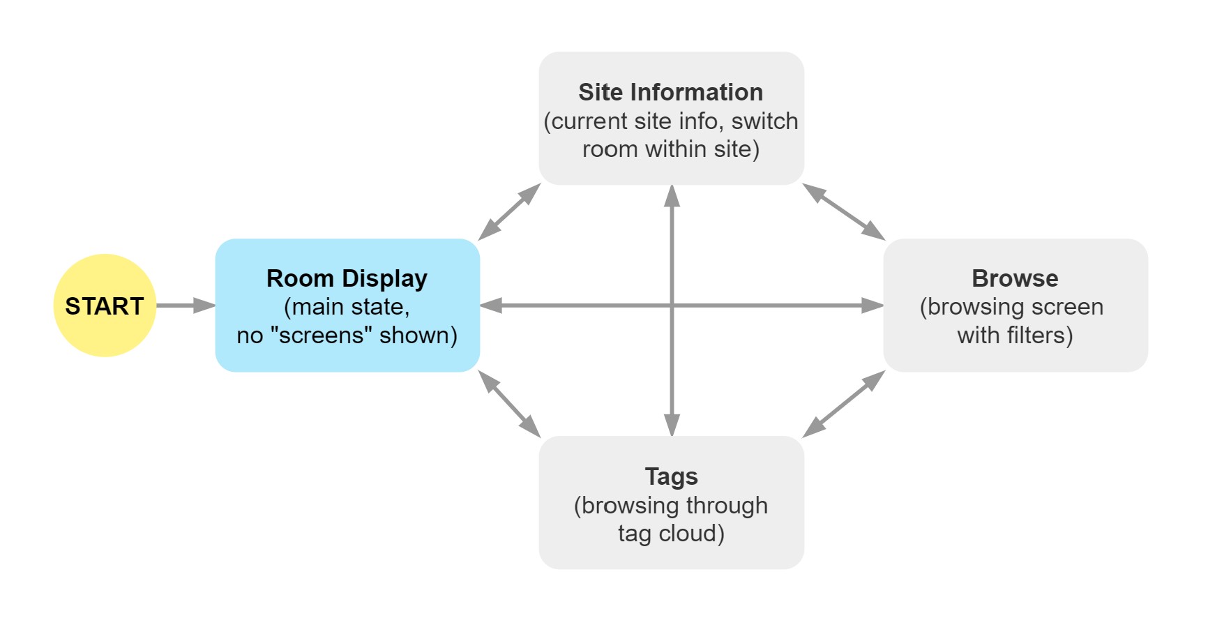
Wireframing
A set of medium-fidelity wireframes was created to solidify the design idea and lay out the screens within the app. The reason that these wireframes were at this level of fidelity was that they were also used to present to clients and gather feedback from them.
Iterative Feedback Gathering
The design was presented to the client as wireframes and feedback were gathered to improve the design. During the development process, the application was also tested with several users before actually exhibiting at the expo. Improvements and adjustments were also made from the feedback I had gathered from these testing.
What I found
- The client was overall satisfied with the design at this stage so I could move on to the actual VR app development.
- The client mentioned that the user interface should leverage more from the 3D environment that VR offers.
- I realized that if the user triggers the site information panel, it blocks their whole field of view with the UI panel.
- This problem is specific to this page since site information is directly related to the current site. Therefore, users should still see the current site to get a sense of still being on the same site.
- Placing controls that are used frequently, e.g., filter dropdowns, in front of the users might cause arm fatigue since they have to reach for the controls.
- Users' height may vary a lot from male, female, adult, to child users. Since this belt navigation relies on users' waist level, some ergonomics issues might arise with different users.
What I changed
- Room selection buttons were moved closer to the user, above the navigation part.
- Room information display panel was moved further from the user. Displaying as if it is a sign placed in the room.
- Search filters were also moved closer to the user.
- With these UI changes, 3D space around the user was leveraged more, arm fatigue problem is addressed, and the view blockage problem was also solved.
- A mechanism for compensating users' height was implemented.
VR Application Development
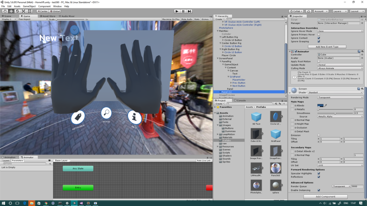
The application was developed using Unity with C# as the 3D engine of the app. The application was also designed so that it dynamically loads sites images and information. This is to ease the administrator’s task of changing the list of available sites in the program and avoid having to re-compile the application to change the content.
Final Product
Exhibiting in Home Buyers Expo
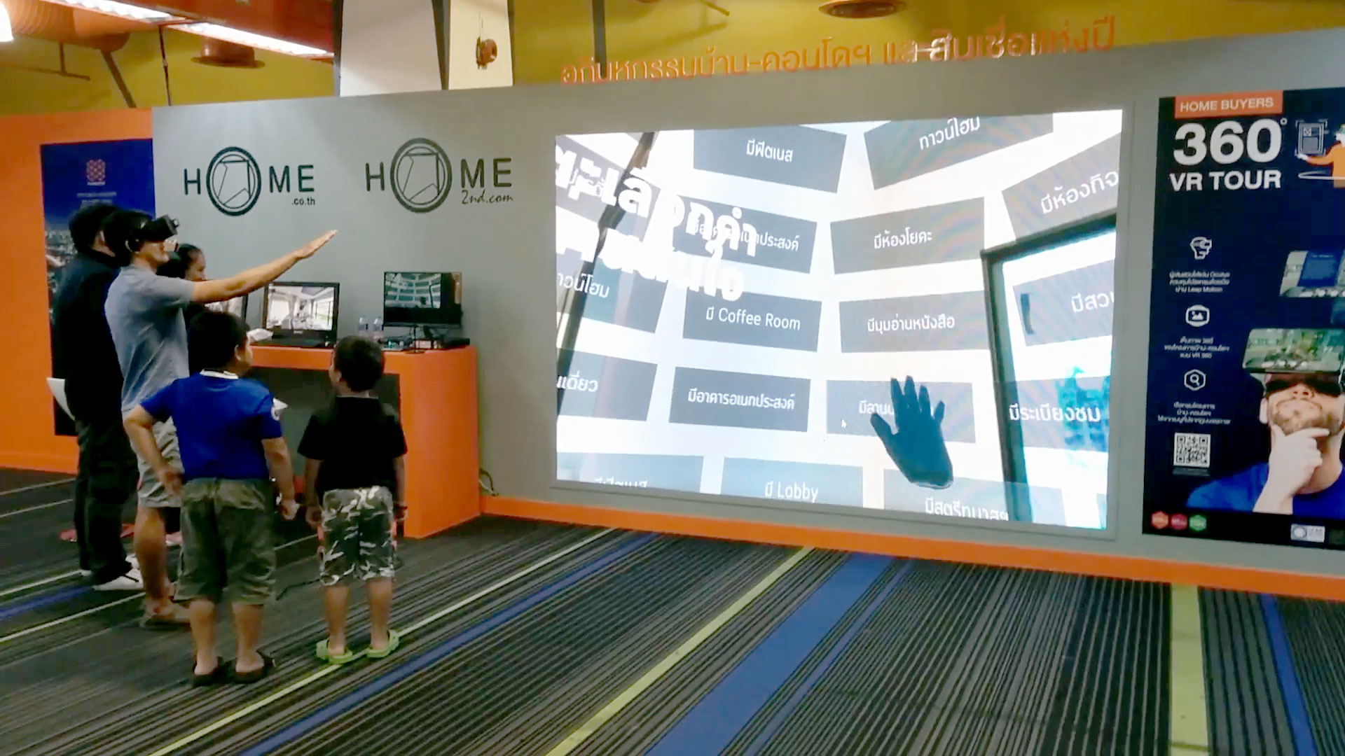
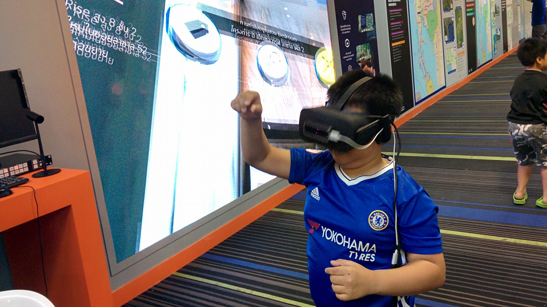
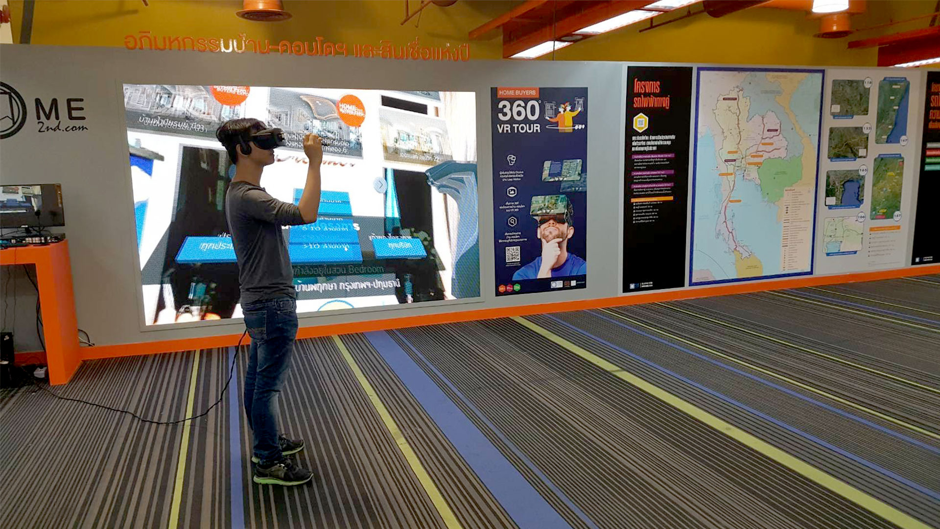
- I went to the exhibition to install the VR experience and also observed the users to informally evaluate the design.
- Users were engaged with this VR experience and they seem to understand how to use it quickly without much help from the staffs.
- Users seem to be able to navigate between the pages fluently with few to no errors.
- Children also enjoyed this VR experience and they also appear to understand the UI intuitively.
- There was a problem with adjusting the UI based on how tall the user is. This problem is actually already assessed with a height compensation feature. However, there was a bug in the software that prevents the feature from working.
Next Steps
- Due to the limited time and constraints of the VR app development, not as much focus were spent on the visual design of the application. Hence, it can be improved in future iterations.
- The application could be improved to incorporate 3D models of sample rooms instead of only photospheres in order to provide better depth perception and even let users walk more freely in the room.
- Experiment with text input methods in VR and Leap Motion Controller for implementing text-based search feature.
What I Learned From This Project
- I learned about the constraints of designing for the current state of virtual reality platforms and the design implications it poses.
- I experienced challenges designing user interface in an emerging platform where design patterns have not yet been fully established and attempted to overcome those challenges through design reasoning.
- I learned to iteratively update the design idea in response to feedback.
- I learned to balance between impressing users with advanced technology and maintaining the usability of the app.
- I experienced developing virtual reality applications in Unity.
This project was somewhat light in terms of user research due to the lack of access to the user group. Most design implications had to be listed based on assumptions. What I would do differently is to test these assumptions with research to make stronger design decisions.