Introduction
During my preparation for graduate school application, one of the applications I use frequently is the GRE General Test. From my experience with its interface from practicing to taking an actual test, I believe the interface design for test navigation could be improved. So, in this essay, changes to the interface are proposed to deal with some issues existing in the current design.
Functionalities of the Test Application
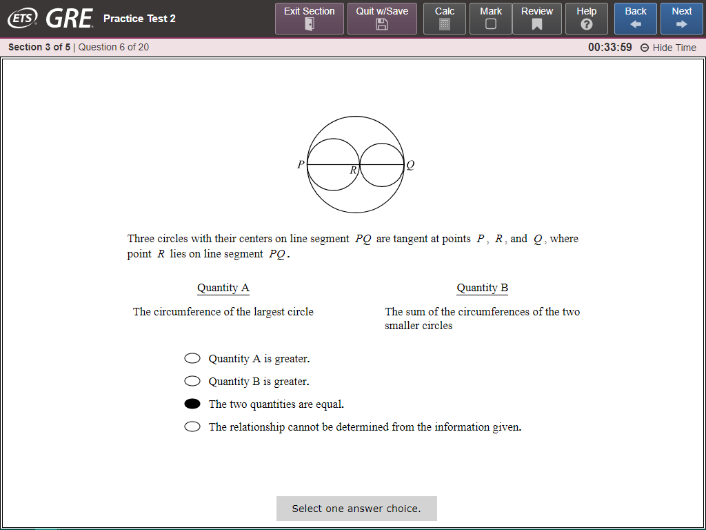
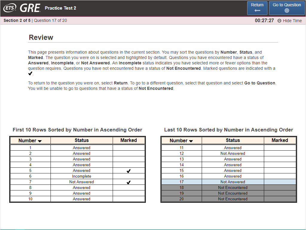
The GRE General Test is delivered via a computer. After the first writing section, each section of the test contains 20 questions with a 30- to 35-minute time limit. In the current interface (Fig. 1), located on the top are the navigation buttons which can be used to:
- navigate to the next or previous question,
- mark questions for reviewing later, and
- go to the ‘Review’ page (Fig. 2) where test takers can review their progress and jump to the other questions within the current section.
The Redesign: Question Pages
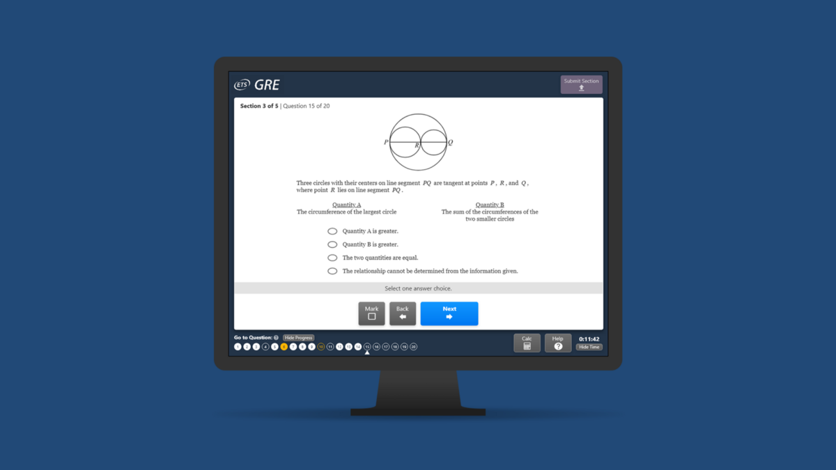
The design changes presented in Fig. 3 aims to address some issues in the current design. As every score could affect graduate school admission results, every minute counts. Saving only a few minutes could mean an increase in the test score. Hence, an important part to improve in the current interface is minimizing the time spent on navigation.
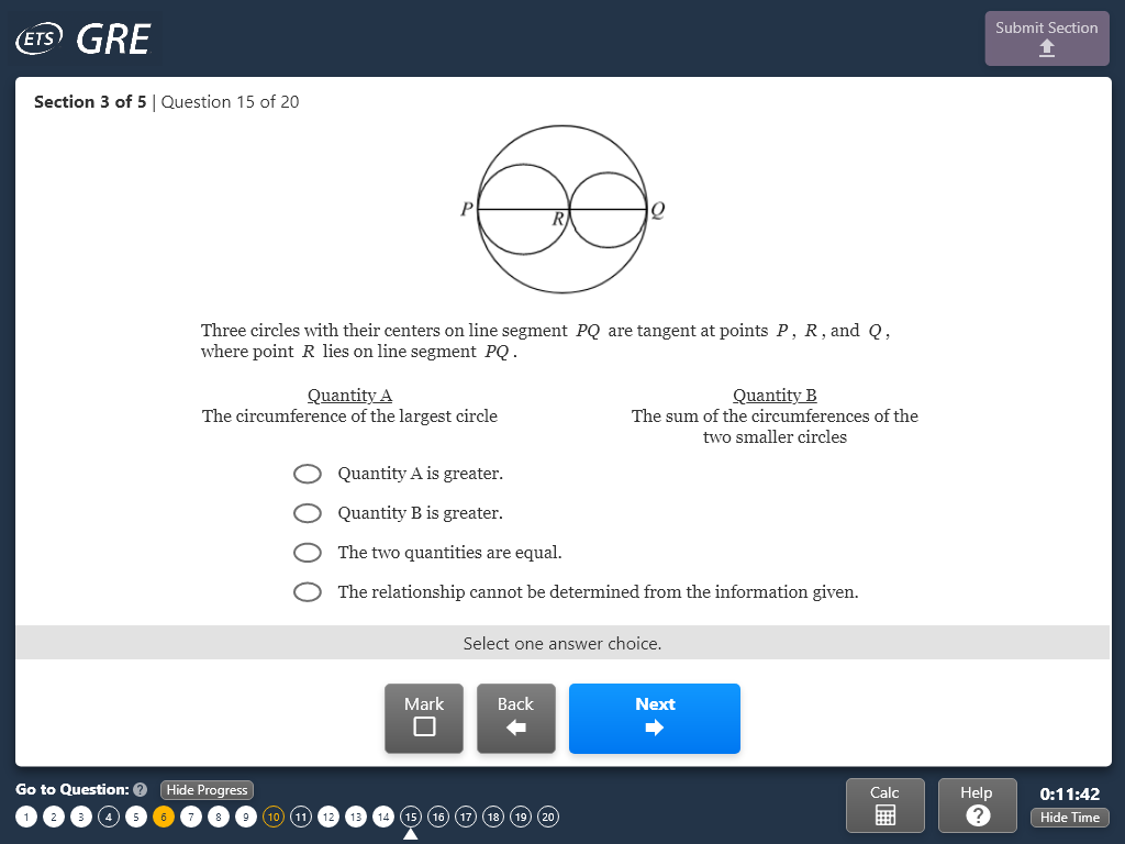
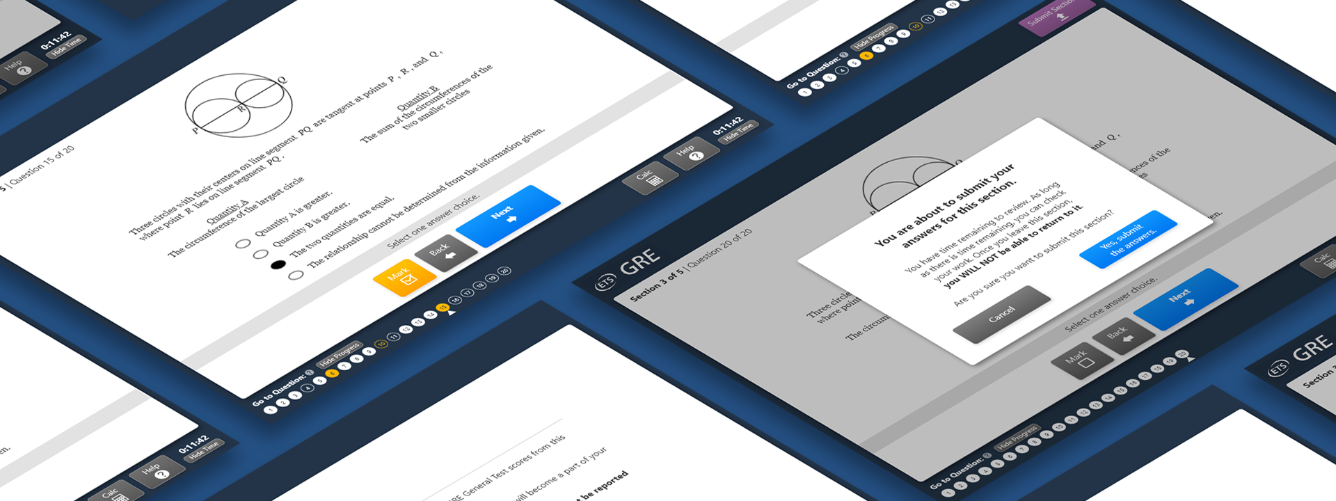
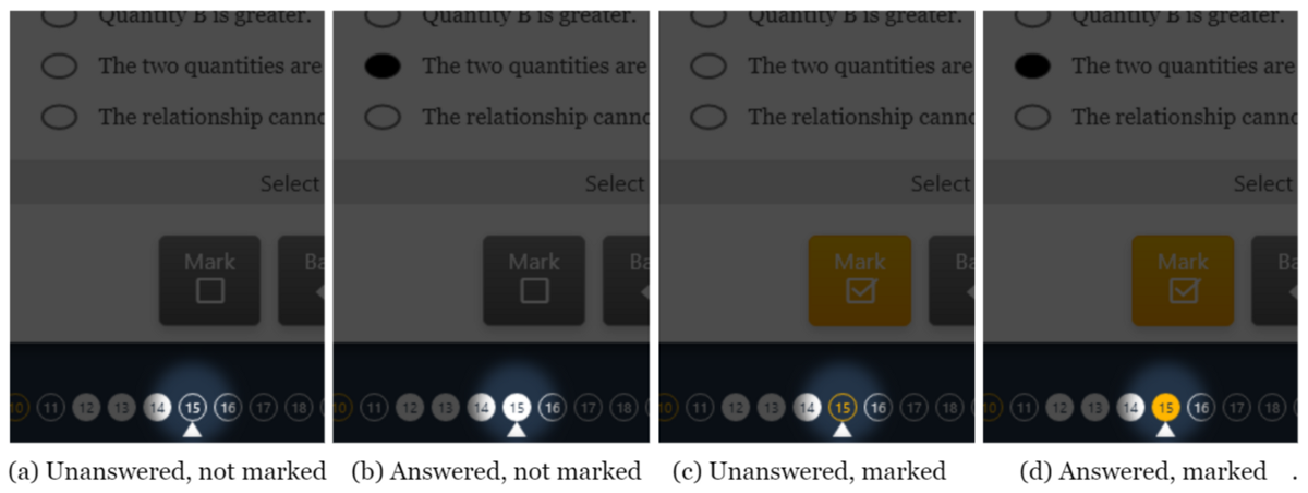
In the current design, when a user wants to see their progress or review the test, they need to jump back and forth between the question and the review page. This could waste a significant amount of time. The proposed design attempts to solve this by displaying a compact version of the review page in the question page itself so that users can just glance at the bottom-left corner to monitor their progress and click on a question number to go to the question immediately. The appearance of each question number in the area also indicates the current state of each question (Fig. 4). Moreover, a “Hide Progress” button is also available for users who might find having their progress always displayed disturbing.
Test takers’ speed is further optimized by moving other navigations to the bottom to correspond with the top-to-bottom reading flow and to reduce the distance from the answer choices. Utilizing Fitt’s Law, the ‘Next’ button is also enlarged.
The Redesign: End of the Test
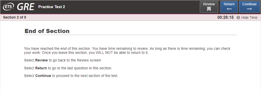
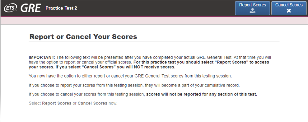
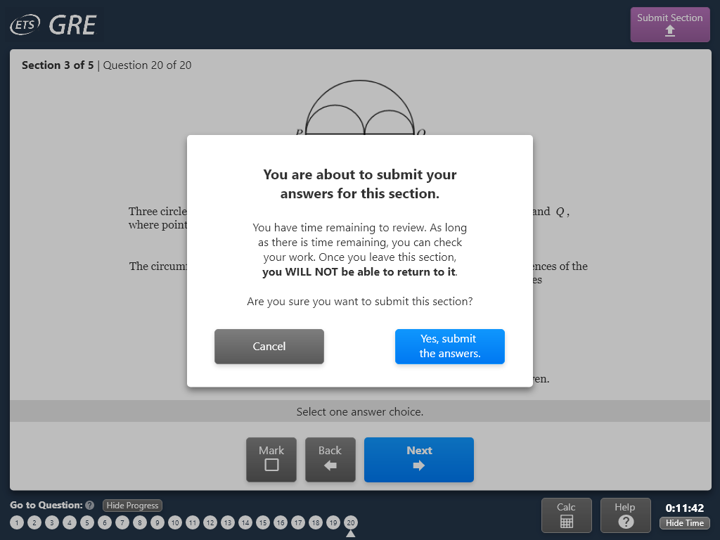
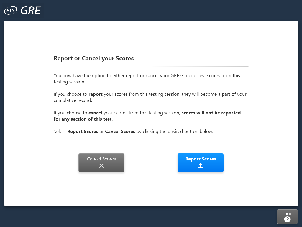
The other aspect these design changes aim to improve is preventing human error. In the current design, some buttons whose associated actions cannot be undone, e.g. ‘continue to the next section’ (Fig. 5) or a detrimental one like ‘cancel score’ (Fig. 6), are placed in exactly the same position as the ‘next’ button in other pages. Suppose a user made a slip click, their test result could be drastically changed. Although there is a confirmation page to prevent such error, these slips can still cause some panic. Illustrated in Figs. 7 and 8, the proposed design tries to prevent these unintended clicks by placing buttons for different important actions away from each other, like how the ‘Submit Section’ button is isolated from the other buttons in the proposed design.
