Introduction
Focus Brands is a food franchisor company owning 7 different well-known restaurant and snack brands such as Auntie Anne's, Cinnabon, and Moe's Southwest Grill. On a massive scale with over 5,000 stores in more than 50 countries around the world, data is an essential tool for Focus Brands to run their business.
Recognizing this necessity, the company is currently trying to promote the use of data to its employees, hoping that it will help them make well-informed business decisions and pushing the business forward. Focus Brands established its own business intelligence (BI) team and a BI tool based on Microsoft Power BI a few years ago.
Note: Business Intelligence (BI) tools are applications that help users analyze data by processing and displaying them into visualizations and reports.

Overview
Problem
According to Focus Brands’ Business Intelligence team, the tool is still suffering from low adoption rate. This means that the company's investments in the BI system could be wasted without achieving the goal of more data-informed decisions in the company.
Approach & Goals
We aim to solve the adoption rate issue by redesigning the tool to be more useful and usable. With a user-centered approach, we discovered multiple pain points that hinder the adoption. Our design aimed to:
- make the data in the tool more relevant and easier to digest
- facilitate collaboration within the team and externally
- build trust in the tool by helping users understand the data source.
Final Design
Reducing cognitive load, facilitating communication, and building trust in the BI tool to help Focus Brands promote a data-informed business culture.
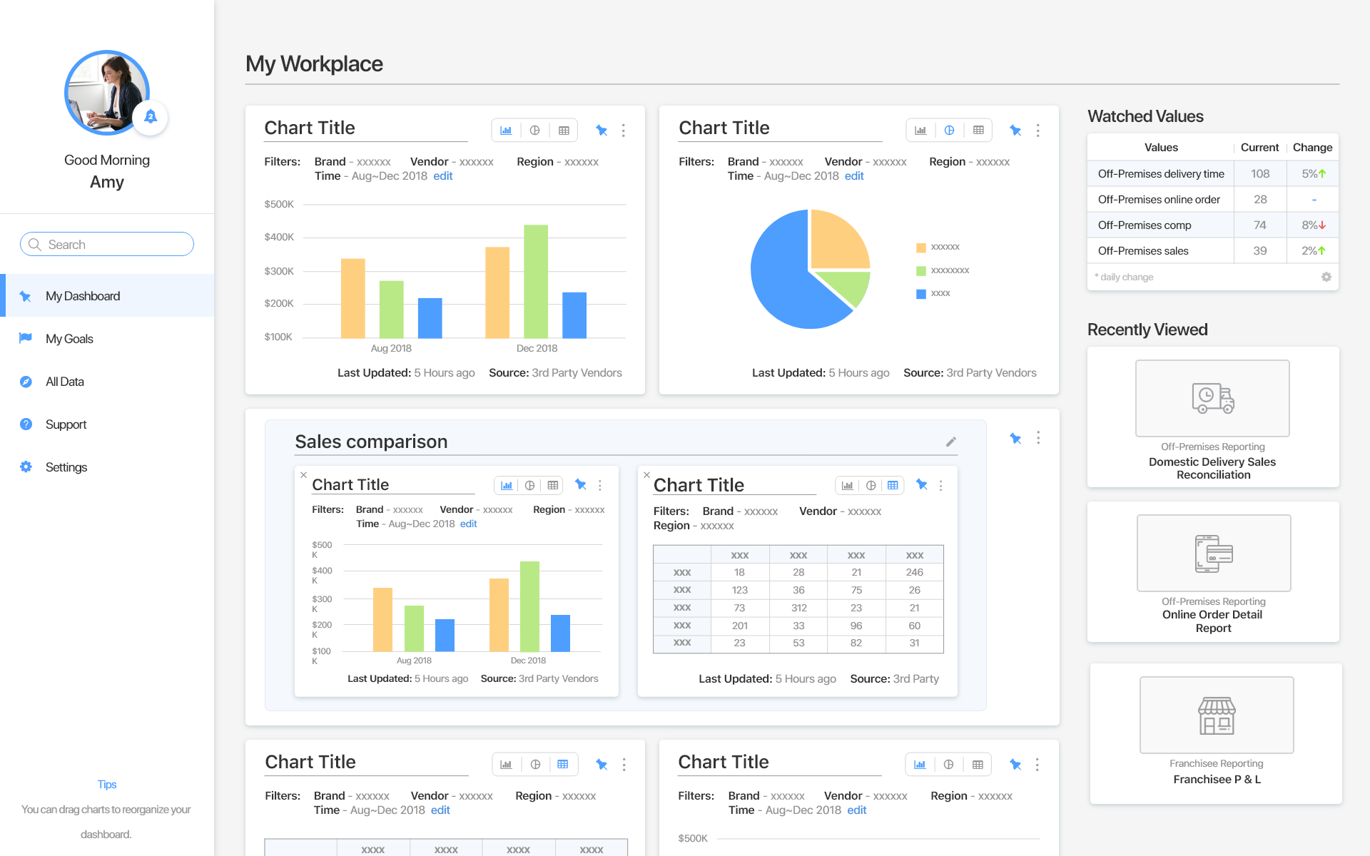
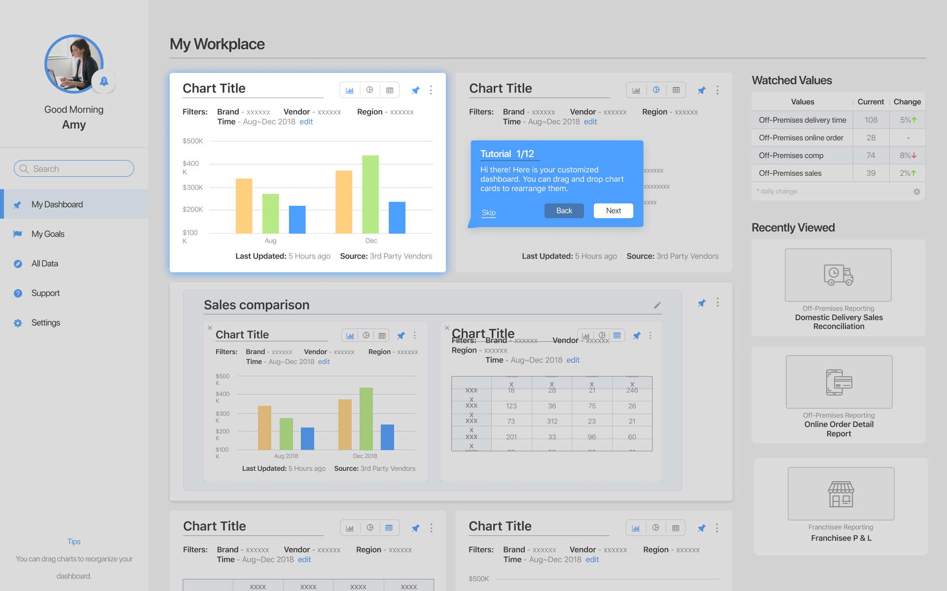
Customizable Dashboard
"I look at these data a lot. Let's pin them to my home page"
- A customizable home dashboard where users can pin charts from other places in the BI tool to.
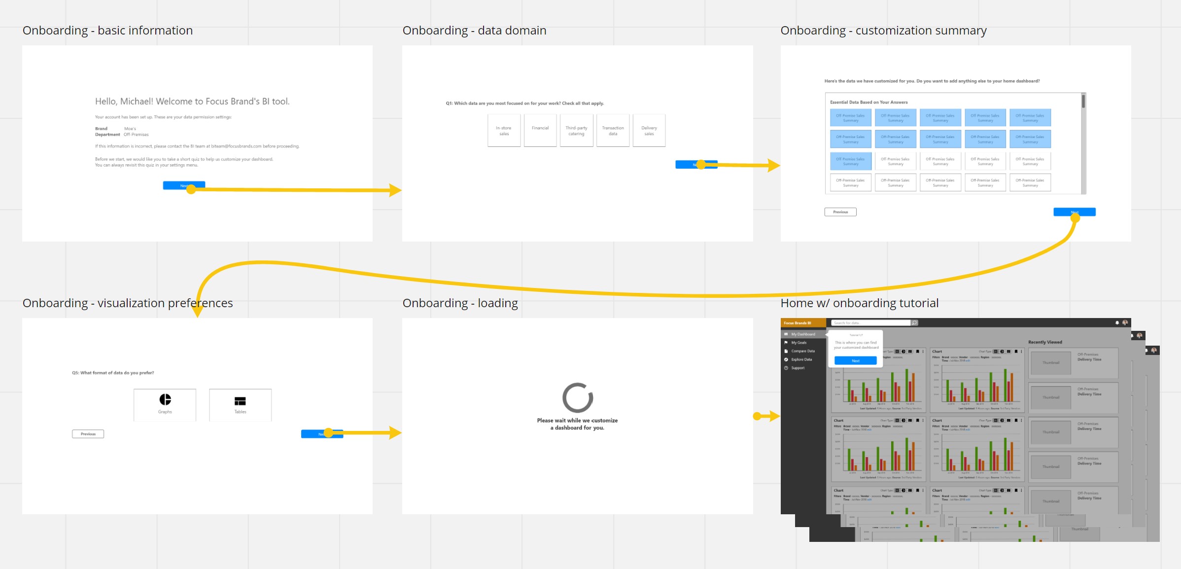
- First-time users will be asked a set of onboarding questions about their work and preferences to help customize their home dashboard.
- A quick tutorial to kickstart users with the tool.
- Showing only relevant data on their home page to avoid overwhelming users.
Search & Navigation
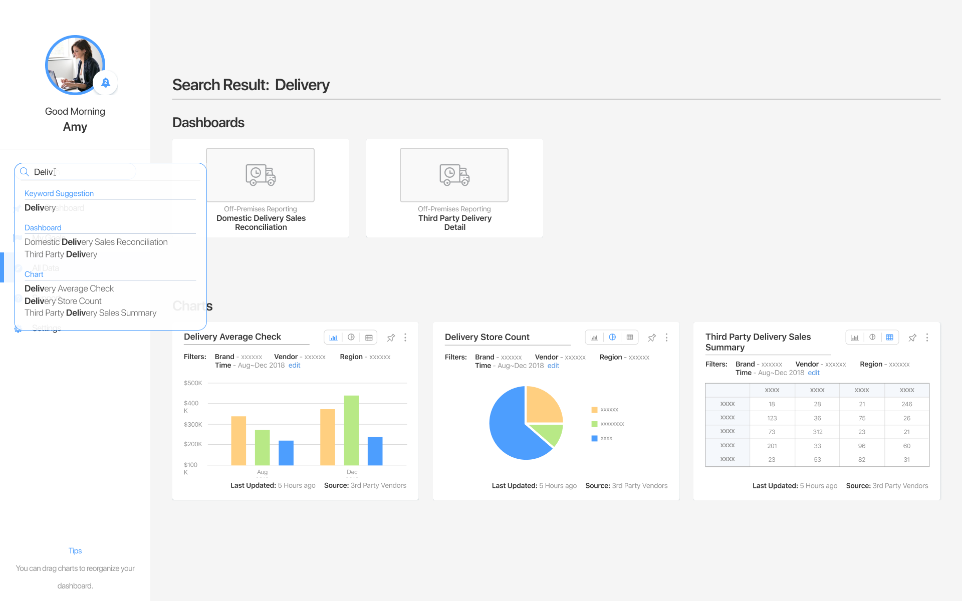
"I need the in-store sales data for this brand but it's not in my home dashboard yet... Let's do a quick search."
- Users can search for specific data from any page.
- Making it easier to navigate to a set of data in the BI tool.
Goal Tracker
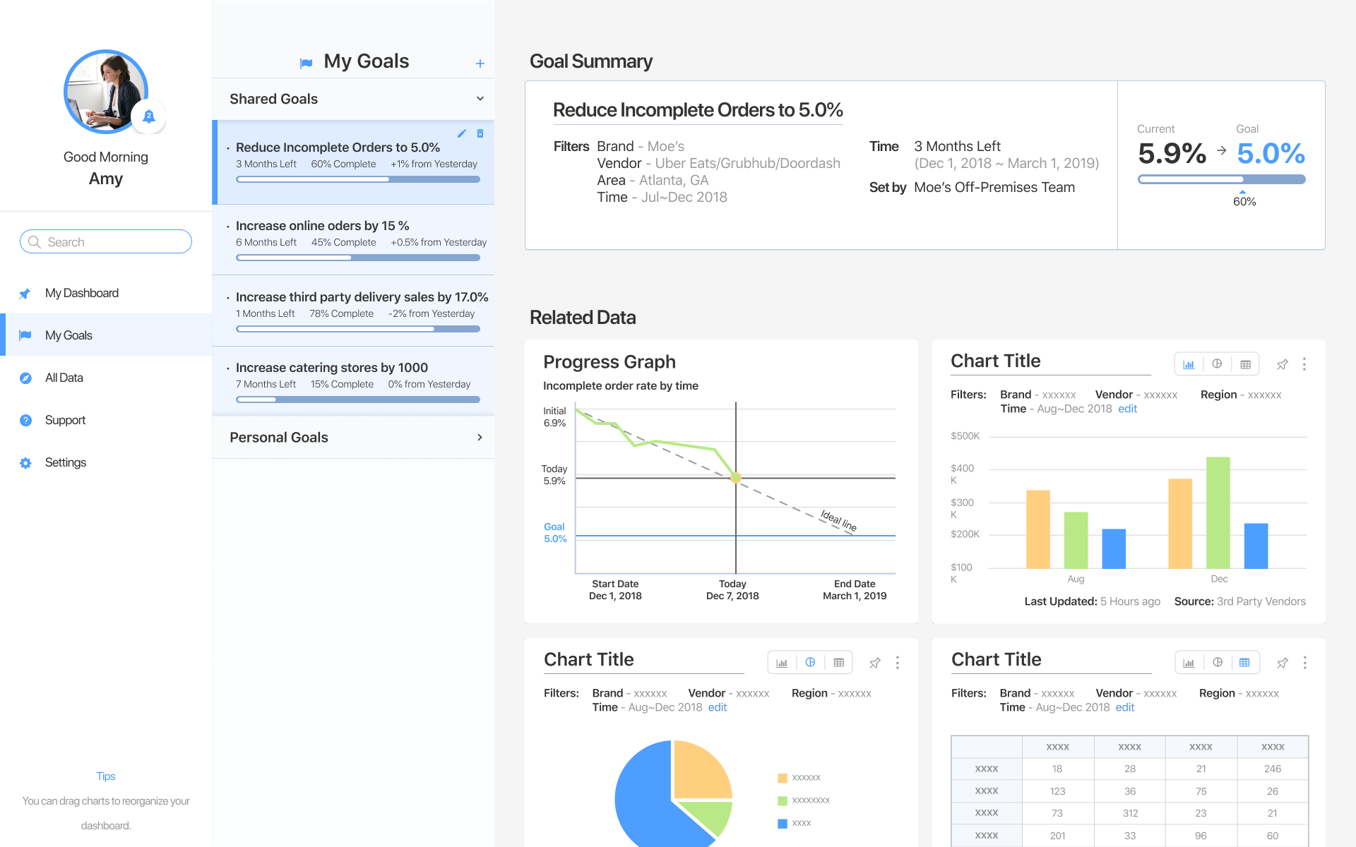
"It's been about halfway through the year. How is my team performing towards the store participation rate goal?"
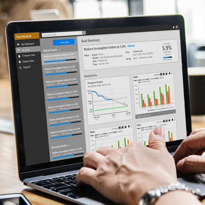
- This tool provides an easy way for users to keep track of their goals.
- It shows how the goals progress throughout the timeline of the goal.
- Potentially related data are also suggested automatically based on correlations.
- Help make the data more focused towards users' goals.
Comparison View
"These data seem correlated. Let's take a look at it side-by-side"
- Side-by-side comparison view for users to look at multiple sets of data simultaneously.
- Lets users create focused, uncluttered views for the data relevant to their needs.
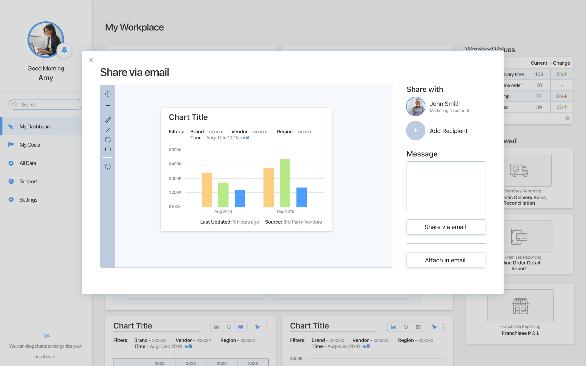
Data Sharing
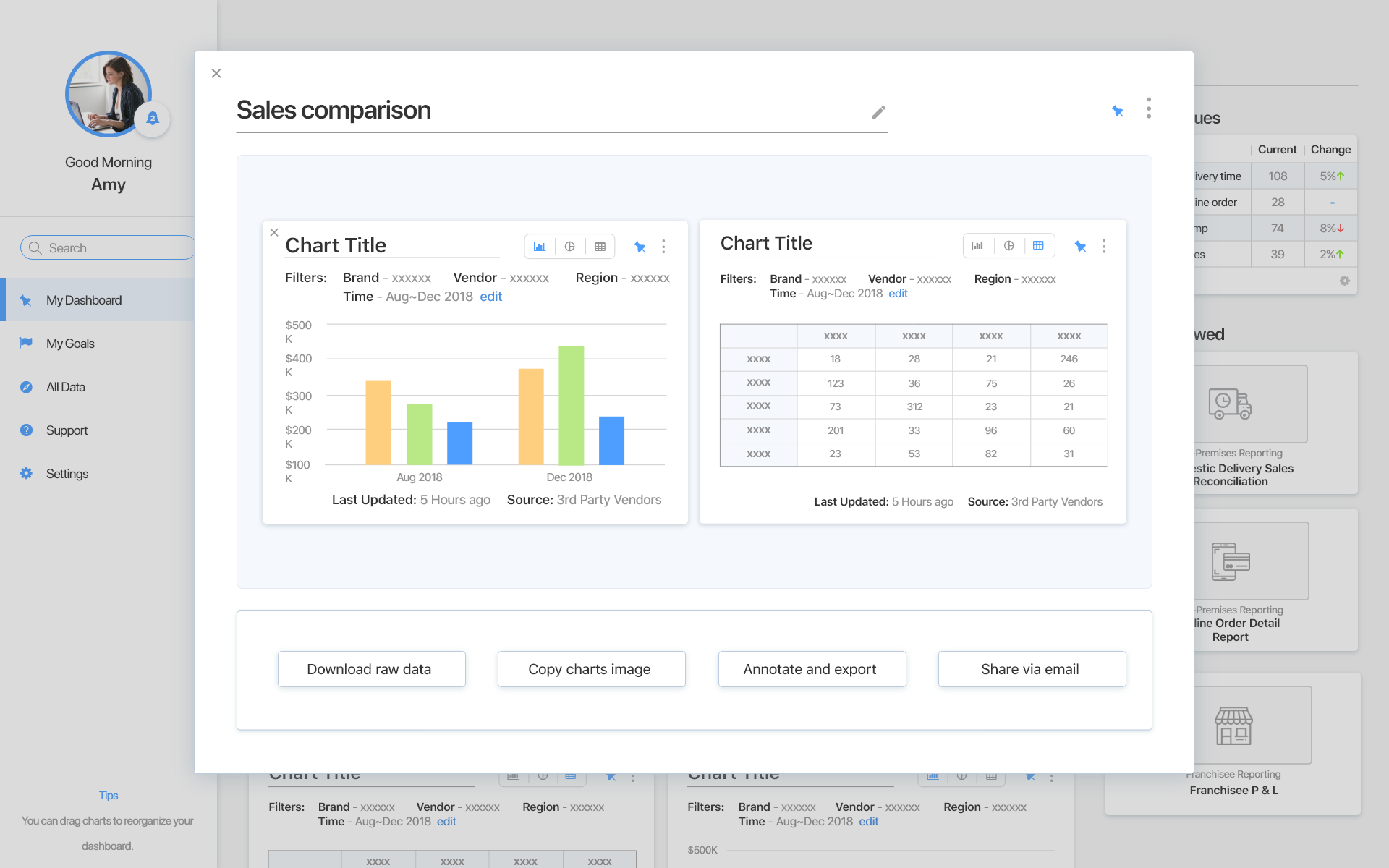
"Hey, I found some interesting trends in delivery time for this week. What do you think?"
- A seamless way for users to communicate with other people about a piece of data in the BI tool.
- Users can also Annotate the charts before sending them to other people via emails, the internal communication tool they already use.
- Facilitating communication about the business data between employees.
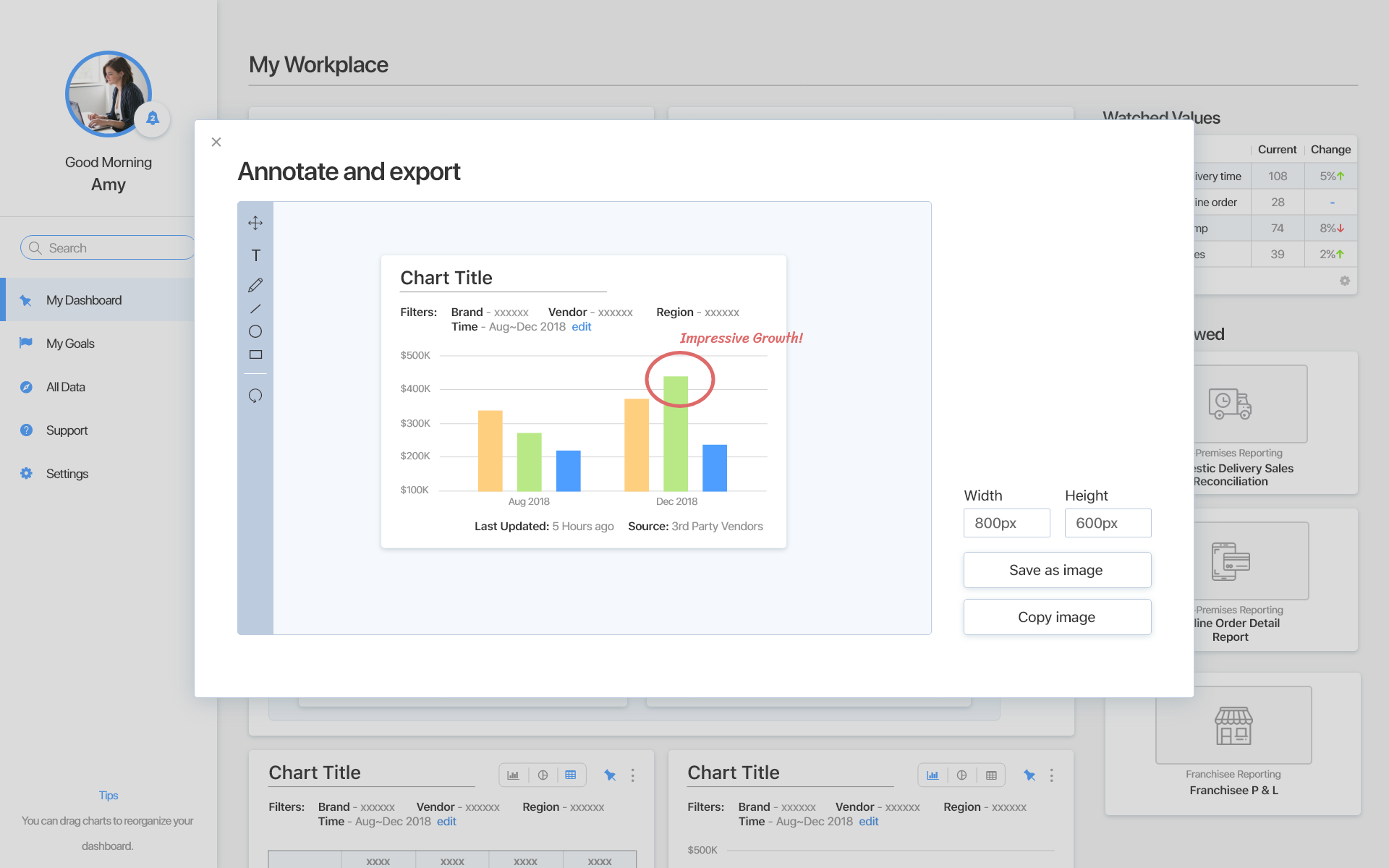
Export for Presentation
"It's that time when I have to make presentations again. Let's do it quick!"
- Users can copy chart images and paste them to presentations directly.
- They can also annotate the charts before exporting them as an image to be used in other apps.
- Ease the tedious user flow of using the data from the BI tool to make a presentation.
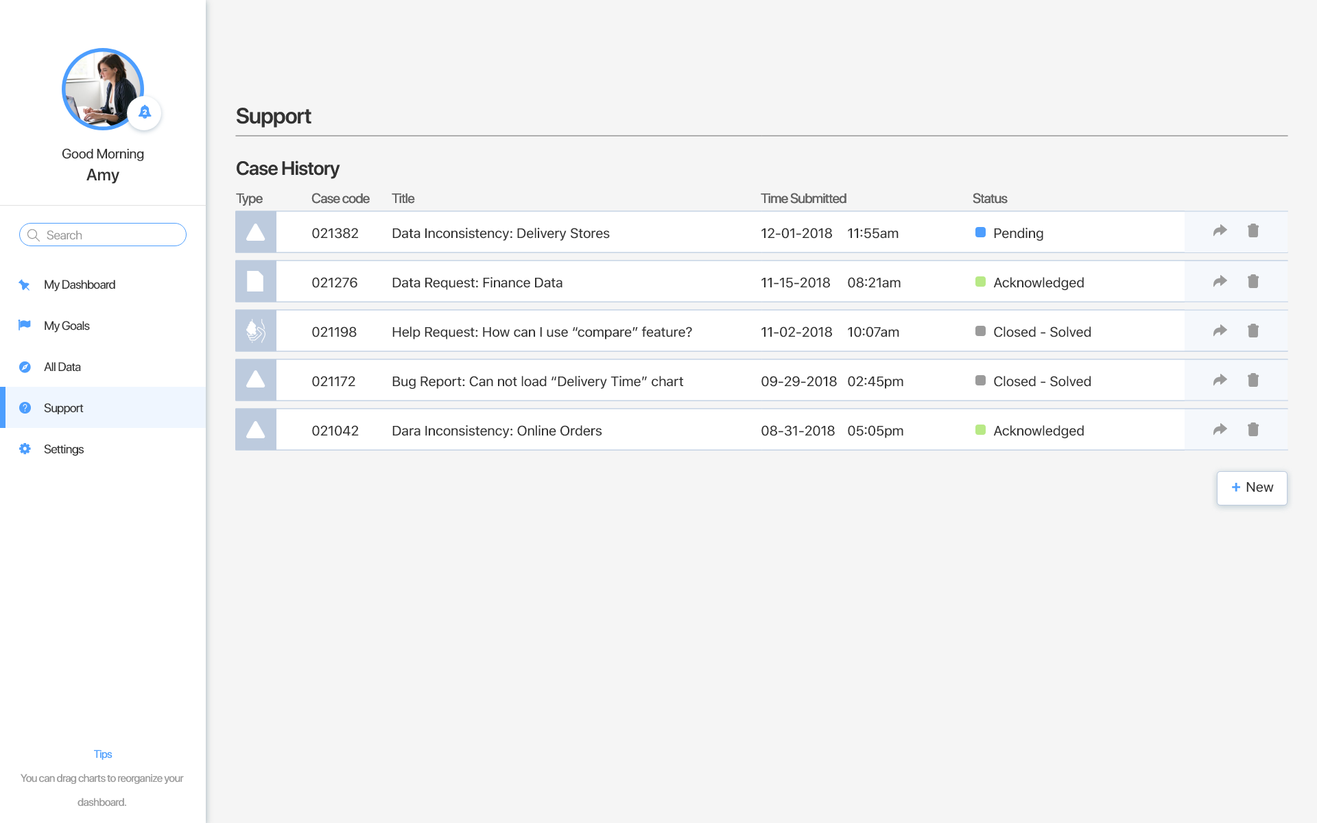
Support Request
"Some data points on this chart doesn't seem right... Could you help take a look at it?"
- Providing a way for users to communicate with and express their needs to the BI team.
- Making it easier for administrators to listen to their users.
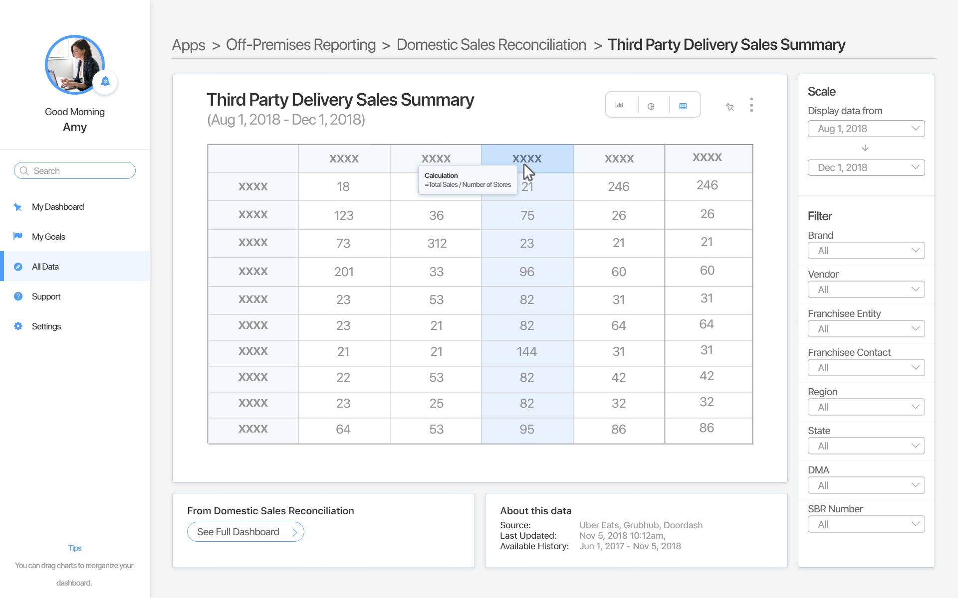
Metadata
"Hmm... When was this catering data last updated? How did they calculate this number? Let me check..."
- Users can see information about data including when it was last updated and where it came from.
- Building trust by helping users understand the reliability and freshness of the data as well as understand possible causes of data inconsistencies.
- Also shows calculation formula for numerical metrics in the BI tool to help users better trace and understand the data.
Process Overview
1. Empathize
- User Interviews
- Stakeholder Interviews
- Contextual Inquiry
- Surveys
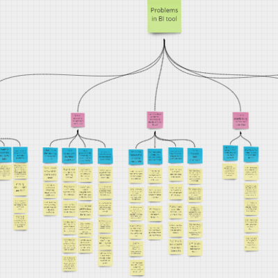
- Affinity Mapping
- Personas and Empathy Maps
2. Ideate
- Design Goals Definition
- Brainstorming & Ideation
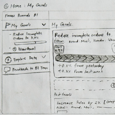
- Sketching
- Wireframing
- Feedback Gathering
3. Prototype
- Sketching
- Wireframing
- Feedback Gathering
- Interactive Prototype
4. Evaluate
- Usability Testing
- Heuristic Evaluation
- Design Recommendations
Empathize: Understanding Users & Context
We started the project with exploratory user research to dive into what are the needs and pain points of our user group related to the BI tool.
Who are the Users and Stakeholders?
Users
Focus Brands Employees
- Works for a specific brand or in a centralized team shared across brands.
- Have different domain of work, e.g., restaurant operations, marketing, finance, international
Stakeholders
Focus Brands BI Team
- Centralized team shared across different brands.
- Responsible for development of the BI tool
- Process data from the source and display them in the BI tool for other employees to see
Understanding the User
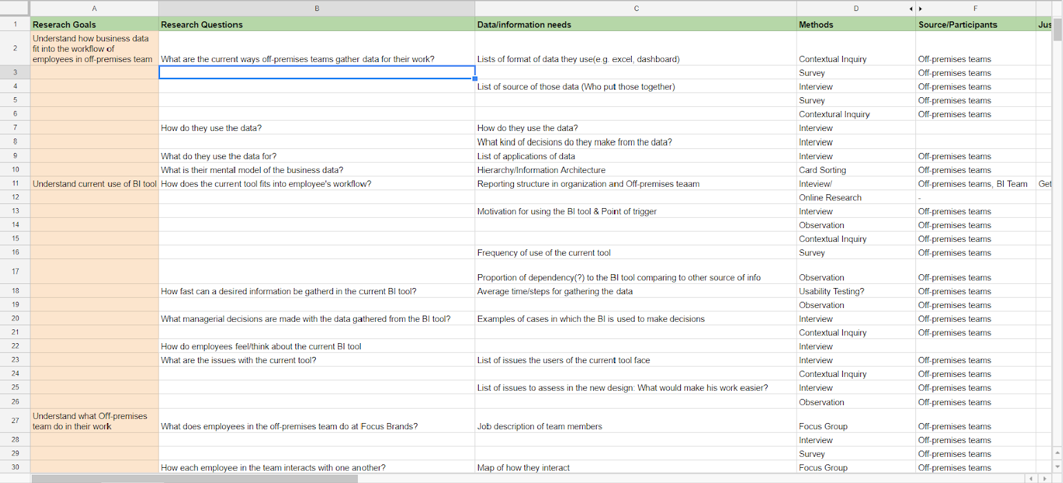
From the goals, we then planned our research in the planning table shown below. We started by listing questions and information needs for each goal and then pick an appropriate UX research method for each question.
User Interviews
2 remote + 2 on-site semi-structured interviews, 40-60 minutes each with Focus Brands employees
To learn about their day-to-day work, business information needs and ways of acquiring them, how the data is being used, and channels of communication within the company and to external partners.
Stakeholder Interviews
60-minute Remote, semi-structured, group interview with the Business Intelligence team.
To understand the needs, plans, and challenges of the BI team as well as how the data is put in the BI tool and the rationale behind the design decisions made in the current system.
Contextual Inquiry
1-hour on-site contexture inquiry session with a Focus Brands employee.
To understand the workflow and the tools they use in their day-to-day work as well as the work environment of the user.
Surveys
8-minute survey sent to the broader set of employees at Focus Brands
Unfortunately, we only received 4 responses
The goal was to reach more participants and validate the qualitative research with quantitative results and learn about the employees' needs and pain points with the existing BI tool.
Analyzing the Data
We used affinity mapping to analyze the qualitative data we collected from the research methods we conducted.
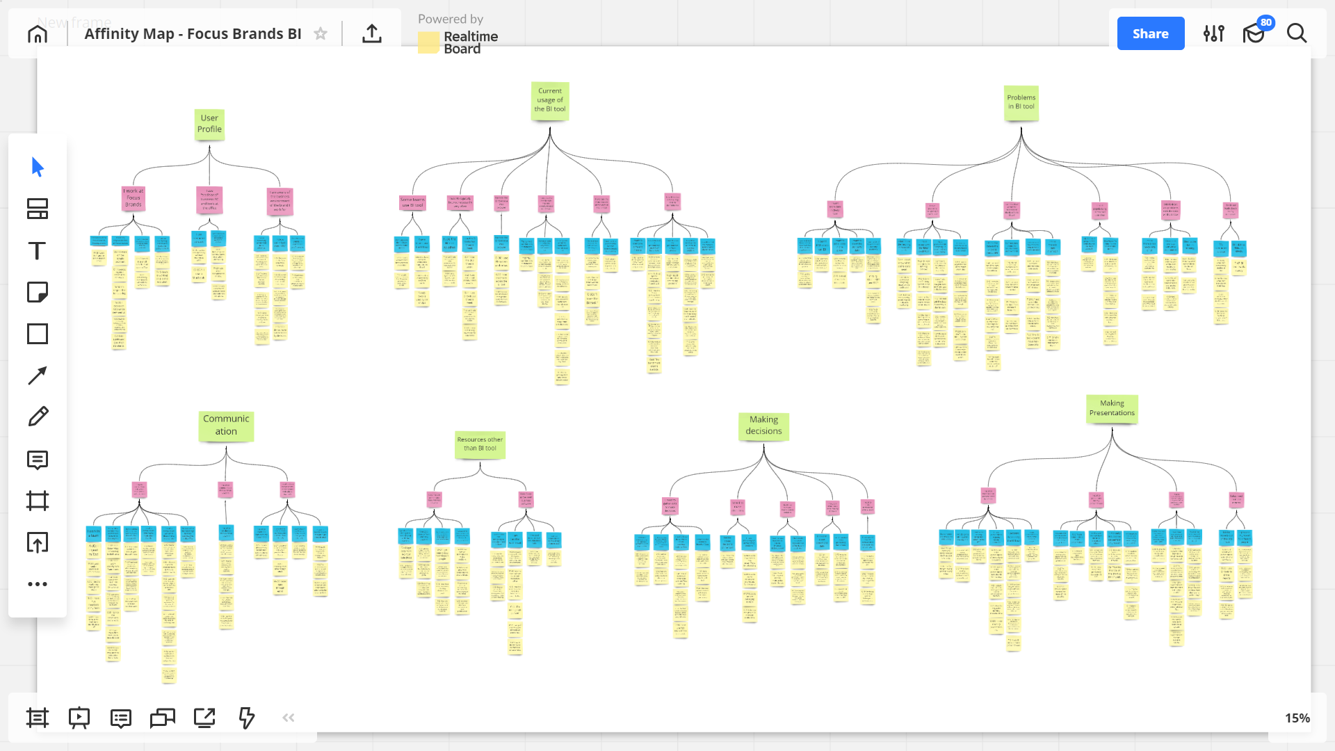
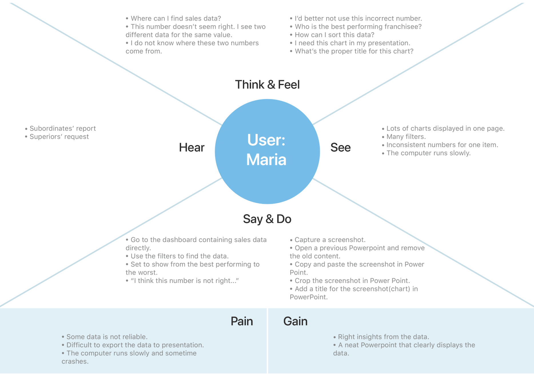
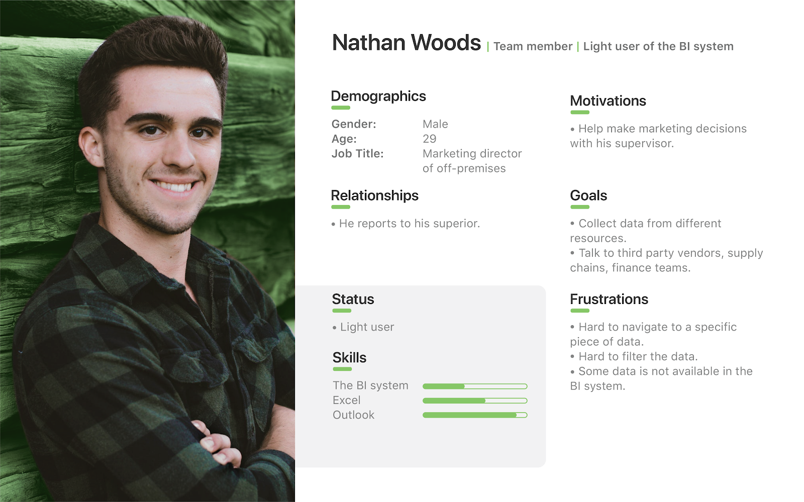
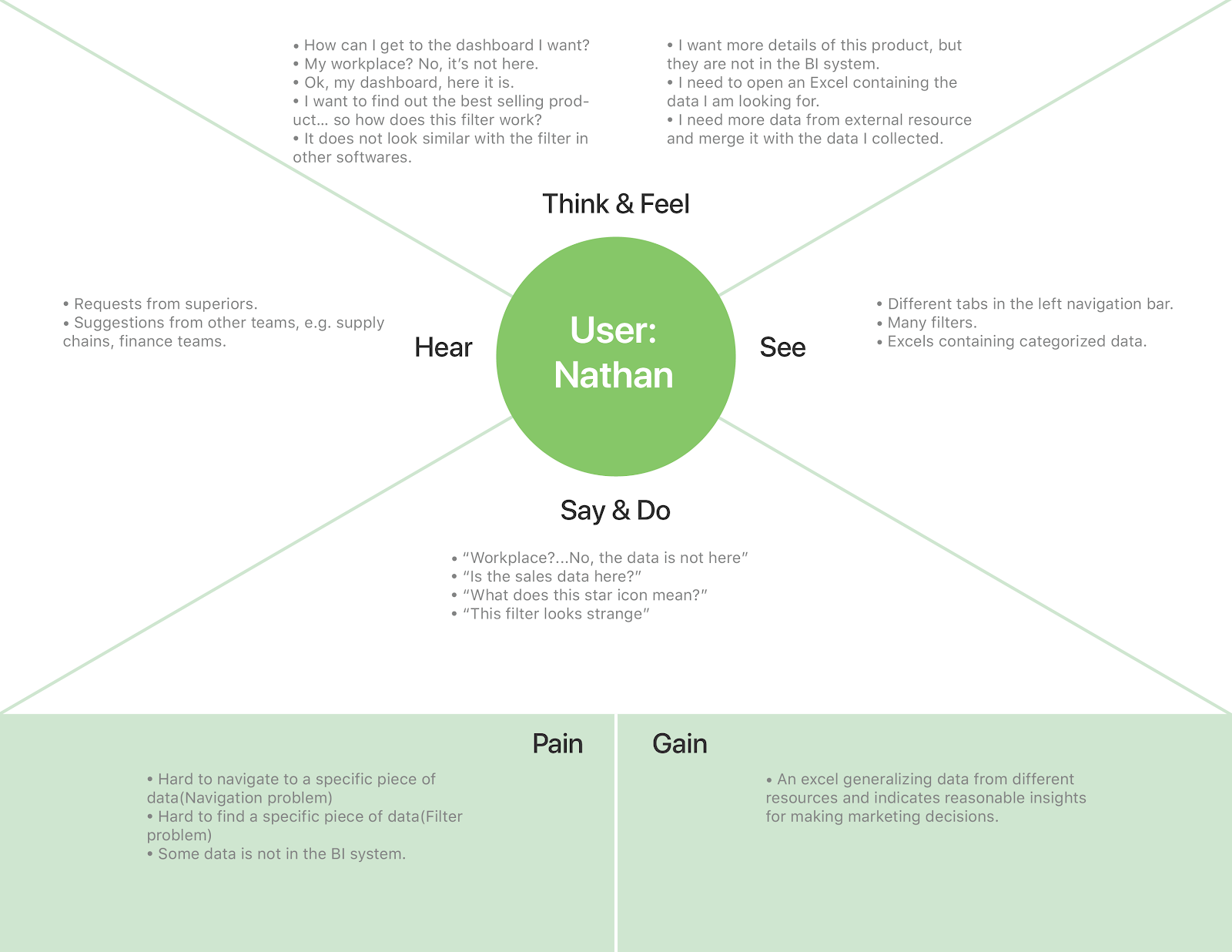
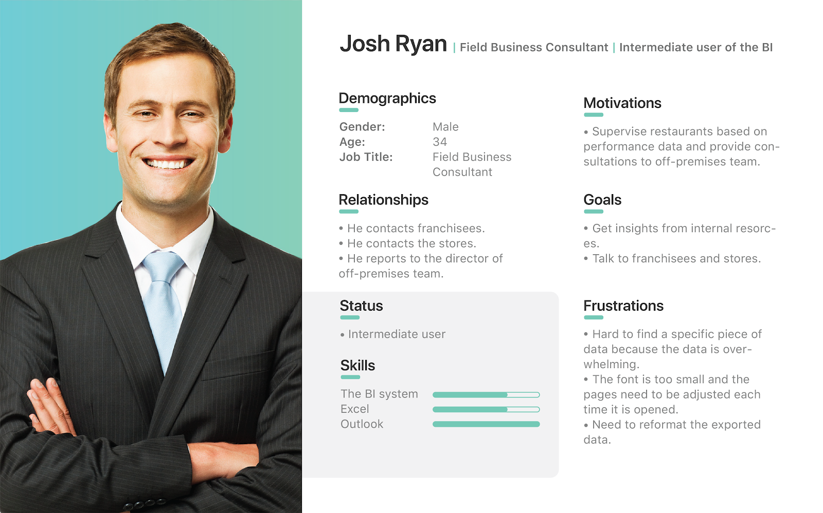
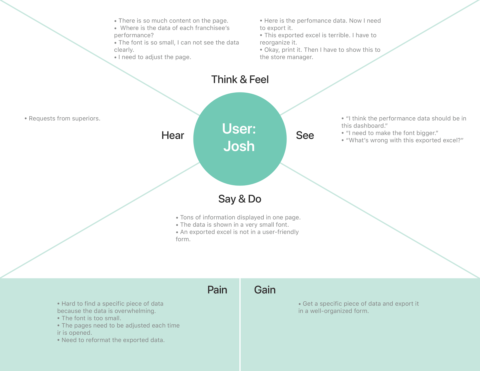
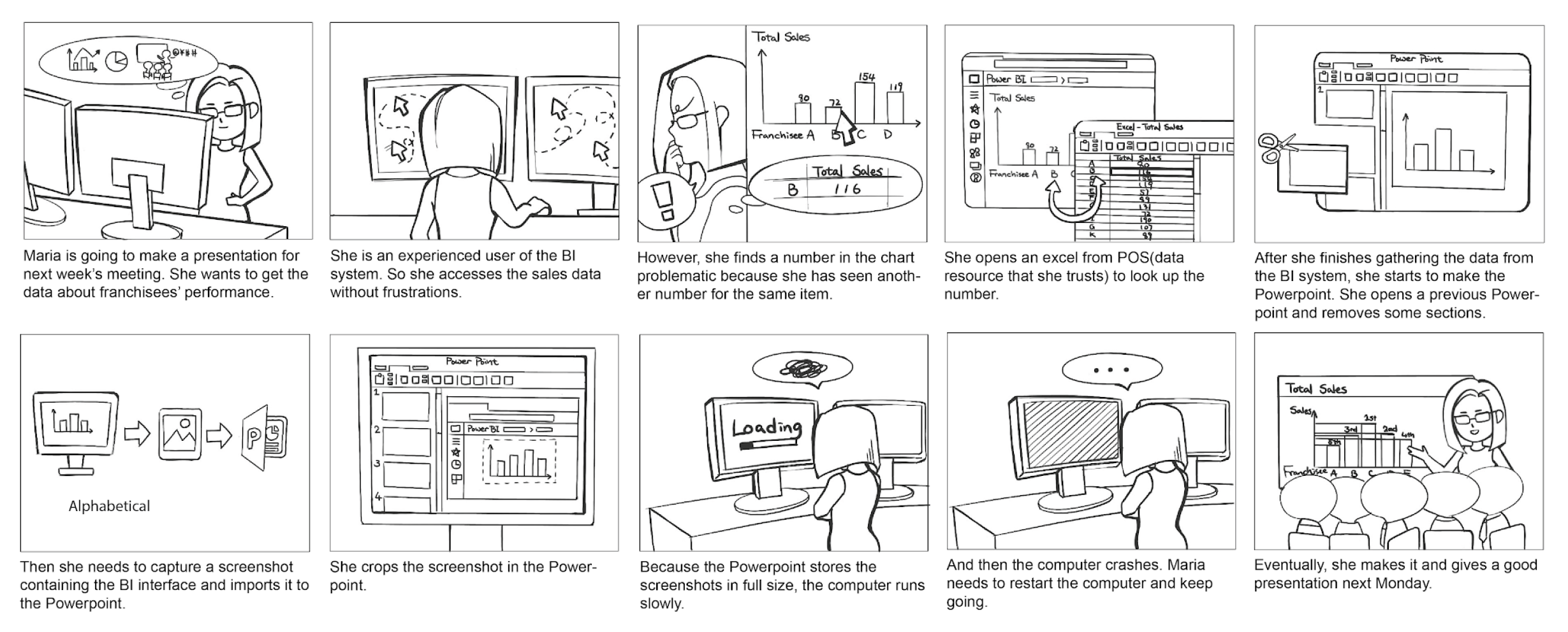
We also compiled the findings into personas, empathy maps, and storyboards. These tools also helped us put the users’ needs and pain points into context to better empathize with our user group.
Meet The Personas
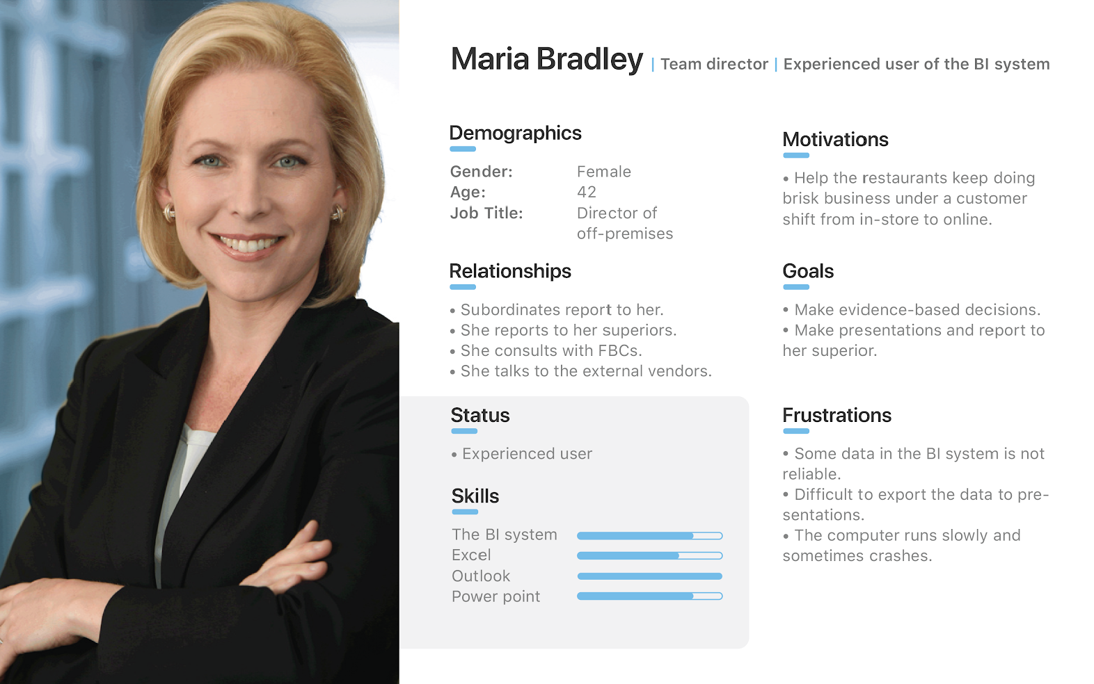
Here are three personas we came up with that reflect different types of our users in multiple dimensions, e.g., managerial vs operational employees, frequent vs infrequent users.
Maria
The Manager
"I make business decisions through these data but I struggle a lot with making sure the data on these dashboards are reliable. I also hate it when my computer crashes when I try to take put a lot of charts from the dashbaord in my presentation!"
Nathan
The Data-Novice
"I am an infrequent user of this the BI dashboard. I find it overwhelming to use; there're a lot of irrelevant data up there on the screen. I can't really find what I'm looking for."
Josh
The Communicator
"As a Field Business Consultant, I have to use these data to communicate with external franchisees in order to help them manage their franchise. I have to make sure I have the data to show them when I go talk to them."
Insights
The Status Quo
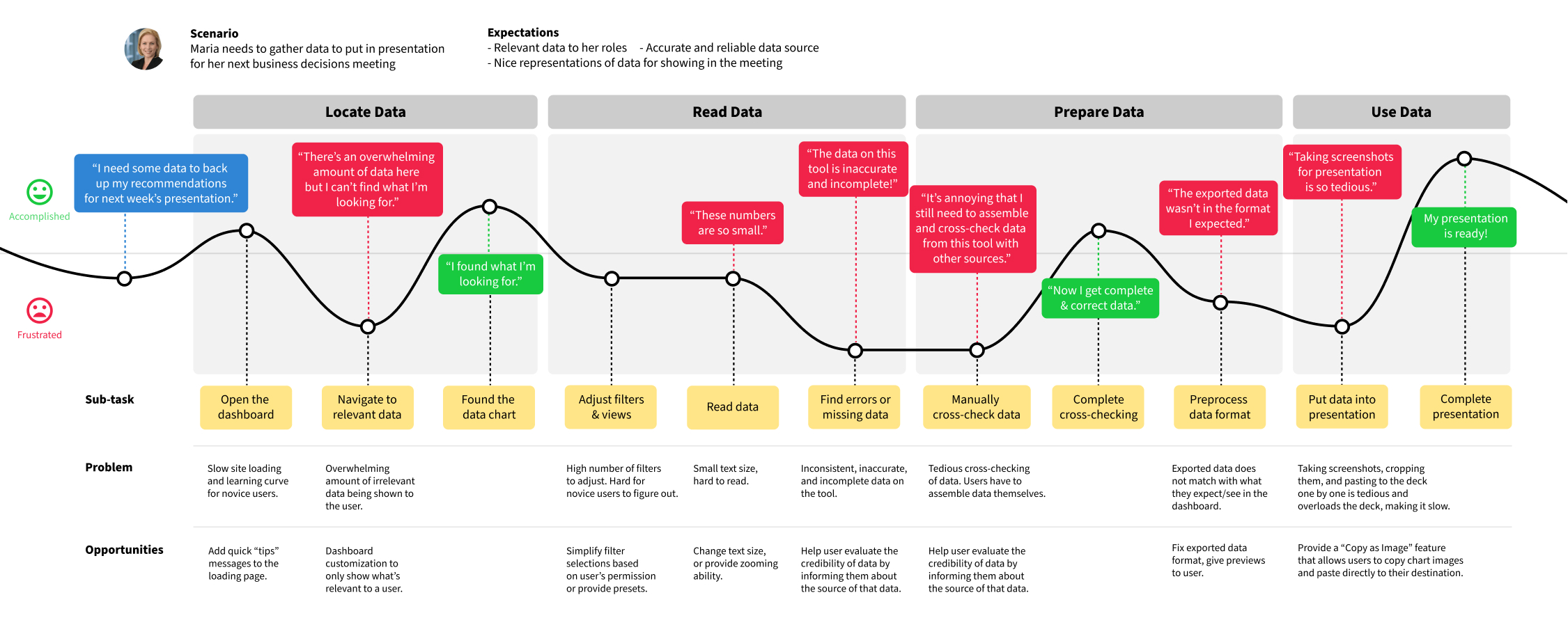
This journey map further illustrates the steps a user would have to take and pain points that could occur when they are using the existing system.
User Needs
Opposing to our initial thoughts, the user needs we discovered suggested that the use BI tool is not just for "looking at a summary of data" and making decisions directly from them. Instead, there are also aspects such as measuring performance, communication, and creating presentations and reports, that are heavily involved in the use of the tool.
The user needs that we found included:
1. Understanding the Business Situation
Employees use the BI tool to keep track of the performance of their campaigns and see whether they have reached their goals/KPI.
2. Making Business Decisions
The data in the BI tool have helped employees make decisions to grow the business, e.g., deciding on the menu line-up for catering.
3. Communication
Doing business is a team effort; they need to communicate to progress towards their goals. These communications happen both within the company and with external partners.
4. Presentations and Reports
Communications also take place in more formal forms such as presentations and reports. These are to show the data and communicate ideas to higher-ups and people they work less closely with.
Pain Points
We found the problems that could annoy and/or hinder the users from completing their tasks:
1. Confusing navigation schemes
Participants repeatedly mentioned about how they do not completely understand how to navigate around the BI tool.
2. Overwhelming data
With the amount of data presented in the BI tool, some data seem irrelevant to the users and, in turn, the data feels overwhelming.
3. Data reliability and availability
There are inconsistencies in the data presented in the BI tool; some data points displayed are not consistent across different views, or some might conflict with other sources or users’ prior knowledge. This makes some users feel skeptical about the credibility of the tool.
4. Learning the BI Tool
Participants often mentioned that it "took a while" for them to learn how to use the tool.
5. Presenting data
Compiling data for a presentation is a tedious and time-consuming task.
6. Sharing data
Getting data from the BI tool and transforming them into a more shareable format is also a taxing task for the users.
Defining the Design Goals
We compiled the findings and defined three main design goals to help our team focus our design efforts. These design goals include:
1. Reduce Cognitive Load
Help make data more relevant and less overwhelming
2. Facilitate Communication
Make it easier to share data with others and provide channels to contact BI team
3. Build Trust
Help users understand about the source of data
Design Ideation
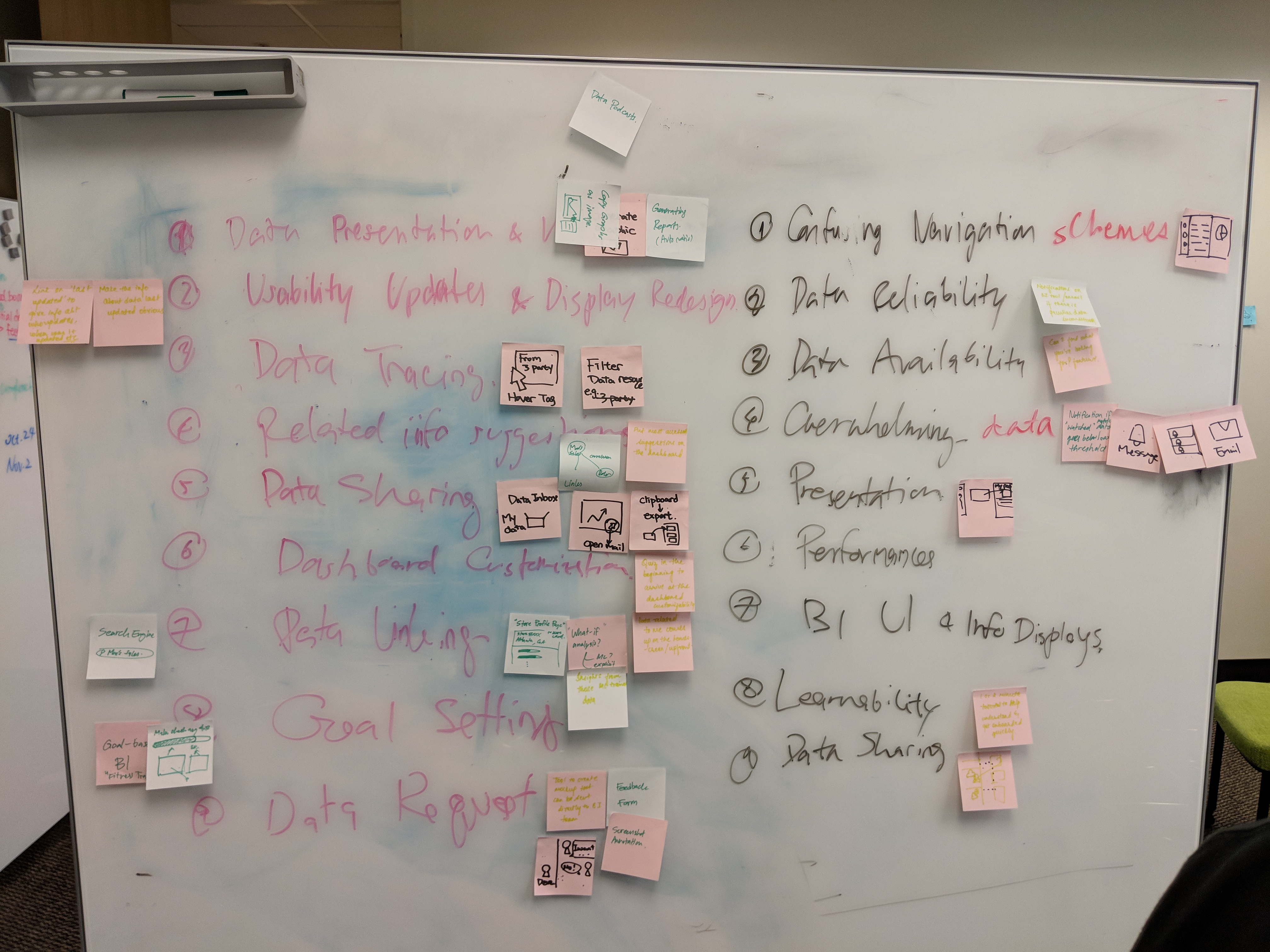
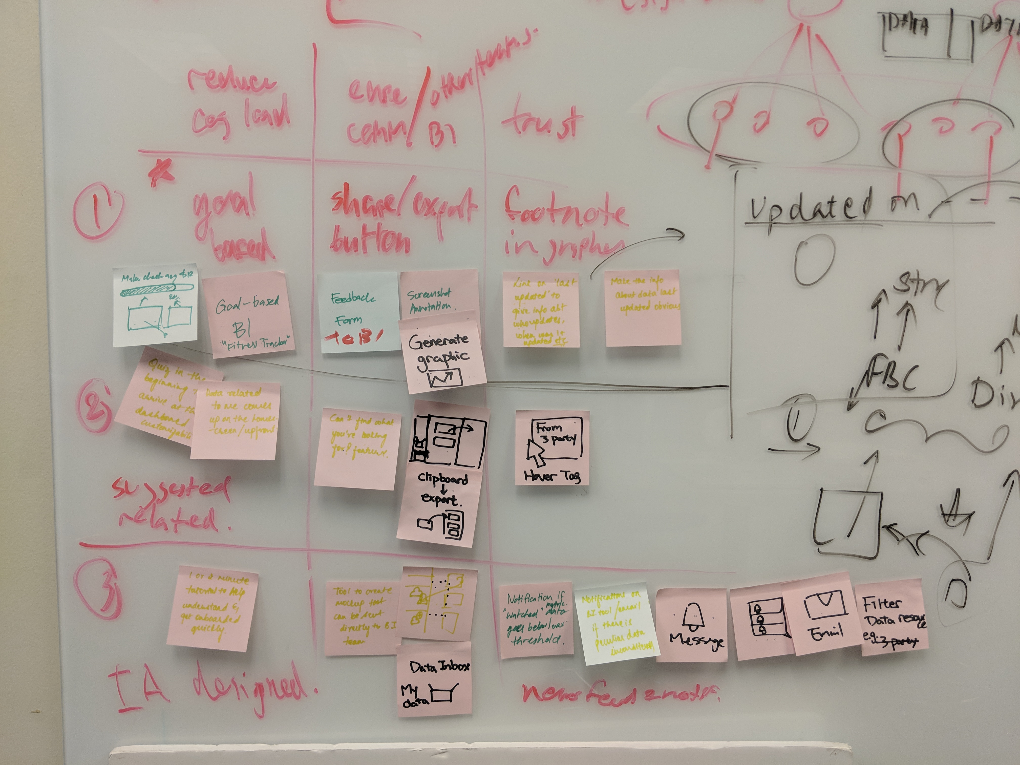
Based on the user needs, the pain points, and the design goals we have defined, we brainstormed design ideas for possible features to address those goals. Some of the feature ideas that seem viable were then selected and grouped together, organizing them into three design alternatives to be prototyped.
Design Iterations
After the brainstorming, we selected the design ideas and made concept sketches out of them. We focused on the three goals we defined earlier and put them into these concepts. The concepts were tested with Focus Brands employees and revised based on the feedback, each time with increasing fidelity.
We went through three iterations in the design starting from low-fidelity concept sketches, mid-fidelity wireframes, to mid-fidelity interactive prototype.
1st Iteration: Low-fidelity Concept Sketches
The 1st iteration was a divergent design ideation effort. For each design goal, we tested three design alternatives addressing these goals and collect feedback about them. For each design idea, key screens were sketched out.
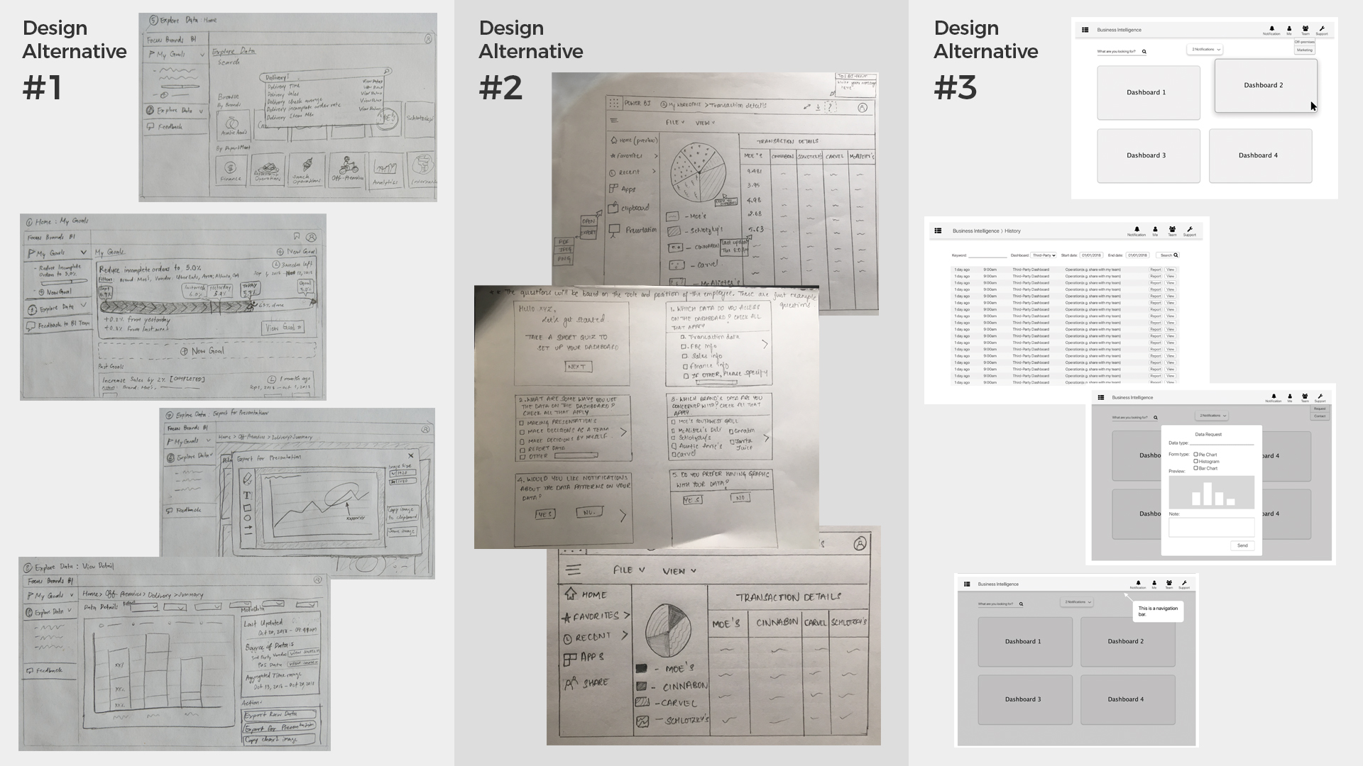
| Alternative #1 | Alternative #2 | Alternative #3 | |
|---|---|---|---|
|
Goal 1 Reducing Cognitive Load |
Goal-based BI
Let users set metrics as goals and track their performances while suggesting relevant data to the metric. Search Bar Keyword-based search functionality to let users easily navigate to the desired data easily. |
Onboarding Quiz
Using a quick onboarding questionnaire to understand users' data needs and help pick only relevant data to display on their personalized home dashboards. |
Onboarding Tutorial
Display a short overlay onboarding tutorial to first-time users. |
|
Goal 2.1
Facilitating Communication (to Colleagues) |
Sharing, Exporting, & Annotation
Make it easier to share a chart on presentations, reports, or emails by providing an option to annotate the chart and export chart images directly from the tool. |
Clipboards
Allow users to "pin" multiple charts to a single "clipboard" before exporting/sharing them with their team. |
Drag & Drop Sharing
Users can drag and drop a chart to an area on the navigation bar associated with a team to share it with that team. |
|
Goal 2.2
Facilitating Communication (to the BI Team/Administrators) |
Feedback form
Let users send messages directly to the BI team through a simple feedback/contact form. |
"Can't find what you're looking for?"
Provide a centralized way for users to request for missing/unavailable data. |
Data Request Form
A data request form which allows user to specify which data in what preferred type of visualization is needed. |
|
Goal 3 Building Trust |
Data Source Information Footnote
Shows metadata including source and last update time at the bottom of each chart. |
Data Source Hover
Shows a similar set of metadata to the users when they hover the cursor on a data point. |
Anomaly Notification
Notifies users when an anomaly in data trends occur. |
What did the users say?
There were a total of 10 participants joining our feedback sessions. Some points mentioned by the users during this round of feedback session included:
Reducing Cognitive Load
- The goal tracker is a valuable tool for their workflow. Users mentioned that the goals usually involve more than one person in the team.
- Some questions in the onboarding questionnaire were not necessary since it already depends on the data permissions they have. Users expect an option to add charts to the home dashboard after the quiz.
- Some users mentioned that they would skip the tutorial while some novice users found the tutorial helpful.
Facilitating Communication
(to Colleagues)
- The users found the sharing/exporting/annotating feature useful.
- They also mentioned that the clipboard feature would be useful and mentioned that they want a side-by-side comparison view for different charts.
- Some participants were concerned about sending data to other people who do not have the permission to view such data.
Facilitating Communication
(to the BI Team)
- Users are concerned that their feedback will be missed. However, the BI team said that they welcome more feedback from the users.
- Some users are concerned about conflicting requests made to the BI team for data visualization types.
Building Trust
- They find displaying the metadata along with the charts helpful for evaluating the reliability of the data. Some also mentioned that they would want to know how the data points were calculated.
- Users prefer to see metadata upfront without hovering on the data points.
- A clear anomaly identification technique must be defined for the anomaly notification to work properly. Participants are concerned that they will either miss important updates or were flooded with too many notifications.
2nd Iteration: Medium-Fidelity Wireframes
Based on 1st iteration feedback, we merged our design alternatives, converging into one set of medium-fidelity wireframes which were then used in another round of feedback gathering.
What did we change?
Most feature concepts were merged into this one design and were implemented with higher fidelity to show more details of how they will work. Some feature concepts were altered based on the feedback in terms of user interface layout.
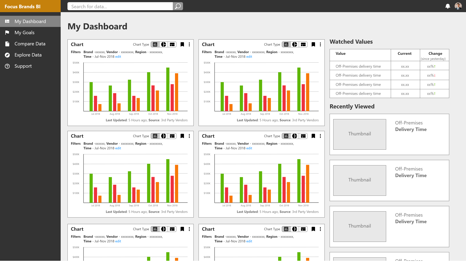
- Drag & Drop
Allow some features to be triggered with drag & drop interaction, e.g., drag a chart to the "Support" tab to file a ticket. - Pin to Home Dashboard
pin/unpin charts to/from the home dashboard after the onboarding quiz.
- Goal Tracker
Allow users to set goals for the others, e.g., a manager setting a goal for their team. - Notifications x Goal Tracker
Use notifications to notify users about goals instead of using it for data anomaly.
- Support
Added a status for each case, e.g. "acknowledged", "solved", to make sure the feedback is addressed. - Visualization Type Request
Instead of having users request a preferred chart type directly to the BI team, provide them with toggle buttons to let them do that on-demand.
What did the users say?
The feedback sessions for this iteration were done through remote video calls where we would operate the prototype based on what the user intended to do. In general, the users said that the redesign was useful and easy to use.
| What we found | How we addressed it in the 3rd iteration |
|---|---|
| Participants did not know that they can perform actions with drag-and-drop, instead, they used the more visible context menu icon as an entry point to chart-based actions. | Drag-and-drop interaction was removed. |
| The name of the "Clipboard" feature confuses the users. Once understanding how the feature works, the users find this feature useful. | The label for this feature was changed to "compare data". |
| In goal tracker, the layout in which the goals were presented—laid horizontally as tabs—cannot fit the number of goals an employee usually have. | Accommodate more goals by stacking them vertically in the sidebar instead of horizontally as tabs on the top of the page. |
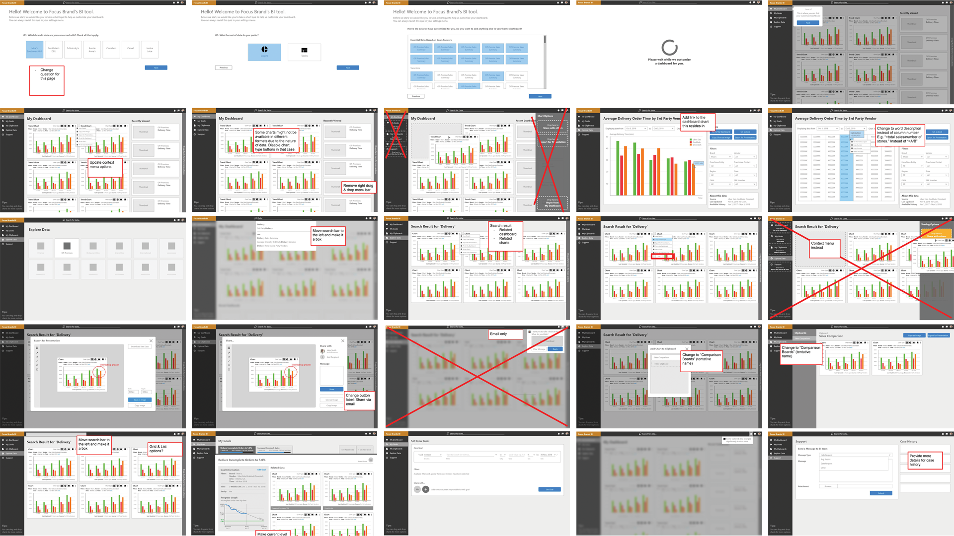
3rd Iteration: Revised Interaction Prototype
The final design was updated from the 2nd iteration wireframes. Changes were made based on the user feedback that we gathered.
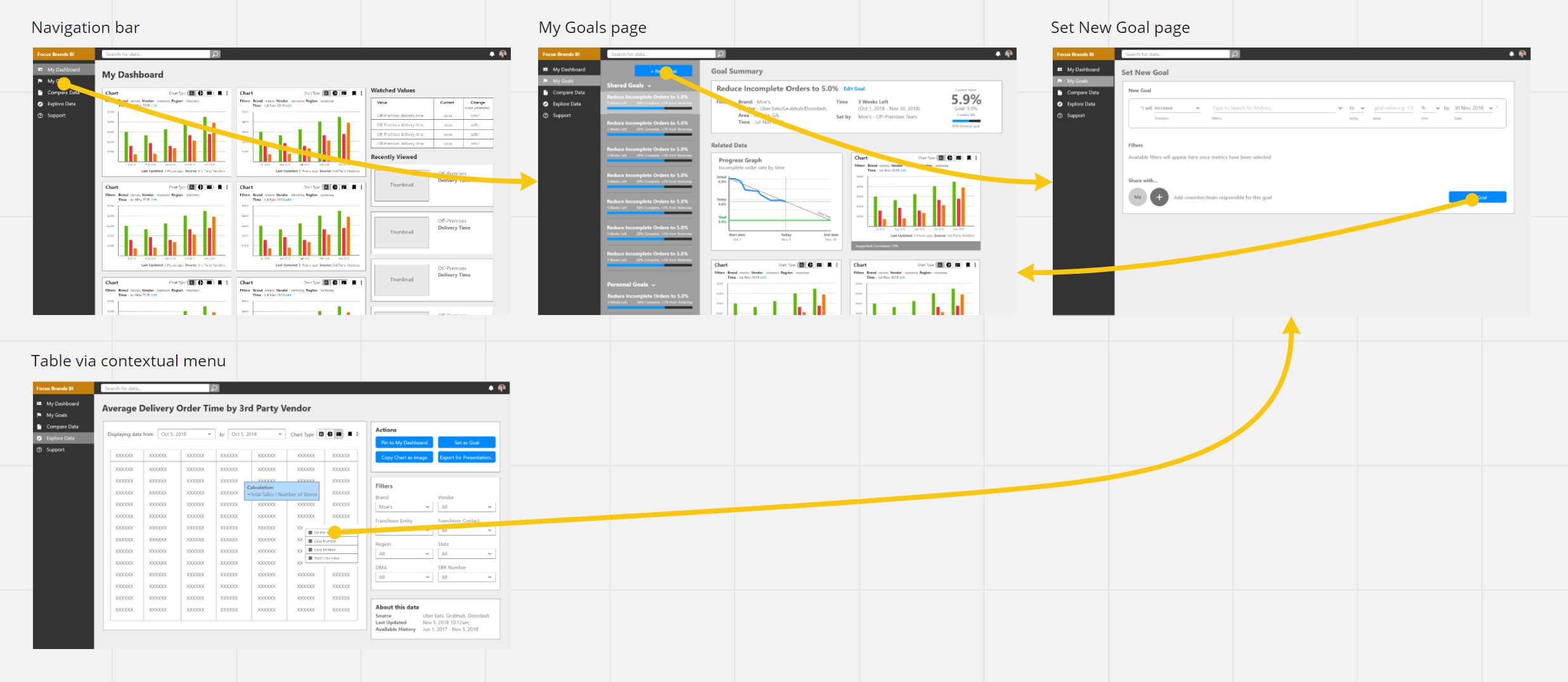
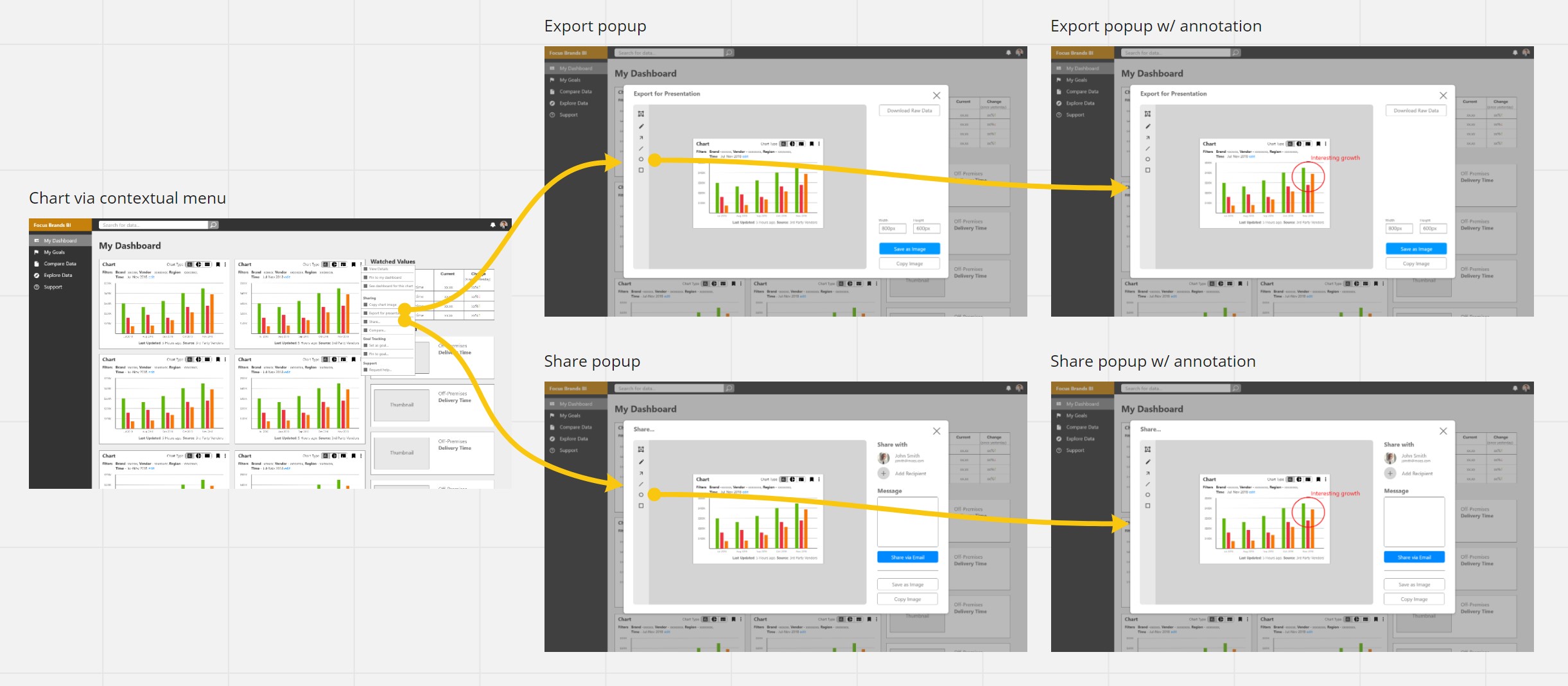
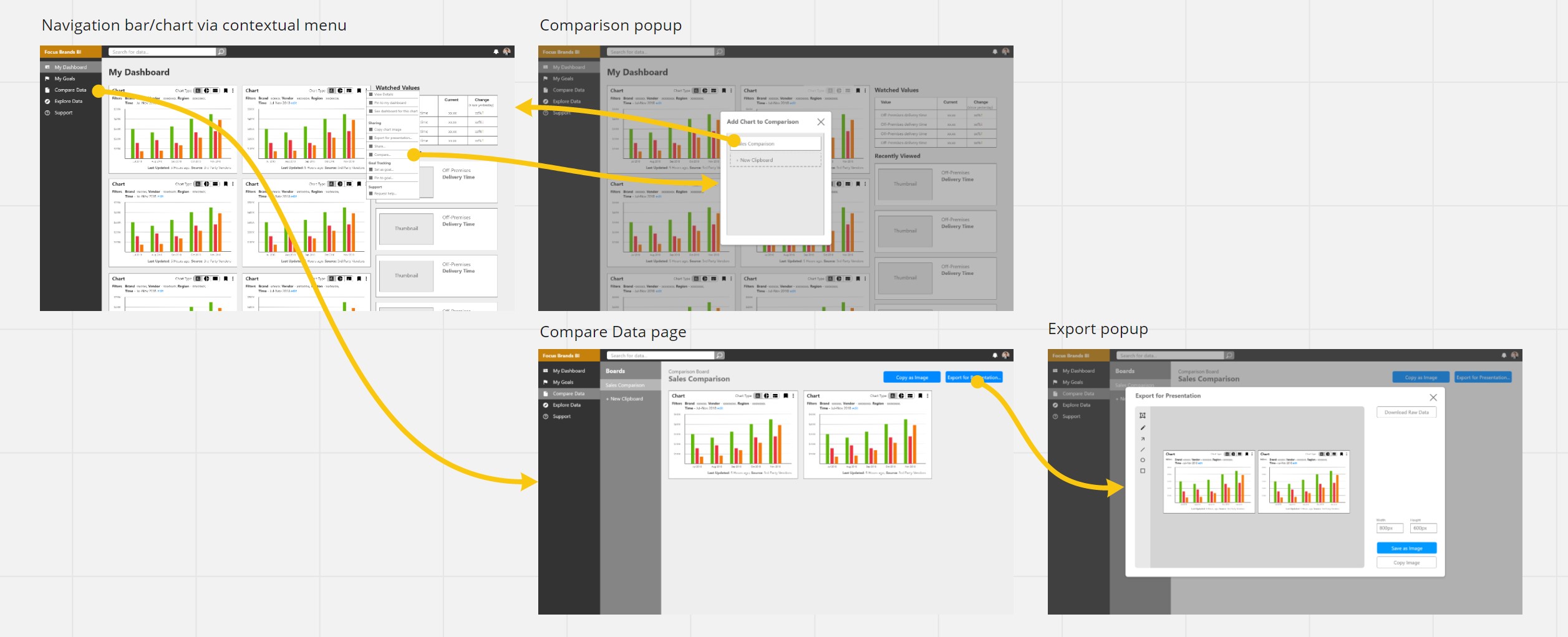
User Flows
We defined and refined the user flows of each use case we designed for, to create a prototype for the final user testing sessions. Below are some examples of the user flows we designed for the prototype.
Onboarding
General Navigation

Goal Setting/Tracking
Export & Sharing
Comparison
Support Request

Interactive Prototyping
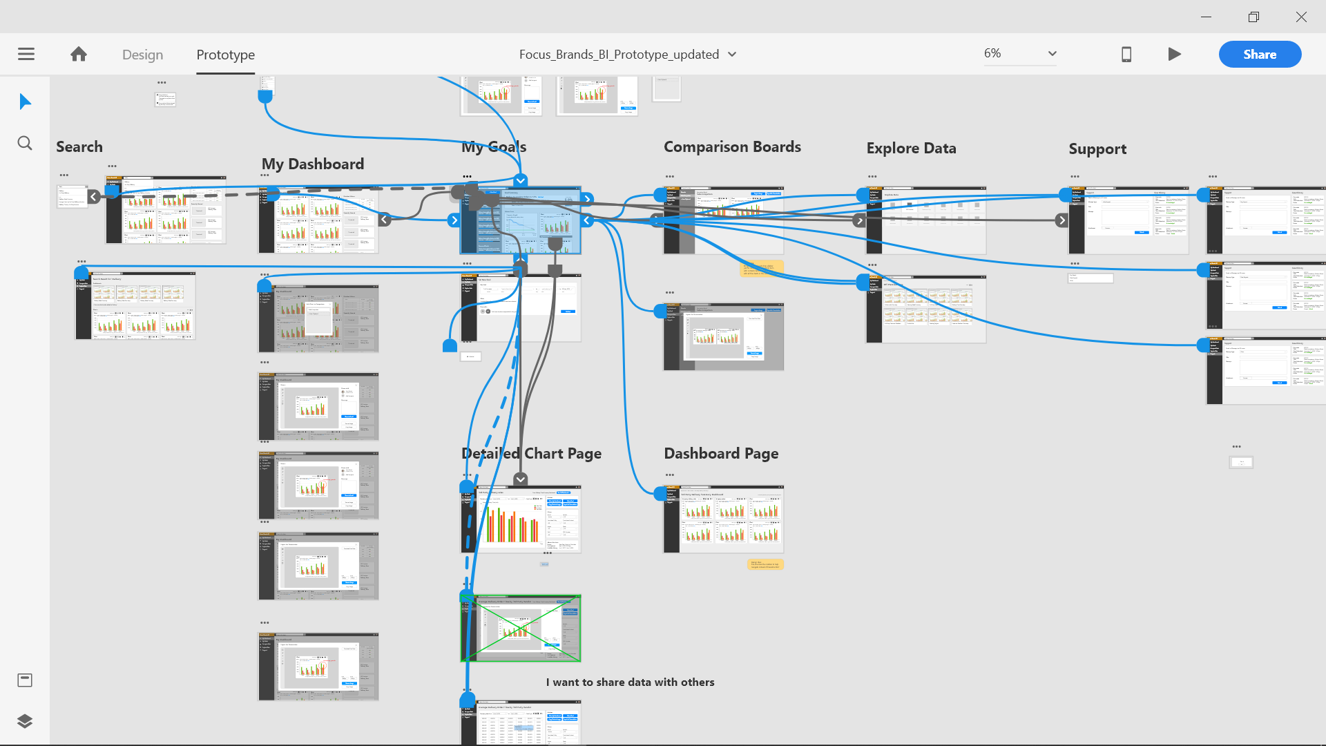
In this iteration, we created an interactive prototype based on user feedback from the last iteration. We used Adobe XD to create the prototype.
Visual Design
As the layout of the design has been laid out, we began looking at the visual design of the system to create an aesthetically pleasing experience for the user. These are some design directions we explored.
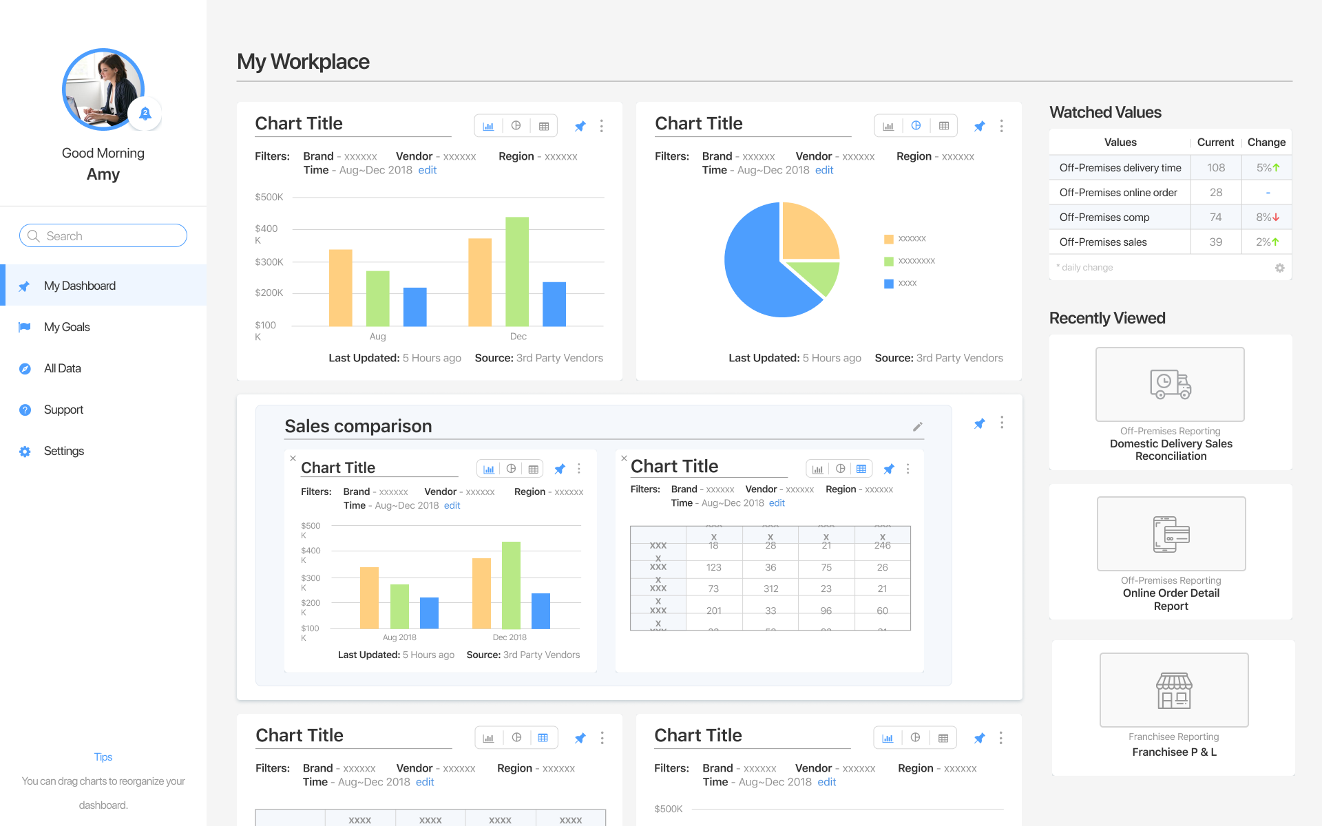
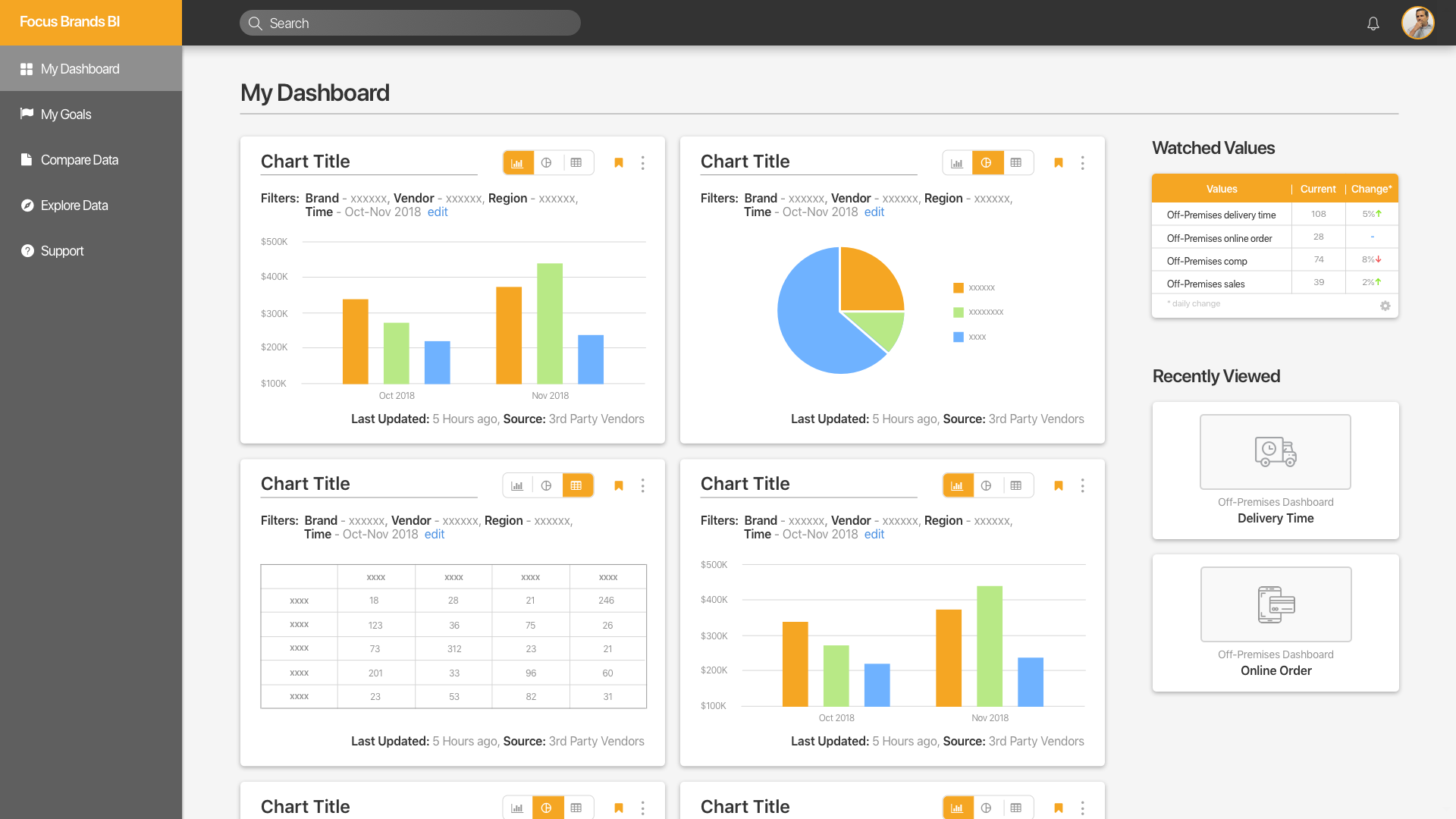
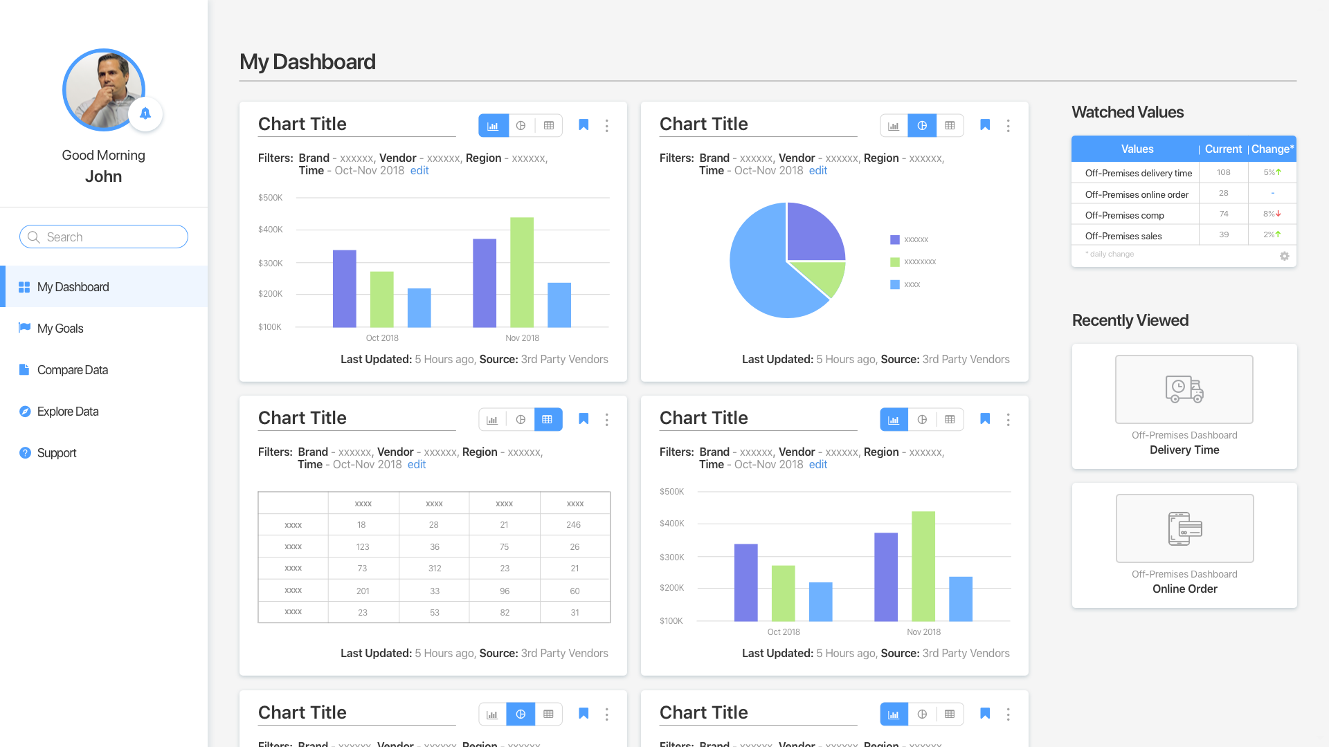
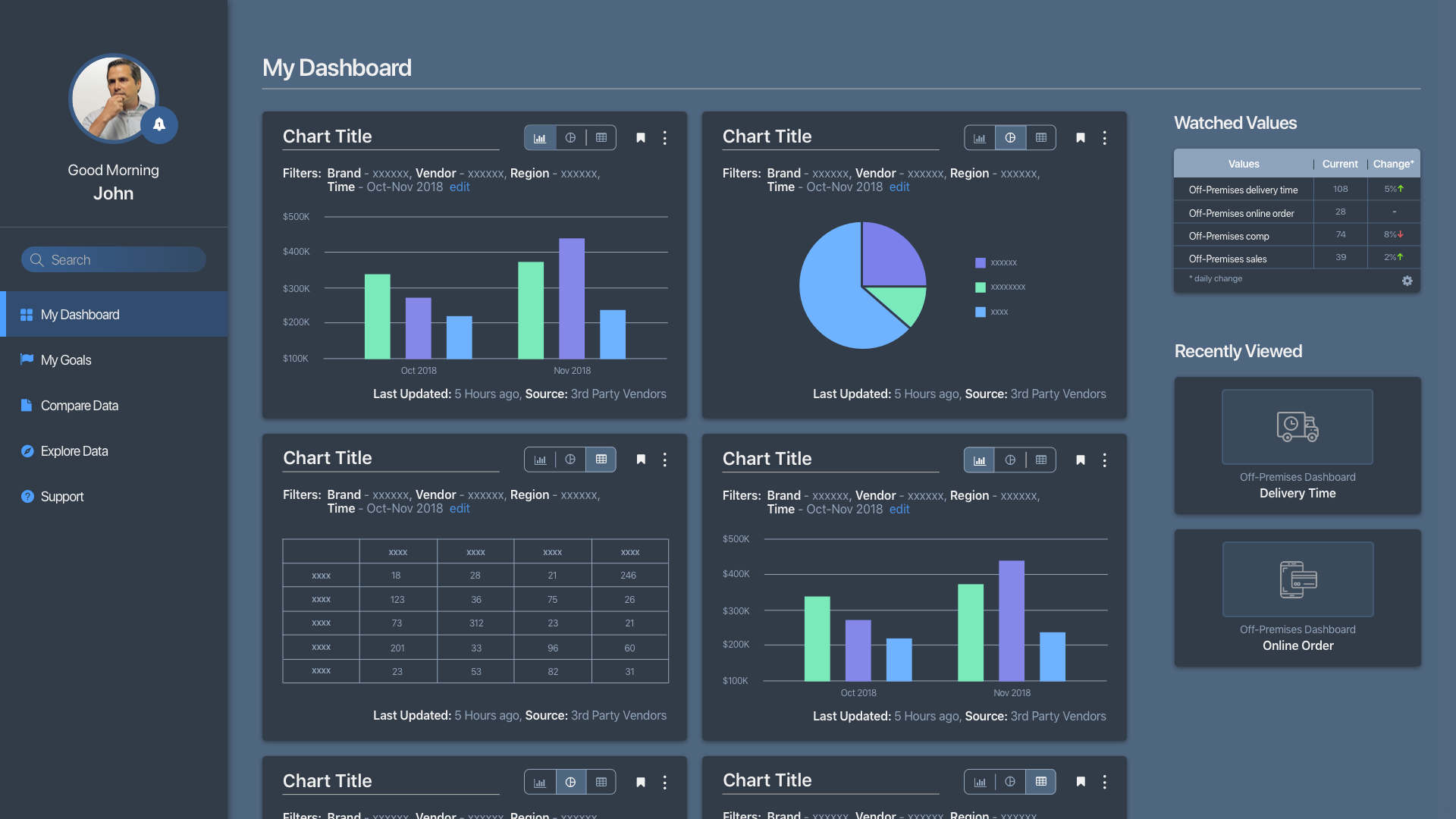
Final Look & Feel
With the visual design alternatives discussed and selected by the team, this is the final look & feel of the design.


Evaluation & Outcome
With the prototype, we put our design to test by conducting both user-based and expert-based evaluation methods.
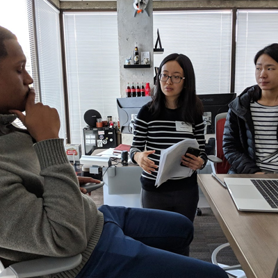
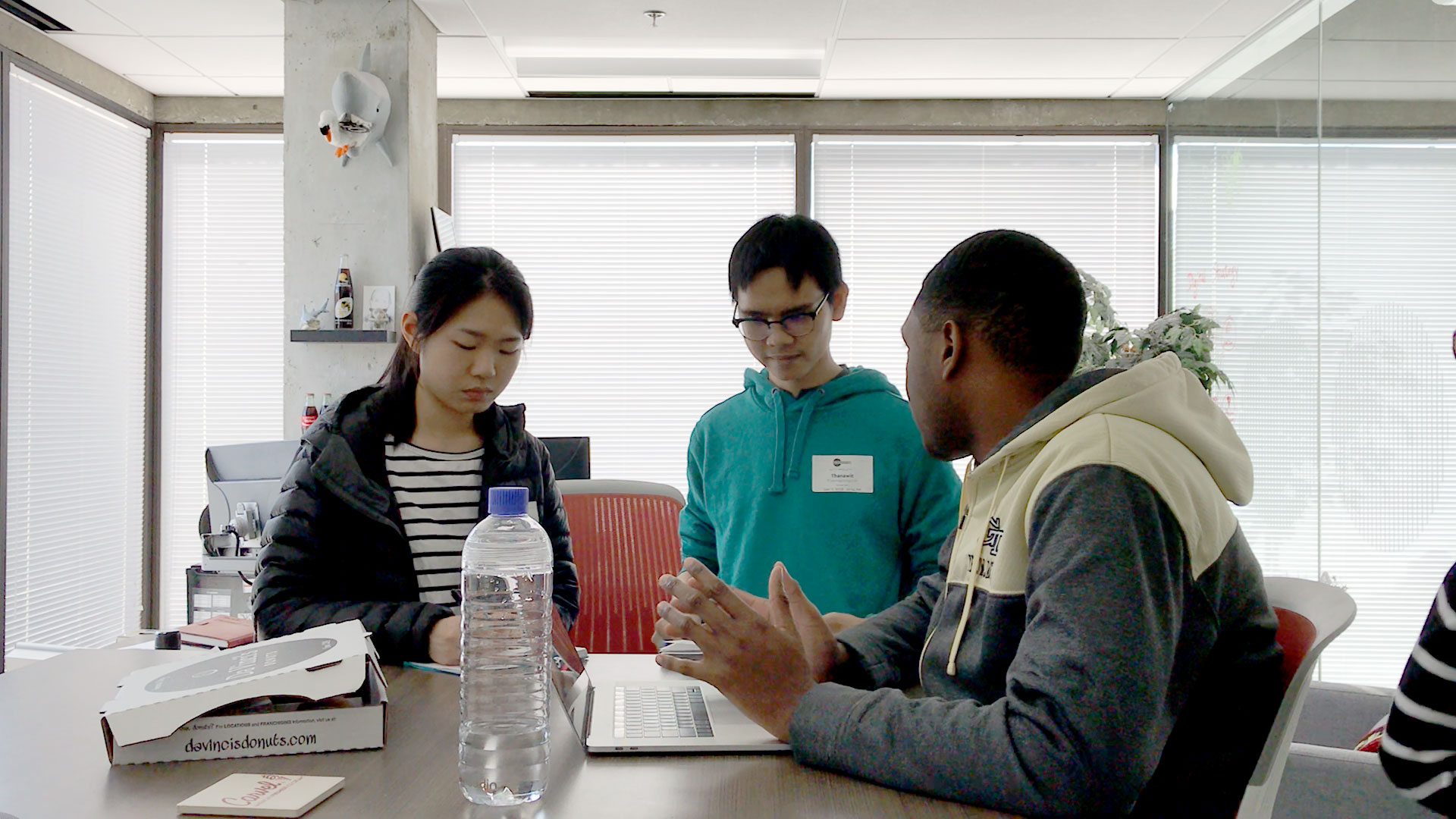
Moderated Usability Testing
We conducted 3 on-site and 3 remote, 60-minute usability testing sessions with 8 tasks. Participants were asked to rate each task in terms of ease of use and rate the related features in terms of usefulness.
the System Usability Scale (SUS) questionnaire is used to get an overall benchmark for the usability of the system.
Heuristic Evaluation
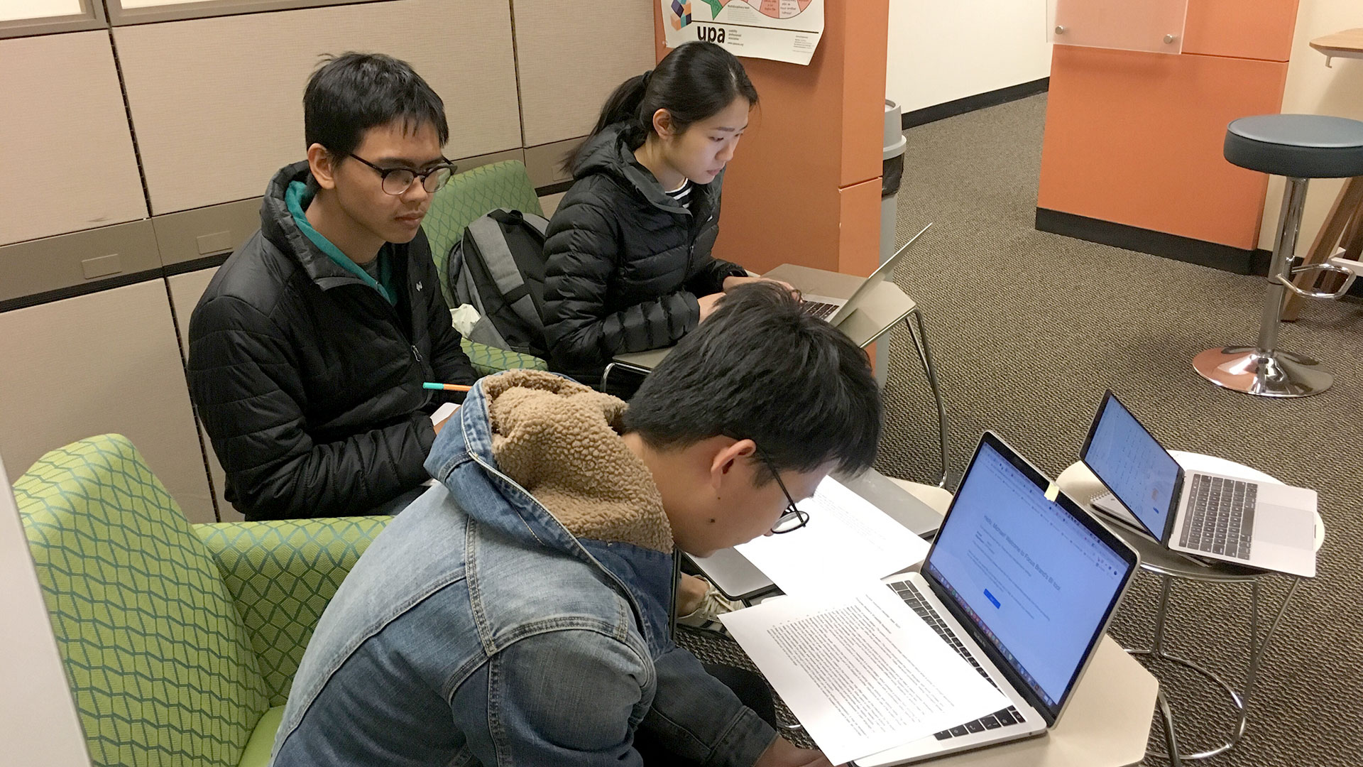
We also conducted 3 expert feedback sessions based on heuristic evaluation techniques to help us spot design flaws we might have overlooked. Neilsen-Norman's 10 Usability Heuristics were used to guide the session.
For this class project, the experts we consulted consisted of 2nd-year MS-HCI students who have experience in usability and have experience in UX from jobs and internships.
Testing Results
Results Overview
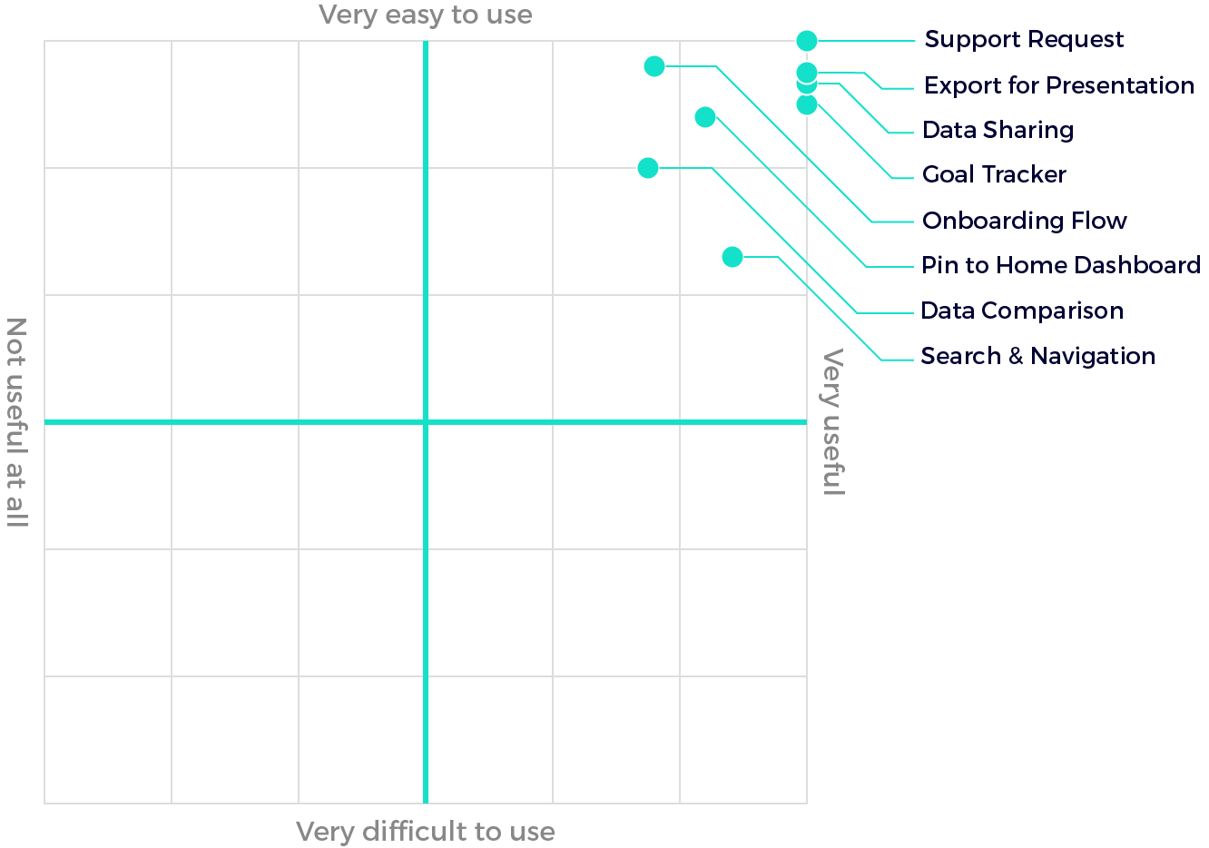
The quantitative data we collected from usability testing included Likert scale ratings of ease of use and usefulness of each feature we tested, and SUS scores to assess the design as a whole. The results showed the users' overall satisfaction with the proposed features in terms of ease of use and usefulness.
Insights from the Feedback
Qualitative data we collected helped us identify the problems in detail. After collecting them, the data were grouped based on related features and ranked by the severity of the problem. Some issues we found included:
| Feature | What we found | Potential Solution |
|---|---|---|
| Explore Data | Most of them did not think "explore data" means showing all available data. This wording problem is also the only issue that received the highest severity rating in expert evaluation sessions. | Change the wording from “Explore data” to a more straightforward term such as “All data”. |
| Comparison View | Some participants did not understand how the feature works; having a “Compare Data” menu in the navigation bar tends to confuse the users. Some experts also mentioned that the functionality of this feature could be confused with the home dashboard since both work by having a user add a chart into some set. | Remove “Compare Data” from the navigation bar and only let users add charts to comparisons through the context menu (“Compare…”). By clicking on the menu, a bottom bar will pop up. This bottom bar contains the charts existing in the current comparison. Users can save the comparison to their home dashboard to view later. |
| Freedom of Navigation | Both participants and experts mentioned the lack of back button and inconsistent appearance of breadcrumbs in the design. This made it more difficult to navigate back to the previous page if a user made a mistake. | Add back buttons and breadcrumbs to every page. |
| Goal Tracker | All participants found this feature very useful, however, some participants mentioned that they want to prioritize the goals they set; not every goal is equally important. | Allow users to drag and drop goals in the list to rearrange it and/or provide options to set the priority of each goal. |
| Data Sharing | Participants mentioned that they might need to format the email before sending it and they expect to do it in their email application, i.e., Outlook | Change the label of the existing button from “Share via email” to “Send email now” and add an “open in Outlook” button to give them the ability to further format the email. |
Next Steps
- Fix the design issues:
- We have identified the issues in our design through different methods of evaluation, the obvious next step is to fix the issues according to the findings for better user experience.
- Details & Prototype improvements:
- At this stage, most design efforts were spent on the conceptual side of the features and not as much in terms of exact details.
- In future iterations, we should look more into detail, e.g., what exactly should be asked in the customization questionnaire, to refine our design.
Key Takeaways
The UX Process
This is one of the first projects where I got to pursue a design through a whole cycle of user-centered design methods. I learned about the UX Process and evidence-based design by conducting research and designing a product based on the findings. I also learned how user research and evaluation could help us focus our design efforts on the problems that matter to our users.
Broad vs Deep Design Focus
In this project, we took the broad approach by looking at the opportunity to improve the BI tool as a whole. While a complete redesign like this can be a valid way to approach the tool, the decision will subject to the impact/effort/time tradeoff. While this project can have high impact on the workflow of the employees, its broad focus makes refining the design within the time frame very difficult.
Working with Constraints
Designing an internal enterprise tool uncovers a lot of interesting and challenging constraints such as collaboration and communication with the client, access to participants, business rules, and technical constraints. Going through this project helped us understand real-world settings of such companies.
Acknowledgements
We would like to gratefully thank...
- John Kuester, the Director of Business Intelligence and Analytics at Focus Brands, for facilitating this project and providing us the resources we needed.
- Focus Brands employees who participated in our research for providing us with valuable insights for our design.
- Huaiwei Sun, Ishaani Mittal, and Ruturaj Eksambekar, for their help in the heuristic evaluation sessions.
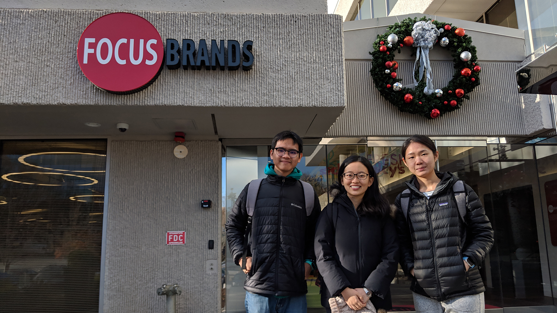
Looking back, I feel that this approach to design puts us at risk of creeping featurism. What I would have done differently is to focus on a narrower set of problems. While redesigning such a big system can be a valid approach, having a narrower focus would give us a more refined project given the 3-month time frame of the class.