Introduction
Most things we use these days—from water bottles, the door knob at your home, to smartphones—are designed using a "Computer-Aided Design (CAD)" software. For such physical products, CAD plays a critical role in the design process. Yet, they are complex; just learning the tool takes at least a full course in a design school. A big part of this difficulty comes from the indirection of control caused by the limitation of 2D displays.
With newer human-computer interaction technologies such as mixed reality (MR) emerging, why are we still designing 3D objects on 2D screens? And how might we design a CAD software on MR that makes it easier and potentially more efficient?
Why are we still designing 3D objects on 2D screens?
Overview
Problem
Traditional 3D CAD modeling is difficult to learn and execute for beginners and entry-level product designers.
Mixed reality has the potential to address this as it allows users to directly interact with 3D virtual environments. However, existing MR-based CAD tools lack the ability to make precision-focused models which makes these tools not useful for product designers.
Goals
There are two high-level goals for this project:
- Explore how mixed reality impact the CAD modeling workflow, i.e., answering "Is it a good idea to do CAD in VR/MR?"
- Design an MR-based CAD tool that makes CAD modeling easier to learn and execute while keeping the essentials, e.g., precision and feature-based modeling tools.
Final Design
Leveraging human intuition of a 3D environment to make 3D CAD modeling easier and potentially more efficient through mixed reality.
Intuitively Create 3D Designs in 3D Space
AirCreate is a 3D CAD modeling application in mixed reality for entry-level product designers and enthusiasts. By leveraging users's intuition of a 3D environment, AirCreate helps them manipulate the design directly in the 3D space instead of indirectly through a flat screen.
Work in a True 1:1 Scale, or Zoooooooomed In
No more "how big is this part when 3D-printed?" Mixed reality helps users see their designs at a 1:1 scale and literally walk around and see their design before manufacturing. Want a closer look? Just grab the space and strech it with your controllers, or push the joystick to zoom in and look at the details.
Allow for Precision
Unlike most VR CAD applications available, AirCreate is designed with precision in mind from the start. Dimensions are shown to the users and they can also snap their designs to a grid or type in the number they want for more accuracy.
Industry-Standard Modeling Methods
AirCreate is design based on the de facto standard CAD modeling paradigm called "feature-based modeling." This helps familiarize experienced CAD users and helps jumpstart enthusiasts into the world of CAD modeling and more advanced tools.
Easy to Learn
A short onboarding tutorial helps adjust users' mental model to understand how the basic CAD modeling and AirCreate works.
Flexible Workflow
One design can be created in many different ways. Each operation can be performed through a Tool or through a context menu of a related object.
Quick Shortcuts
Shortcuts for a more efficient workflow. E.g., dragging the arrow on a sketch will extrude it without going to the menu and selecting the Extrude Tool.
Tool Preview
Most beginners do not know what each tool does and what CAD terminolobgy means. AirCreate provides an animated preview of those tools to address this.
Process Overview
How did we get here?
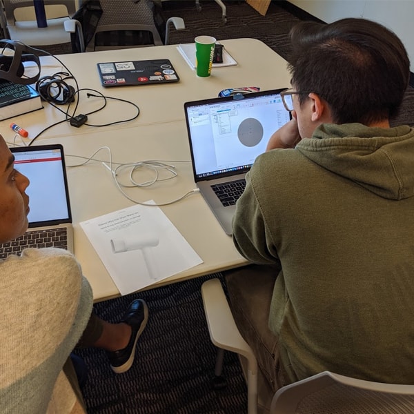
1. Research
- User Interview
- Problem Scoping
- Contextual Inquiry
- Literature Review
- Competitive Analysis
- Task Analysis
- Affinity Mapping
- Problem Definition
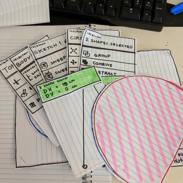
2. 1st Iteration: Concept Exploration
- Brainstorming
- Sketching
- Low-Fidelity Design
- Paper Prototypes
- Concept Testing & Feedback Gathering
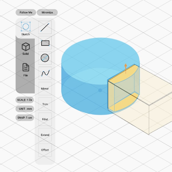
3. 2nd Iteration: Detailed Design
- Gesture Study
- Menu Study
- Information Architecture
- User Flows
- Visual Design
- Usability Testing
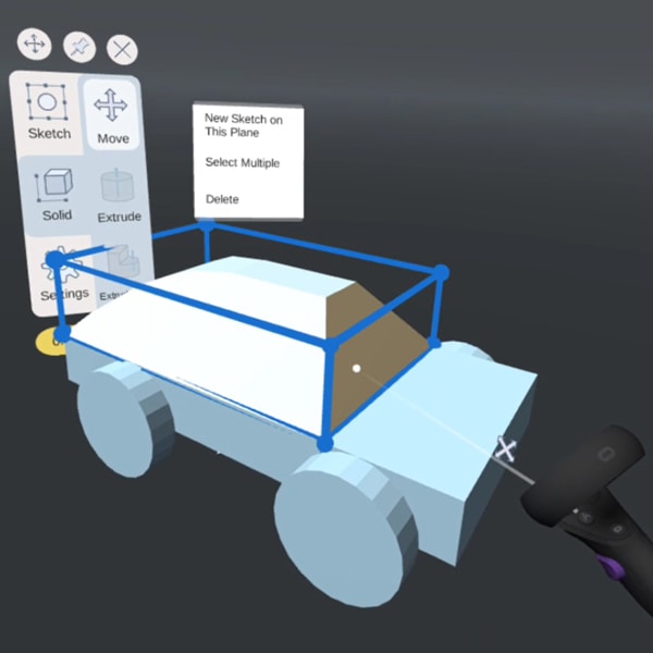
4. 3rd Iteration: Hi-Fi Prototype & Evaluation
- Functional Prototype
(Unity & Oculus Quest) - Usability Testing
- Expert Evaluation

First Things First
By the way, what is ...?
Mixed Reality (MR)
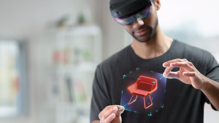
Mixed Reality (MR) includes Virtual Reality (VR), and Augmented Reality (AR). It is the technology that simulates a 3D virtual environment on top of a real environment. In this project, we're using VR (Oculus Quest) as our main platform instead of head-mounted AR due to cost constraints.
CAD Modeling
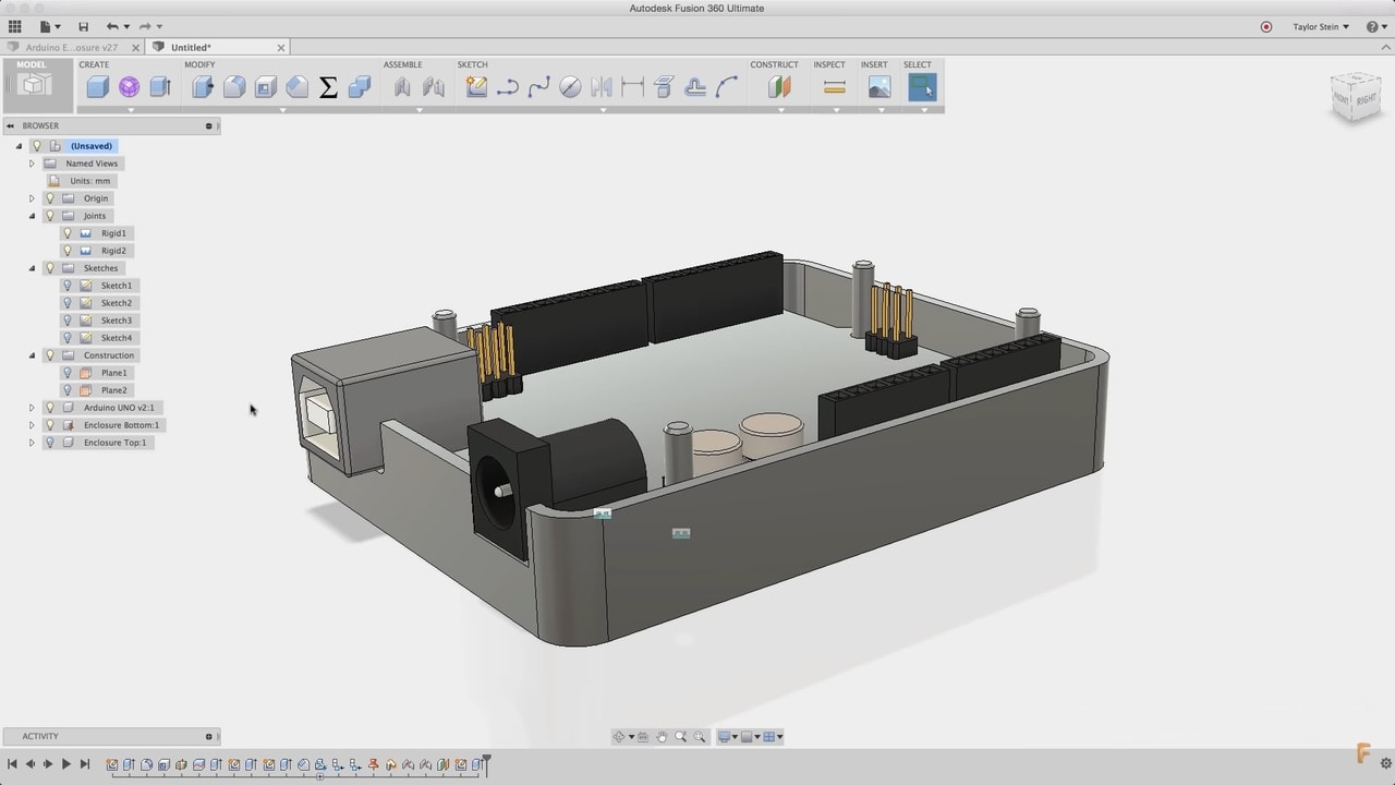
For the scope of this project, Computer-Aided Design (CAD) software is a software that lets product designers model 3-dimensional products for manufacturing. Examples of existings CAD software include Autodesk Fusion 360 and SolidWorks.
Research
Since the top-level goal of this project is two-way: to explore whether CAD modeling in MR is a good idea as well as to do our best to design a good MR-based CAD tool, the end product of this project would be a prototype of an MR-based CAD application.
However, before jumping into designing, we had to first learn about our users and their needs, how they work, and what they expect from 3D CAD modeling and mixed reality. We also needed to find a focus in order to make sure that the project is feasible within the time frame.
Initial Assumptions
Here are the hypotheses we had coming into this project:
- Product designers would use MR as a creative space to ideate.
- Precision is essential for engineers while 3D modeling in MR.
- MR could make 3D modeling easier to grasp for the novice users.
- MR could speed up the workflow for experienced users.
Gathering Data
User Interviews (9)
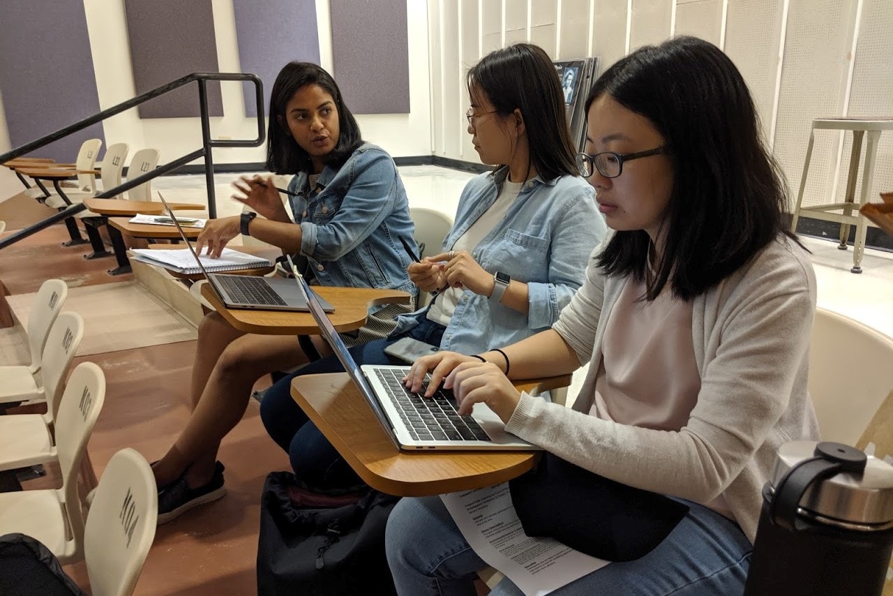
We interviewed participants with varying CAD backgrounds (product design, 3D content creation, architecture, engineering) and levels of expertise (novice, experienced, working professionals) to learn about how they do 3D modeling and their views on using MR in CAD. We were also using this to narrow down the project's focus.
Contextual Inquiries (5)
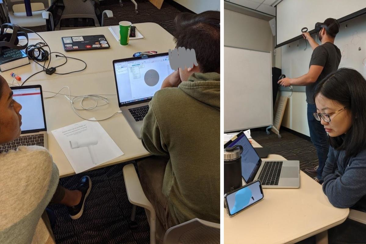
We found from the user interviews that it was hard for experienced users to articulate their workflows. So, we asked participants to model a simple object from a given image using a CAD tool they prefer and also on an existing VR CAD application (Gravity Sketch) while we observe closely and ask questions.
Literature Review +
Competitive Analysis
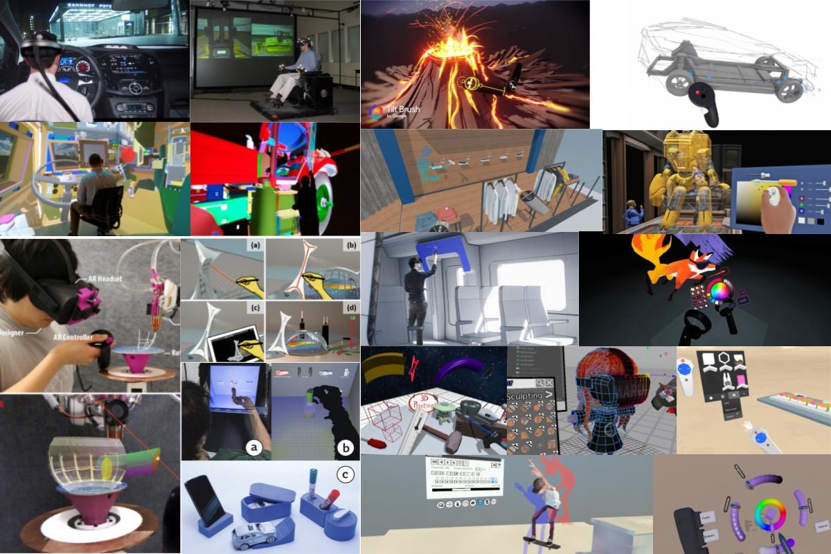
We reviewed academic papers on mixed reality for 3D modeling and industry use, as well as researched existing commercial CAD products on both MR and traditional platforms to identify the gap in the market that fits with the user needs.
Data Analysis
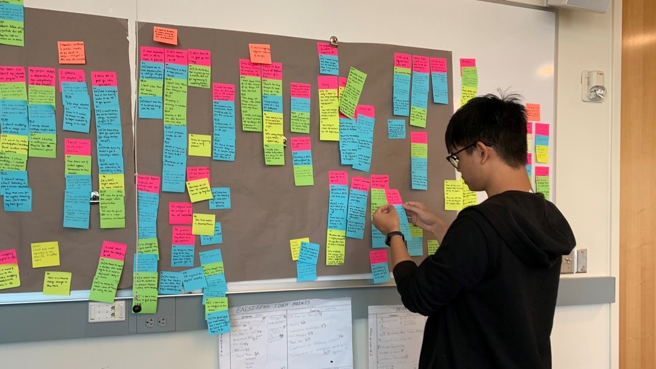
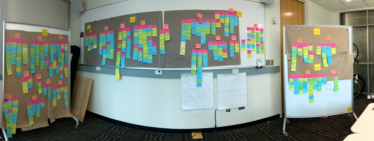
We performed Affinity Mapping to make sense of the multitude of data gathered by grouping them into hierarchical themes. The resulting top-level themes included:
- Workflow
- Learning Curve
- Collaboration and Versioning
- Pre-Modeling Work
- VR-Specific Thoughts
What We Found
The Different Flavors of 3D Modelers
These are the different user groups and their unique needs that we found from user interviews.
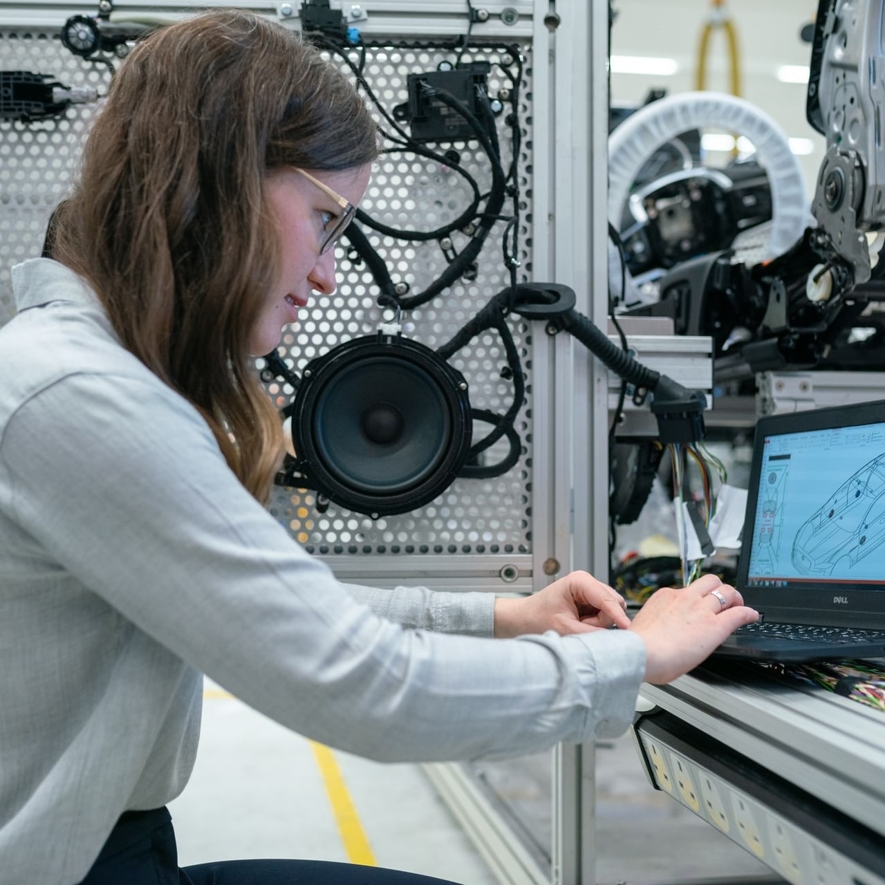
Product Designers
(& Engineers)
- Design physical products to be manufactured.
- Use CAD to bring design ideas to fabrication.
- Precise dimensioning is crucial; their designs have to fit with other components.
CAD Tools They Use
SolidWorks, Fusion 360, Rhinoceros
Photo from Unsplash
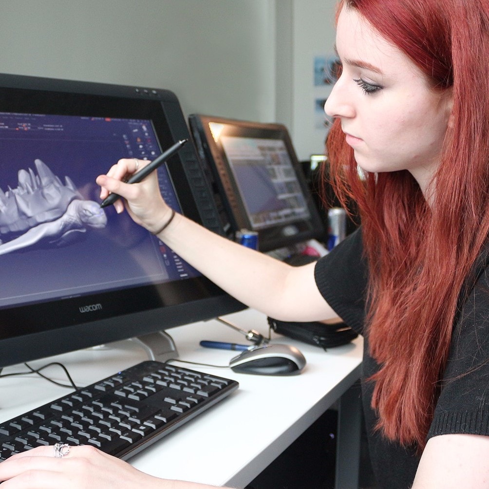
3D Content Creators
- Create 3D models for digital media, e.g., games, animations, and VR experiences.
- Use CAD to create models for digital mediums.
- Precision is not as important to them as whether the model 'looks good'.
CAD Tools They Use
3DS Max, Blender, Maya, Cinema4D
Photo Courtesy of Digital Lith

Architects
- Create 3D models for large structures.
- CAD is used to create plan views all the way to designing facades.
- Generative/parametric design plays a bigger role in creating repetitive features (e.g. windows on a building).
CAD Tools They Use
AutoCAD, Rhinoceros, Grasshopper
Photo by Karolina Grabowska from Pexels
Narrowing the Focus
With limited time and resources, as well as the diverse needs of the different user groups, we decided to define a clear scope for the project to make sure that it is feasible within the time frame.
Target Users
Product Designers
Selected based on the interests of the team, accessibility to the group, feasibility of addressing their needs, and the existing market gap. Note that, from our research, the needs that "engineers" have are also very similar to product designers'.
Target Expertise Level
Novice to Entry-Level
The "experts" were excluded from the target group because their workflows has already been extremely streamlined over the years and their needs seem to require rigorous engineering solutions rather than design-focused ones.
Target Task
Creating a 3D CAD Model
We would like to focus on the crux of 3D modeling: the act of 3D modeling itself, and deprioritize auxiliary tasks such as file saving/loading, importing reference sketches, etc. for the sake of the time and resource constraints.
Task Analysis
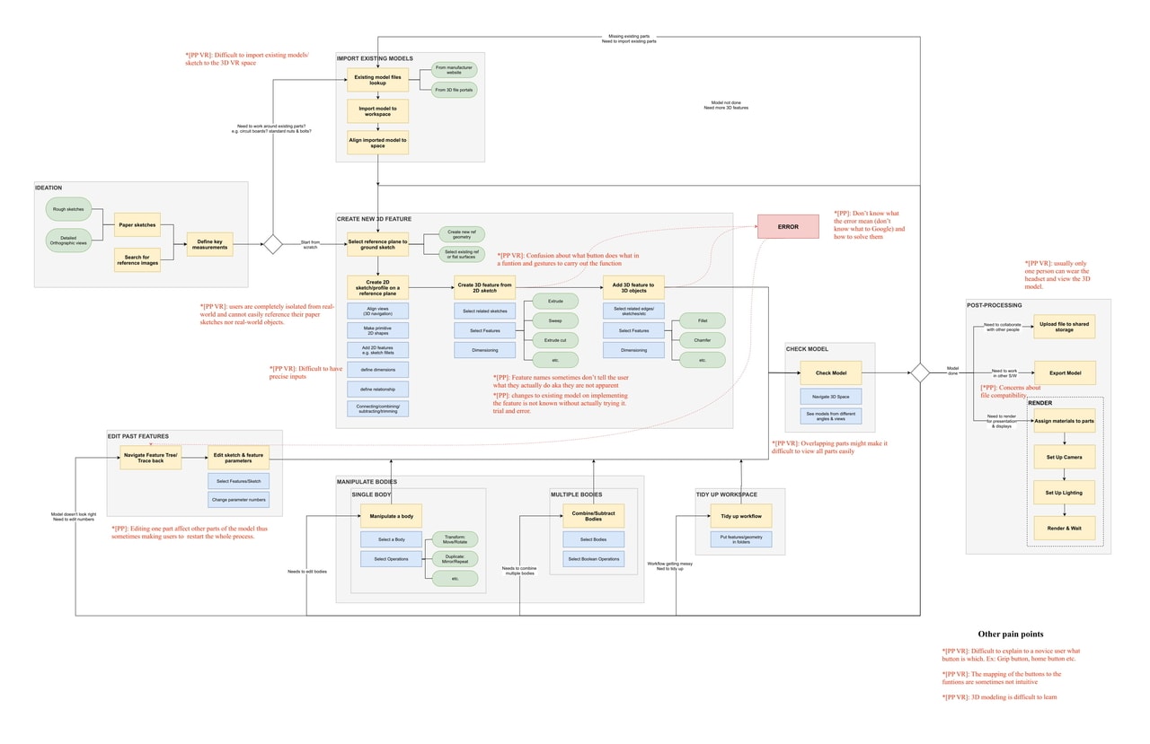
From the interviews and contextual inquiries, we conducted task analysis to summarize the detailed CAD workflows of product designers into this task flow diagram. Doing so also allowed us to annotate the problems we found at each step of the workflow.
Insights from User Interviews & Contextual Inquiry
Assumptions (partially) debunked.
For product designers and engineers, 3D modeling is used for concretizing previously conceived ideas and refining them, and not for ideating. This is due to the rigid and time-consuming nature of CAD workflow. Also, both groups care a lot about precision in 3DM, unlike our assumption that engineers care more about precision.
Learning curve is the common pain point.
Most participants said that it took them a long time to learn and master a CAD tool. Some learned 3D modeling from over 15+ hours of following YouTube tutorials while other groups, especially product designers, learned CAD from a class in design schools. However, once a tool is learned, it is easy to transition to another similar one.
CAD users: "Mixed reality has potential."
Participants said MR might help overcome CAD's steep learning curve. On the other hand, experienced modelers were not sure if MR would make their workflow more efficient. However, visualizing 3D objects in MR at the actual 1:1 scale before manufacturing is a clear benefit for them.
Existing VR-based CAD lack precision-focused tools
While trying an existing CAD tool in VR, participants struggled to create precise geometric models because the tool relied on freehand, midair drawing. We also found that few, if any, VR-based tools were designed with a precision-focused paradigm. Without such features, these tools would not be useful for designers to design for manufacturing.
Shifting mental models from 2D to 3D
Novice users who are familiar with 2D creative tools need to familiarize themselves with a new way of thinking, e.g., space navigation, new jargons, and new mental models, to shift to working in 3D.
Limitations of current MR
Apart from the learning curve of 3D modeling, mixed reality itself also has a learning curve despite being marketed as "intuitive." There are also issues such as ergonomics concerns and the physical discomfort caused by the heavy headset.
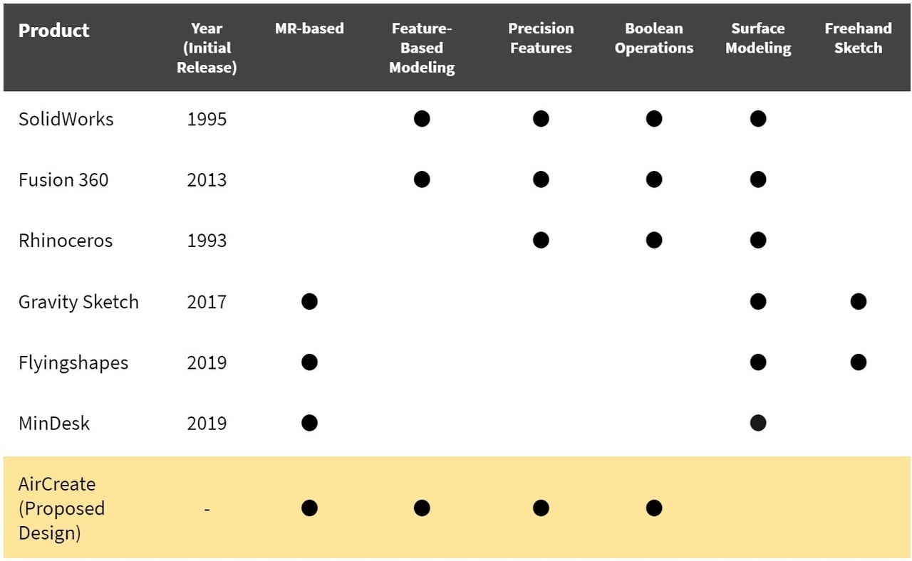
What's Already Out There? Where's the Gap?
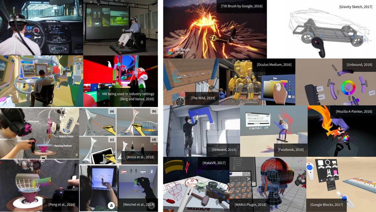
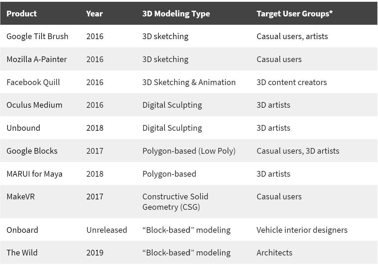
From our literature review and competitive analysis, we found that most existing MR-Based work were focused on 3D modeling for 3D content creators. Even for product designers, there are currently no MR solutions that allow users to perform precision-focused feature-based modeling.
"There are currently no MR solutions that allow users to perform precision-focused feature-based modeling."
Design Goals
We compiled all these findings and defined six main design goals to guide our team’s design efforts:
#1 Easy to Learn
The tool needs to be easy to learn. The user should be able to grasp the concept of 3D modeling easily and quickly.
#2 Simple But Powerful
The tool needs to be simple and powerful. The user should be able to perform relatively complex tasks with ease.
#3 Allow for Precision
The tool should allow users to create models with precision through intuitive precision controls.
#4 Comfortable to Use
Since 3D modeling process usually takes hours to complete, the tool should be reasonably comfortable to be used in long sessions.
#5 Industry-Standard Modeling
The tool should comply with industry-standard 3D modeling methods to ensure that new users get adapted to other tools easily and experienced CAD users can also easily transition into the tool.
#6 Faster Work
It would also be interesting if the tool enables the user to perform the tasks quicker on VR when compared to its 2D counterparts.
1st Iteration: Concept Exploration
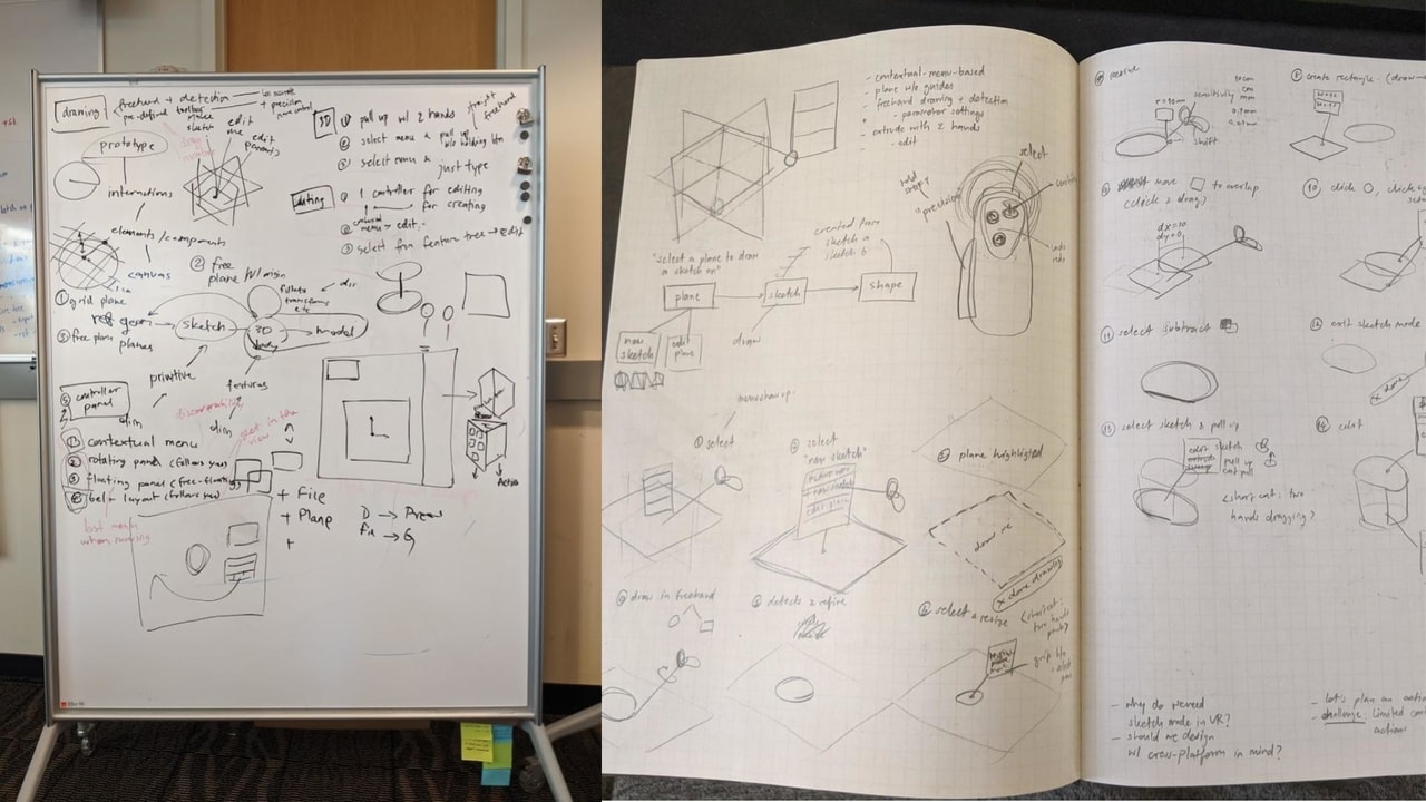
Brainstorming
We started by holding a brainstorming session to generate the early concepts.
We recognized that the entire experience had two important components: the menu and the process of how users create 3D models.
Exploring Design Alternatives
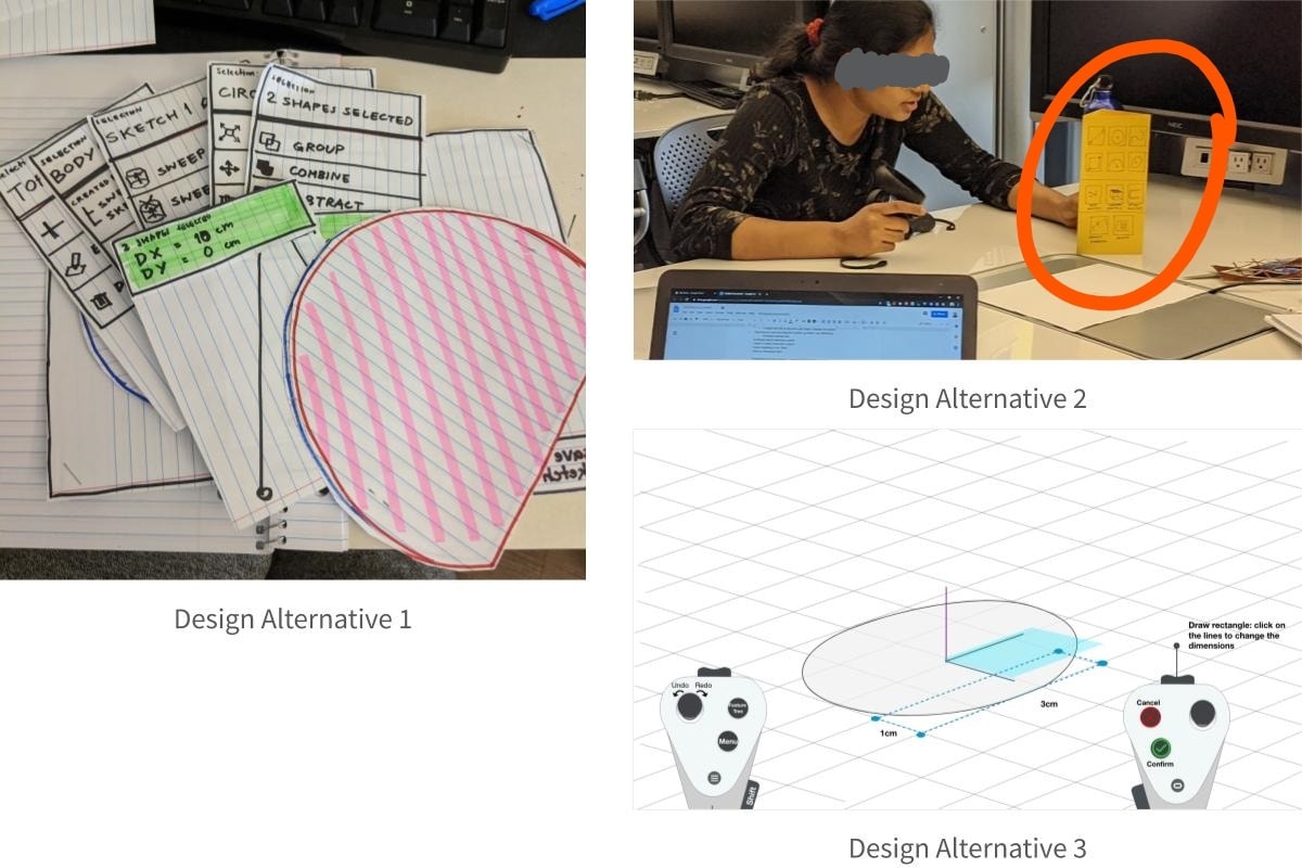
With the rough ideas, we compiled them into three design alternatives so that they are testable as a whole experience.
The modeling paradigm used in all three prototypes follow the feature-based modeling method, like SolidWorks or Fusion 360, with 2D "sketches" and 3D "features".

| Menu | 2D Sketch Drawing | 2D to 3D (Extrusion) | |
|---|---|---|---|
| Alt #1 | 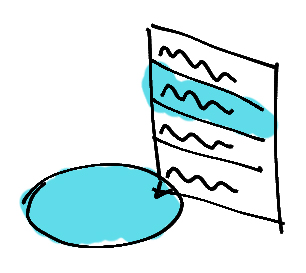 Contextual menus only without any main menu. Contextual menus only without any main menu. |
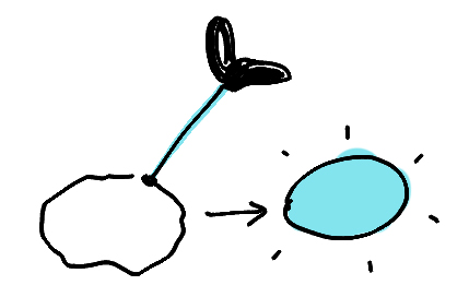 Free-hand drawing and automatic shape detection.
 |
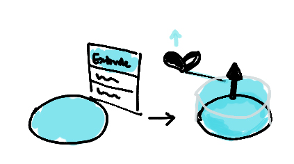 Select “extrude” from contextual menu & pull arrow visible on the drawn sketch.
 |
| Alt #2 | 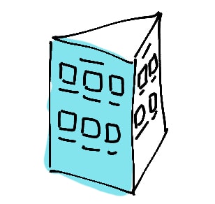 Three-sided prism tool menu floating in space.
 |
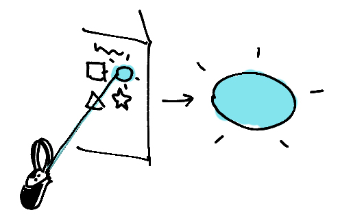 The shape was to be selected from the menu and it would appear on the scene
 |
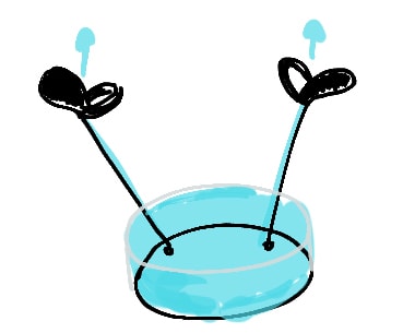 The sketch was required to be pulled up using a two-hand pull gesture.
 |
| Alt #3 | 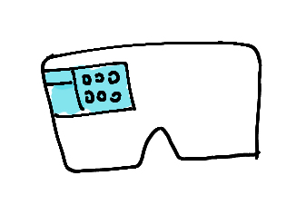 Heads-up display tool menu, always in the viewport.
 |
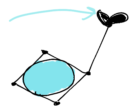 Pick a shape tool, then drag the corners of the shape to form the required shape.
 |
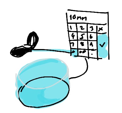 Select ‘extrude’ from the menu and then type in the desired height.
 |
Paper Prototypes
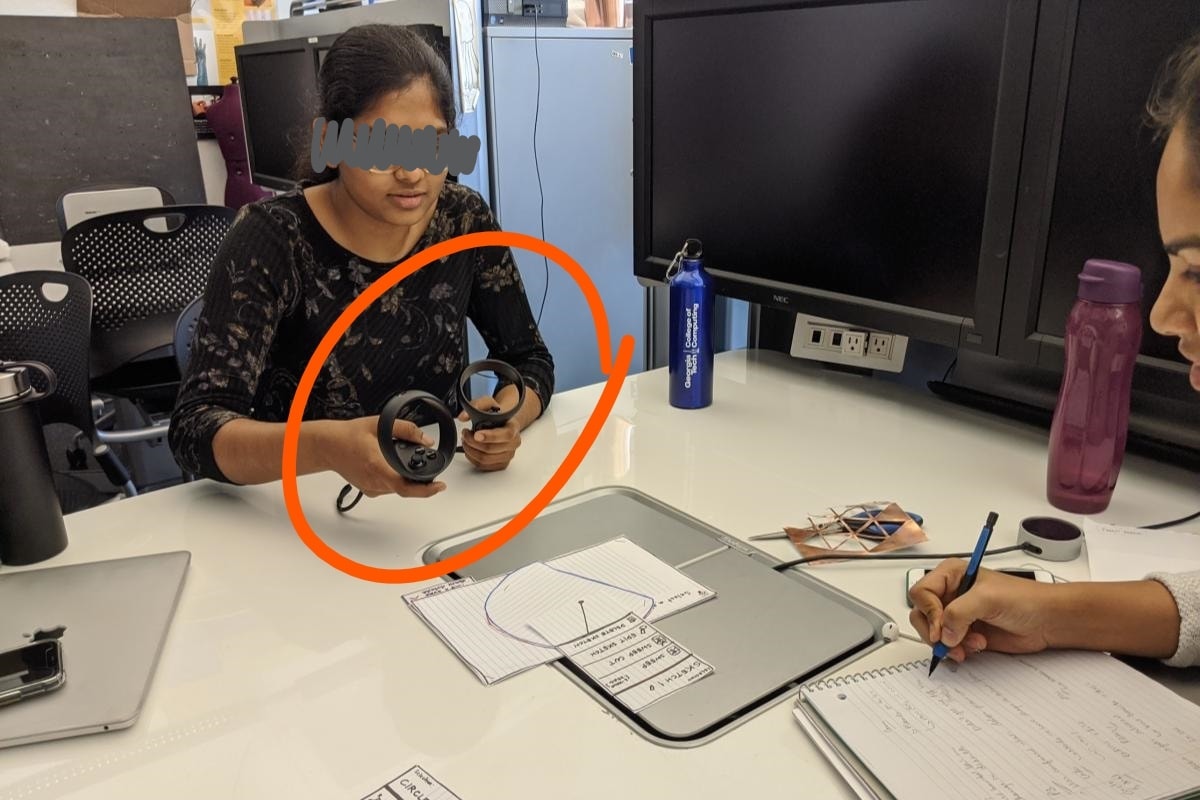
We decided to make low-fidelity paper prototypes and resorted to the Wizard of Oz technique to emulate the VR experience. The goal of this phase of iteration was to manage the fuzzy and ambiguous phase of initial design quickly and gather high-level feedback about the concepts.
Concept Evaluation
With our wizard-of-oz prototypes, we conducted user testing with 4 participants - two CAD novices and two experienced users. Participants held Oculus Quest controllers in their hands to perform a simple 3D modeling task and gave us their thoughts throughout the sessions.
User Feedback
We assessed each feedback session and listed down the points that we learned from these sessions.
Menu
- The main menu should be visible at all times.
- Although designed to avoid overwhelming the users, having only contextual menus caused discoverability issues and confusion.
- However, having contextual menu as a secondary menu worked well.
- No strong preferences on the position of menu as long as it is visible when needed.
Gestures
- All participants expected to use some gestures to do certain operations such as resizing a shape or extruding a shape.
- However, each participant has different ideas of which gestures to use.
- Button mapping and gestures should be consistent throughout the tool.
- Participants expected to use a "pull" gesture to extrude a 2D sketch.
Workflow
- Visual feedback is needed at specific points, e.g., extrusion dimension/ruler, menu tooltips, etc.
- They wanted flexibility in the order of operations and did not like to be constrained.
- Participants needed full and precise control of the shapes they were drawing.
- Participants were not sure about the sequence of shape subtraction.
2nd Iteration: Detailed Design
With the learnings from the previous iteration, we realized that we needed further data before jumping into the next iteration. Therefore, we conducted two more mini-studies to learn more about how the gestures and the menu should work.
Gesture Study
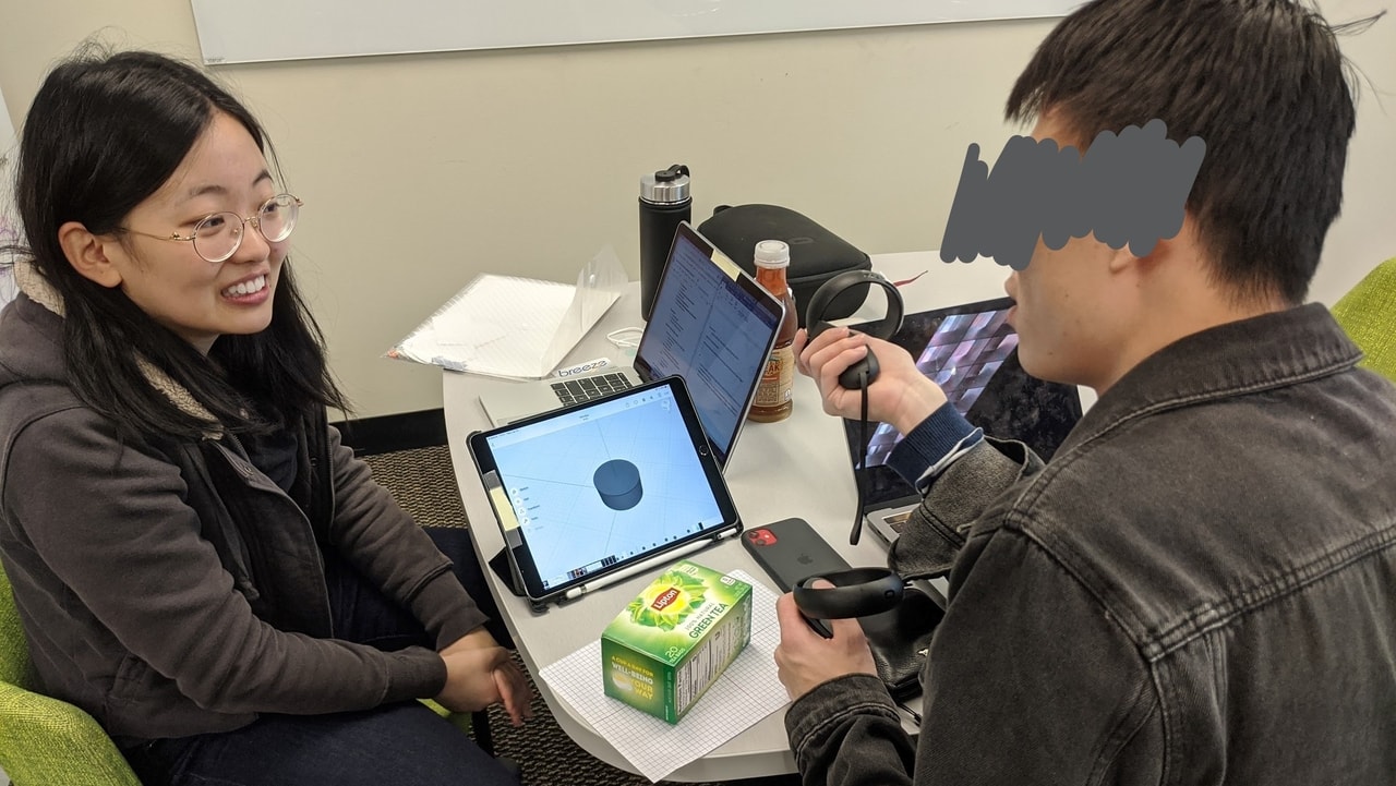
The feedback from the previous iteration taught us that users expect gestures in VR. However, they have different ideas on what gestures to use. We conducted a further study with 14 participants to determine what gesture would be the most intuitive for the users.
Finding out what is 'intuitive'
14 participants were asked to perform several basic 3D modeling operations (e.g. zoom/pan the view, extrude a circle into a cylinder, resize/move an object, etc.) with Oculus Quest controllers.
Half of the participants completed the task sitting, the other half standing. We observed what gestures and buttons they used and identify the controller mapping scheme accordingly.
Study Results:
Controller Mapping
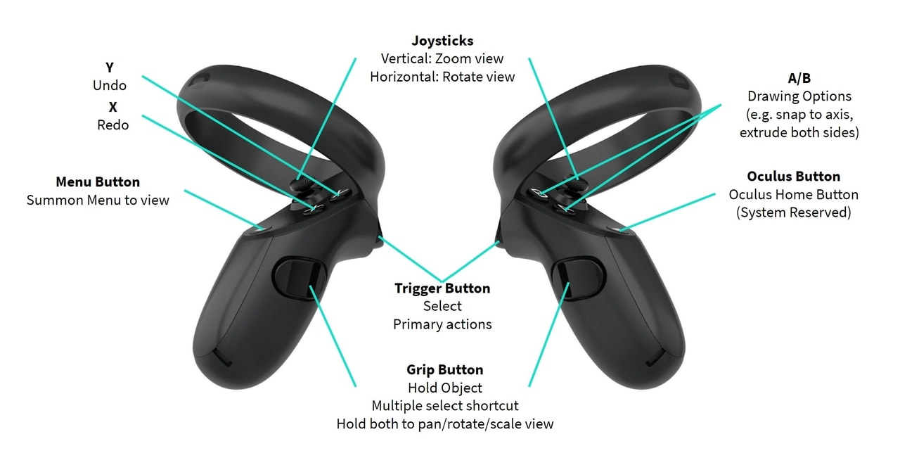
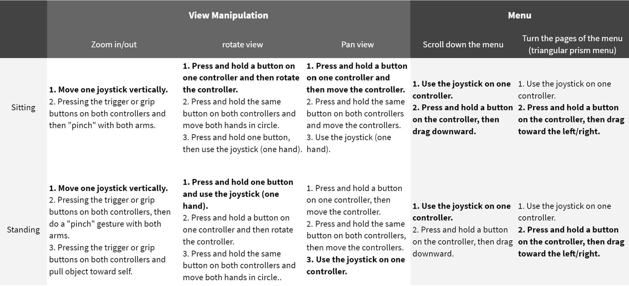
The observed gestures were compiled into a controller mapping scheme shown on the right.
Among the gestures we found, participants had two different ideas for the gestures for manipulating the view (zooming/rotating). One common gesture we found was the two-hand movement, and the other was using the joystick. We decided to provide both options to the users.
There were no outstanding differences between the gestures used in the sitting and standing groups.

Menu Design & Study
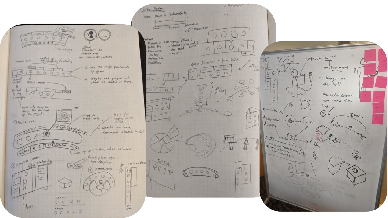
The next part to design and test in detail was the main menu. We brainstormed and tested different concepts to come up with the menu designed used in the application.
Initial Ideas
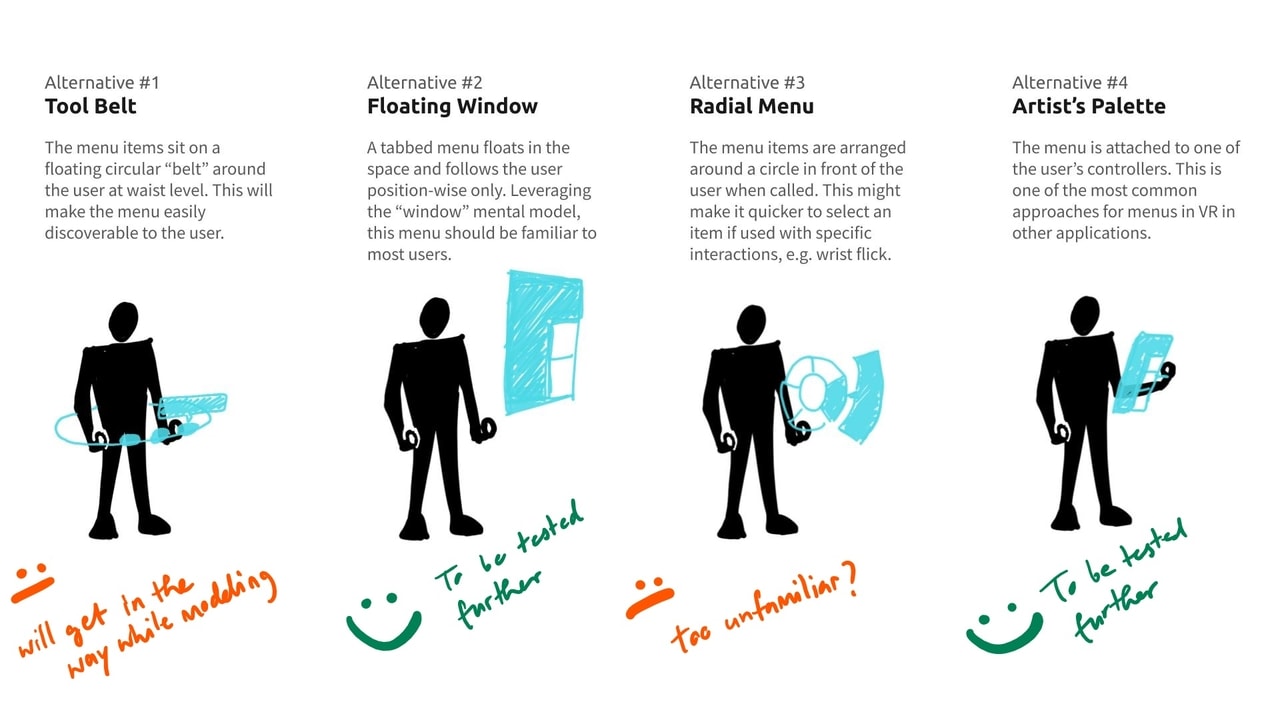
One of the takeaways from the user feedback was to make the menu visible at all times and leverage the "tools" mental model familiar to the users.
We brainstormed the design of the menu and came up with 4 initial candidates.
Prototyping
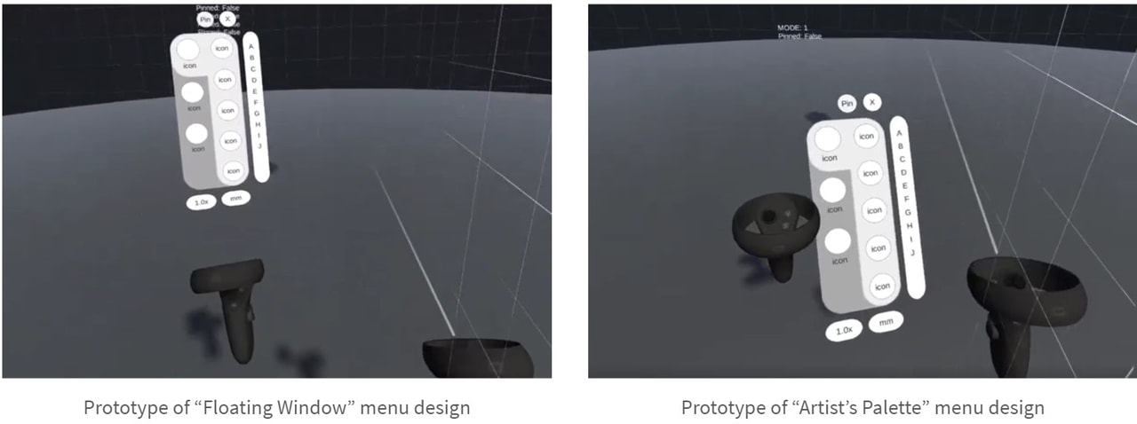
We selected alternatives 2 “Floating Window” and 4 “Artist’s Palette” to be tested further. We added menu interactions such as pinning and minimizing and created a functional prototype in Unity to test and compare the two.
User Testing & Result
We tested the prototype with 7 participants with varying experience in 3D modeling and VR. After trying the prototype, we asked them to rate and give comments about the designs.
| Floating Window | Artist’s Palette | |
|---|---|---|
| Ease of Use (Likert 1~7) | 6.3/7 | 5.8/7 |
| Physical Comfort (Likert 1~7) | 6.1/7 | 5.0/7 |
| Preference (# participants) |
3 out of 7 | 4 out of 7 |
Final Menu Design
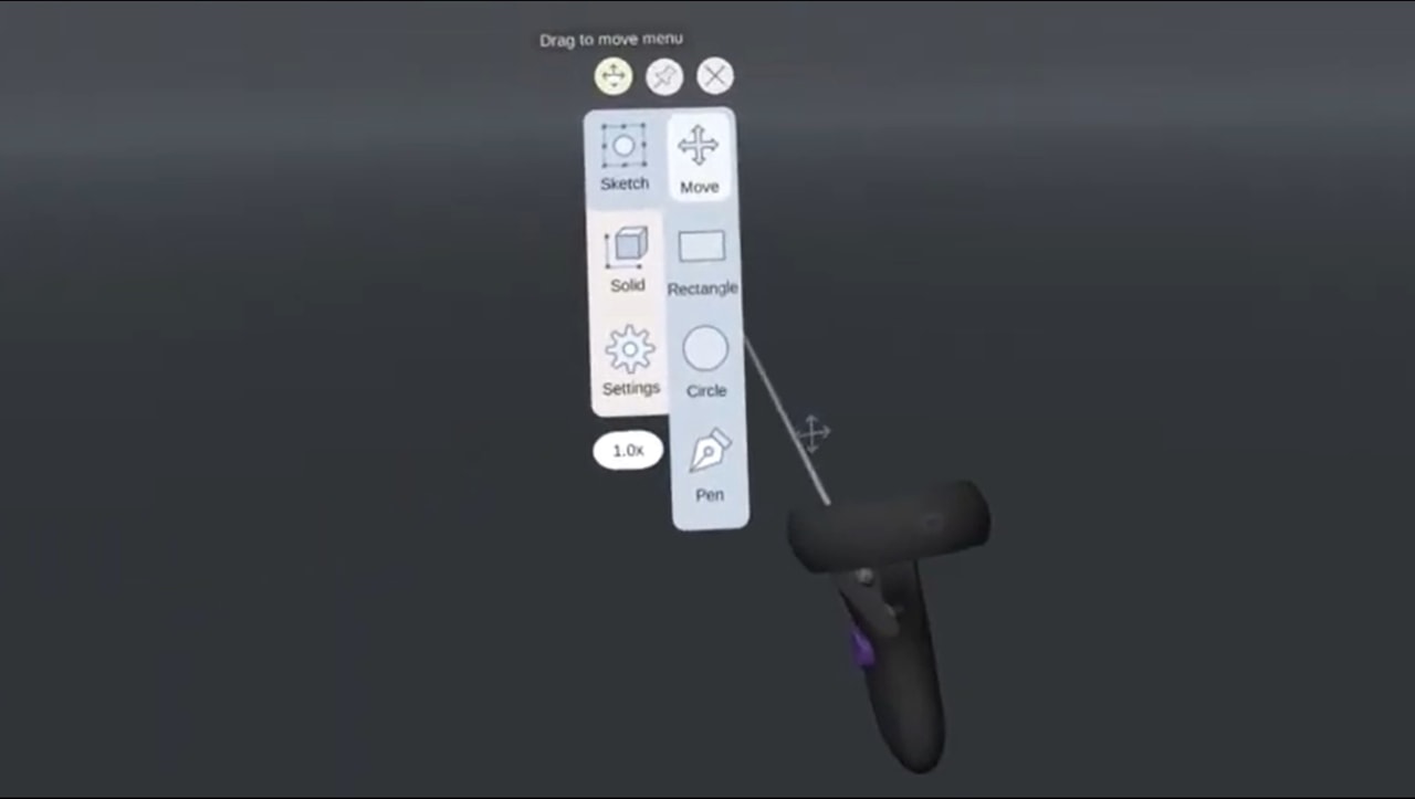
Informed by the study, the final design of the menu was a modified version of the “Floating Window” design:
- The menu automatically follows the user by repositioning itself when it has been out of the user’s field of view for 1 second.
- When pinned, the menu will always rotate itself to face the user regardless of the user’s position in 3D space.
- A move button was added to the menu. The user can drag the button to move the menu around.
Mid-Fidelity Prototype
With the learnings from the 1st iteration and the two mini studies, we moved on to the second design iteration.
Early Concepts Merged
The new version of the design was created by merging what worked from the first iteration. First, we settled on the feature-based modeling paradigm. Then, we decided to have a main menu visible at all times and use contextual menus as a secondary option to provide flexibility with other features taken from the first alternatives.
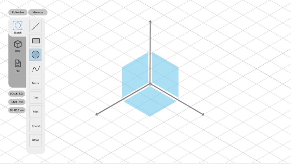
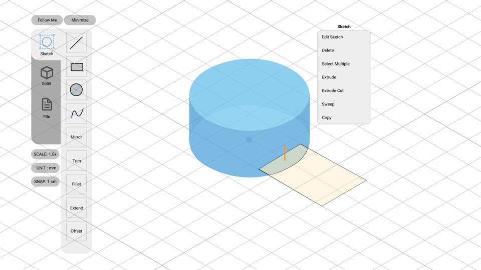
Plane Selection
Users can select a plane to create 2D sketch. They can select the plane before or after they have chosen a 2D sketch tool.
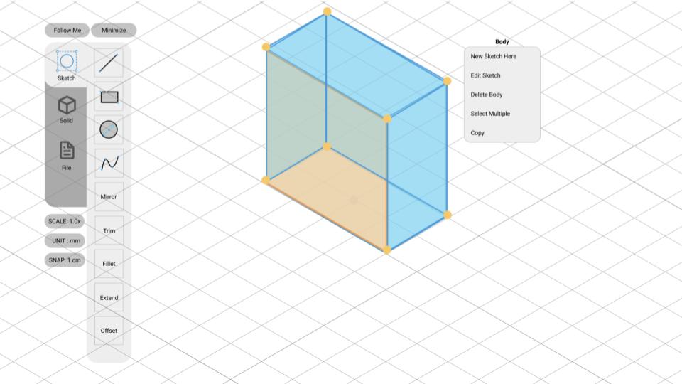
Contextual Menu
After clicking on an existing shape, a contextual menu with common operations will pop up on the screen.
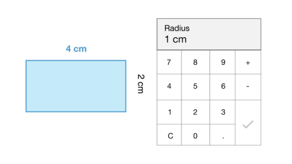
Visual Keypad
A numeric keypad to let users input precise dimensions when creating shapes.
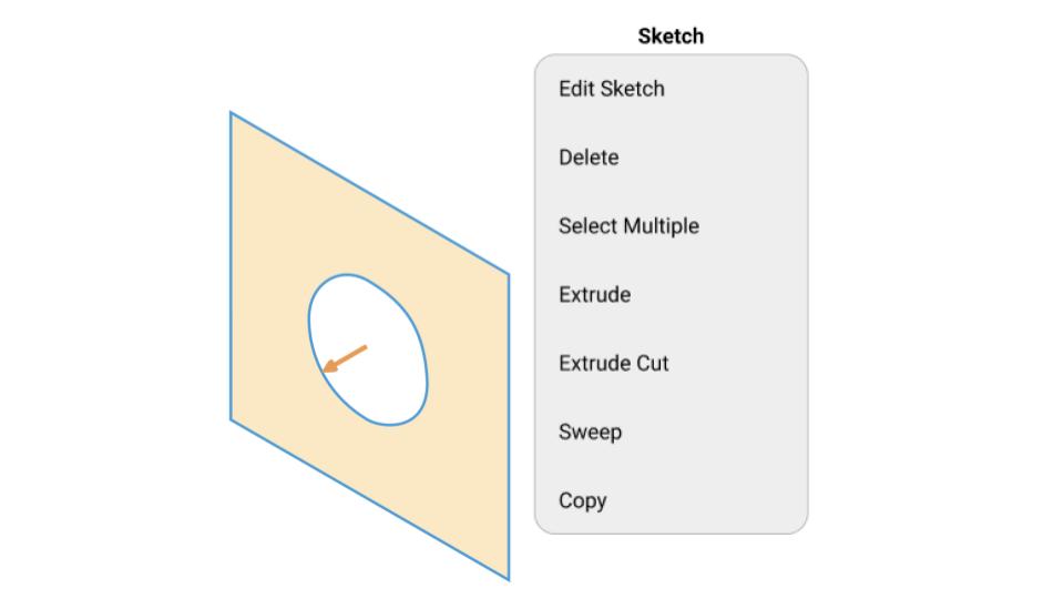
Extrude Arrow Handles
A selected 2D sketch will be highlighted on along with an arrow. Users can click and drag this arrow to extrude the sketch.
More Detailed Specifications
Evolving from the rough concepts from the 1st iteration, we needed to more formally define how the tool will work.
User Flows
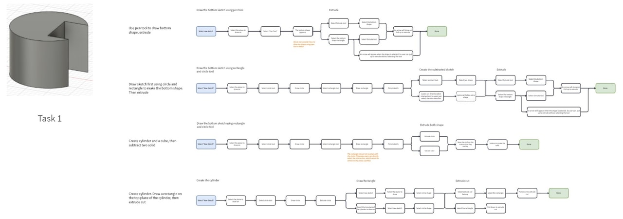
We started by mapping out the user flows. Unlike usual UX work whose flows are mostly linear, the tool we are designing is a creative tool that requires a highly flexible workflow and outcomes. Therefore, we decided to create the prototype that support only these two "benchmark" tasks at this stage.

Information Architecture
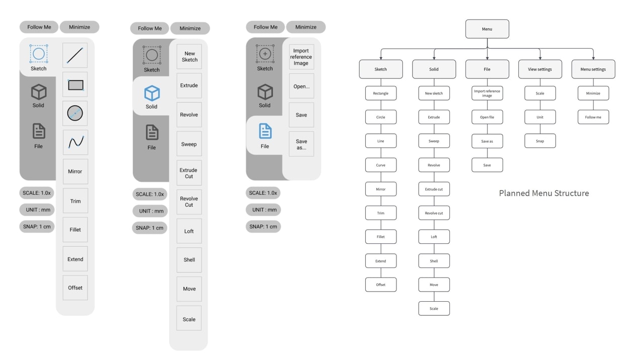
We then decided on how to categorize the "tools". We grouped them into "Sketch" and "Solid" tools, which are concepts derived from existing feature-based modeling tools. Users start with 2D sketches and build 3D solids upon those sketches.
"Clickable" Prototype
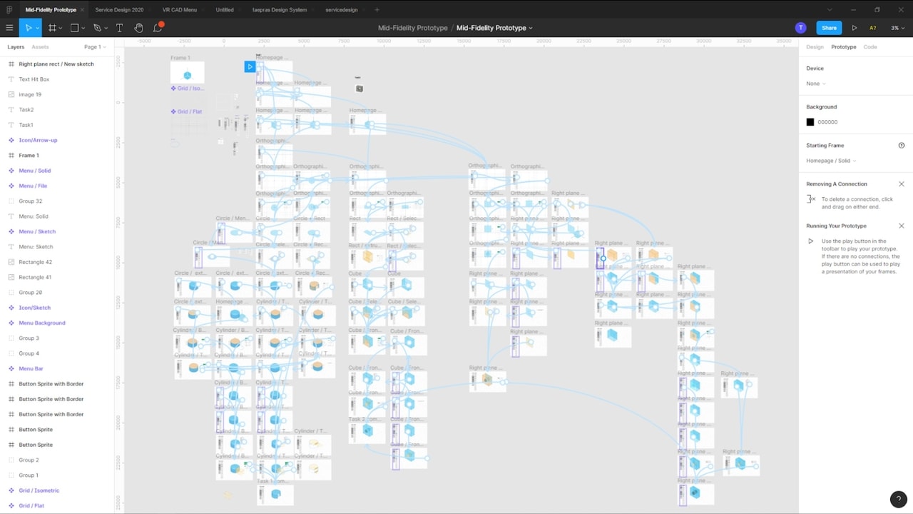
With the details defined, we created a clickable prototype in Figma. The prototype was intended to be operated in a wizard-of-oz way with the test participant holding Oculus Quest controllers to "use" the prototype.
Prototype Testing
We tested this prototype with 4 participants, 2 novices and 2 experienced users. To simulate the VR experience, the prototype was projected on a screen while having the participant "control" it with the Oculus Quest controllers.
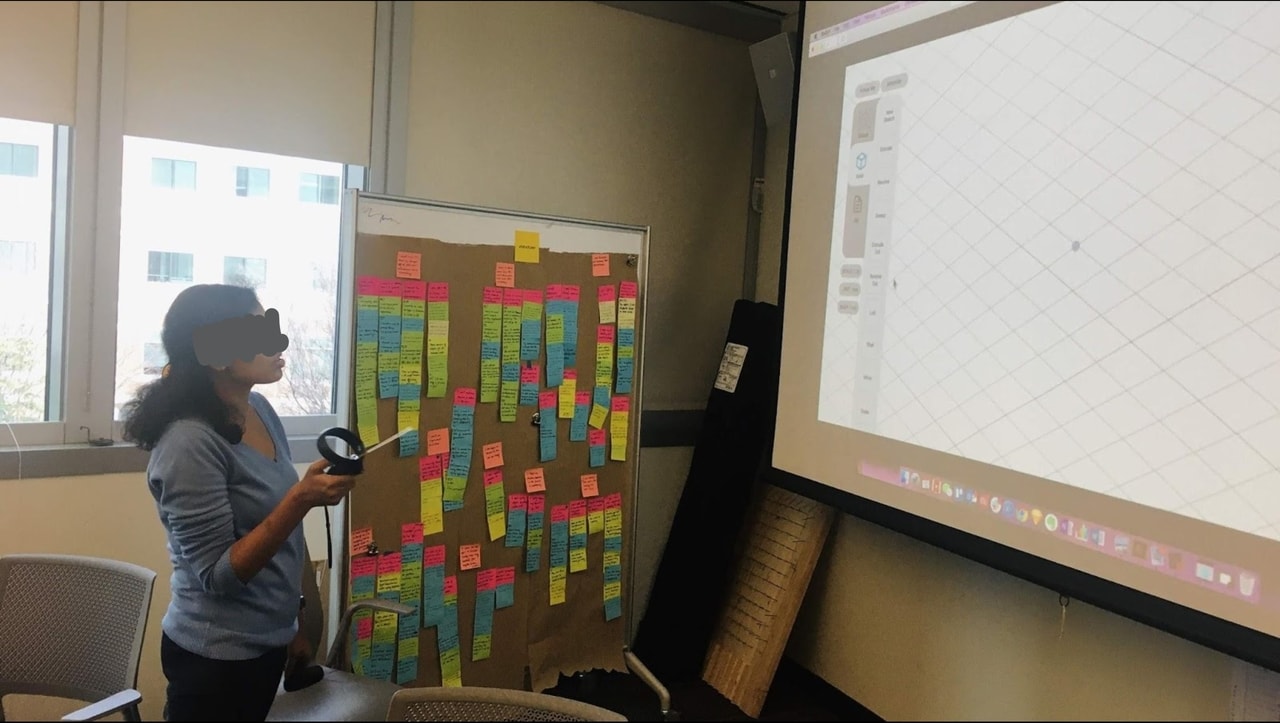
Testing Feedback
We assessed each feedback session and listed down the points that we learned from those sessions.
What Worked
- Overall, participants thought this tool was easy to learn.
- The time taken to complete the second task was less than half of the time taken to complete the first.
- Participants liked the tool shortcuts as they are easy to grasp and help speed up the process.
What Needed Improvement
- Novice participants were confused when seeing 3D modeling terminology.
- Plane selection was confusing to participants due to lack of prompts telling them what to do.
- Other minor inconsistency and redundancy issues.
Prototype Limitations
- There were too many different ways to model even a simple shape.
- Figma did not support the level of flexibility needed; participants had to follow the limited number of pre-designed user flows to complete a task.
- This limitation sometimes led to confusion and frustrations.
3rd Iteration: Hi-Fidelity Prototype
Building a Functional Prototype
With the design specifications more narrowed down, we were ready to take the time to build a functional VR prototype in Unity and Oculus Quest.
Doing so allowed us to test the interactions we were not able to test earlier. Developing a working application also helps mitigate the problem of exponentially growing user flows we faced when prototyping in Figma.
Also, since prototyping a VR applciation is a time-consuming process, we also decided to cut non-essential features and build a minimum viable product of the design.
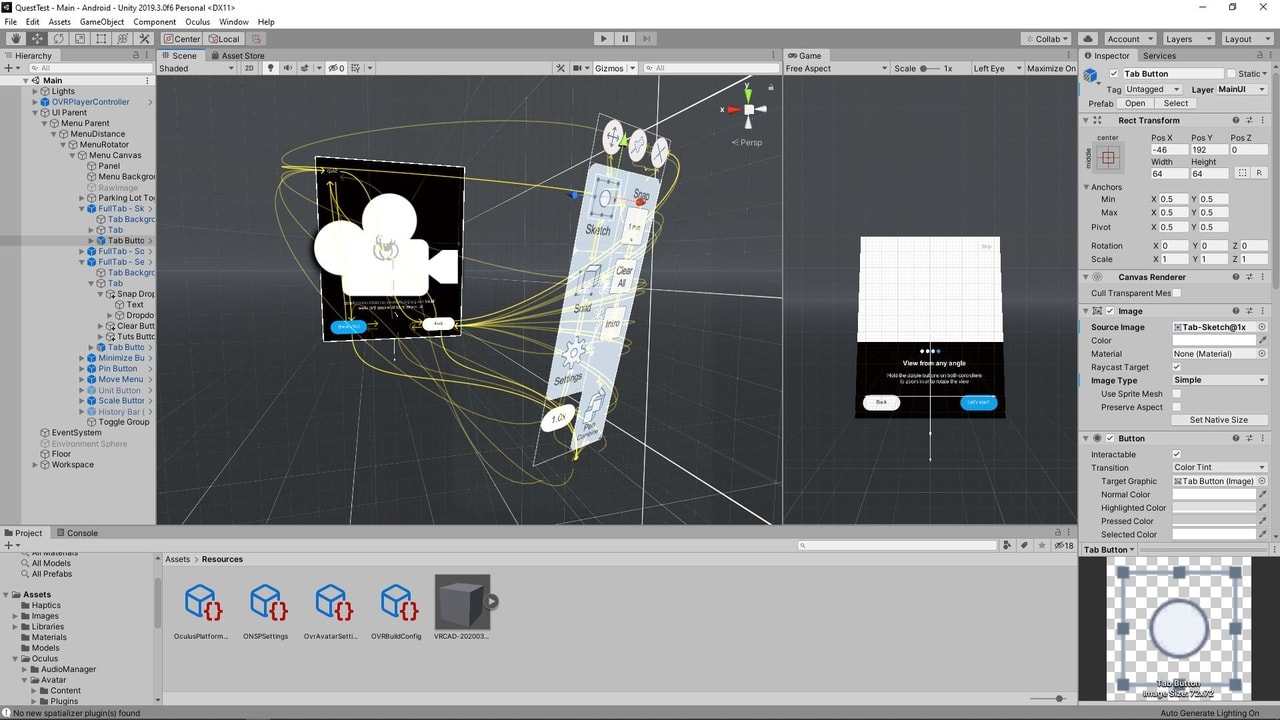
What’s Changed?
Based on the last iteration’s feedback, these are the major changes from the previous version.
Educational Elements
From testing, a lot of user frustrations were caused by the unfamiliar mental models and the terminologies. We decided to add features such as onboarding cards, action prompts, and animated tool previews, to address this.
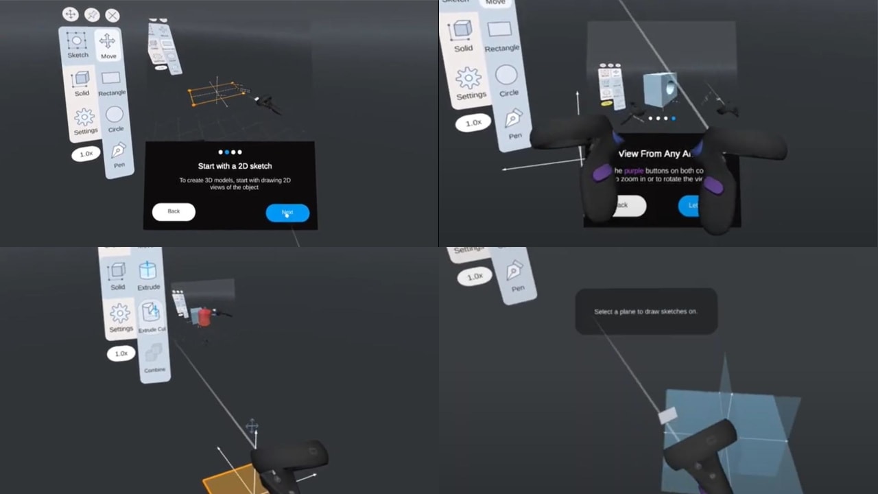
VR-Only Interactions
We added other interactions that we were not able to prototype in earlier iterations. These VR-only interactions include grid snapping and view control gestures and joystick controls (e.g., zooming, panning, rotating).
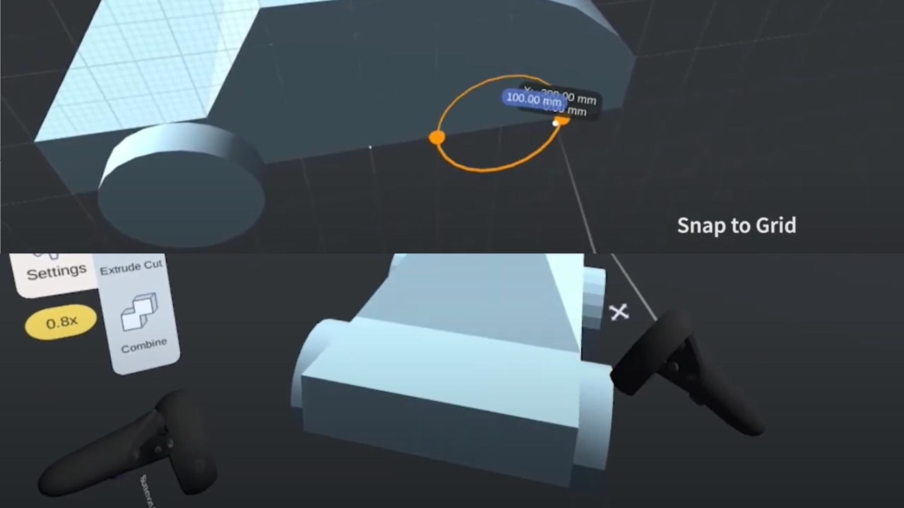
More Detailed Specifications
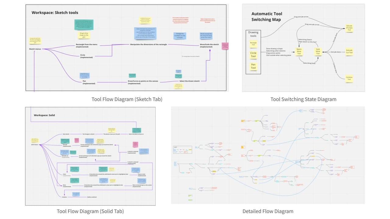
We moved from designing the user flow for a couple benchmark tasks to designing the flow for each tool to get a better definition of how they work. Also, shortcut interactions were not consistent with the tool that is selected, so we designed an automatic tool switching scheme to address that.
Visual Design
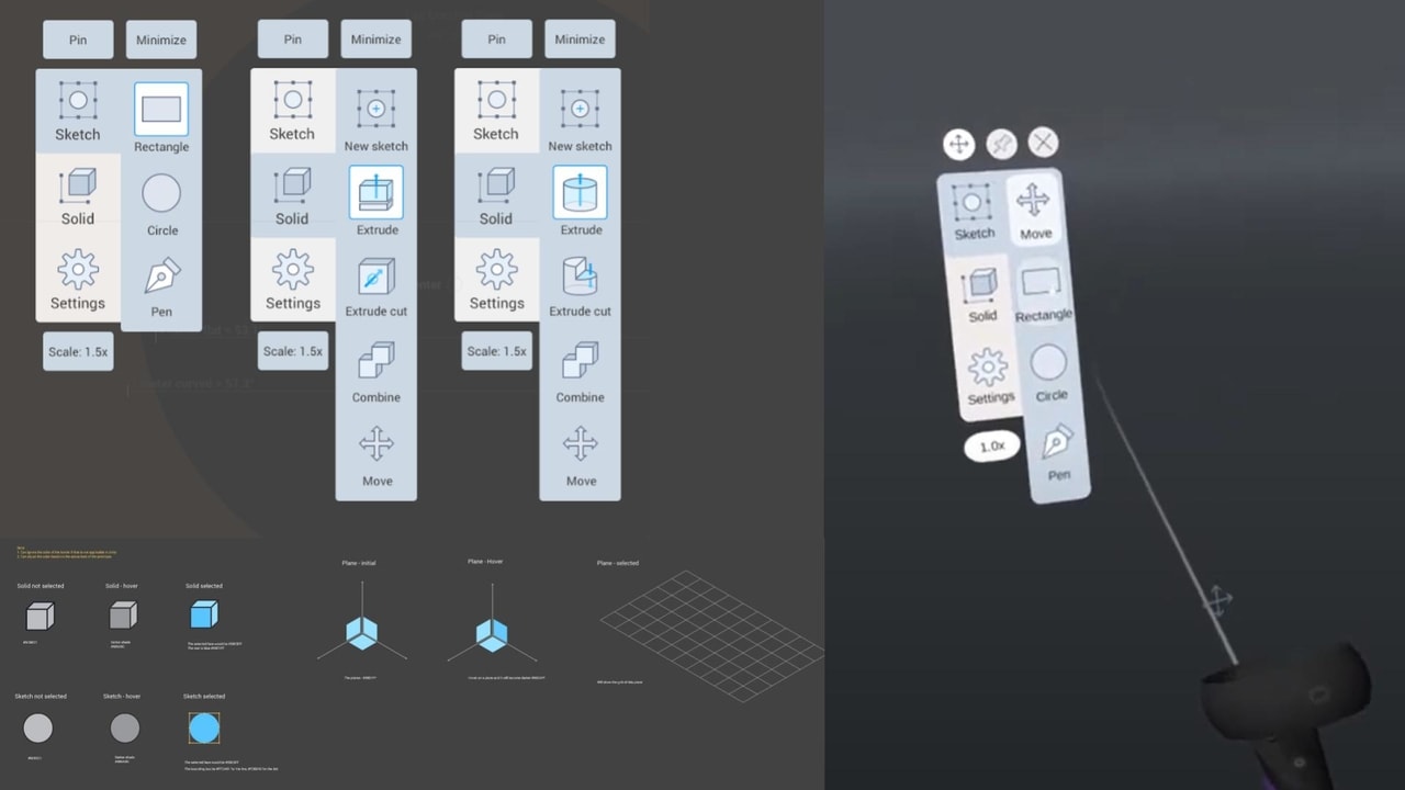
We looked into the visual design of the application and created visual styling and an icon set for the menu. We also changed the background of the virtual environment to a dark background to avoid eye strain.
Discovering & Solving VR-Specific Problems
Transitioning the prototyping platform to actual VR led us to some unforeseen problems in our design because these interactions were not simulatable earlier.
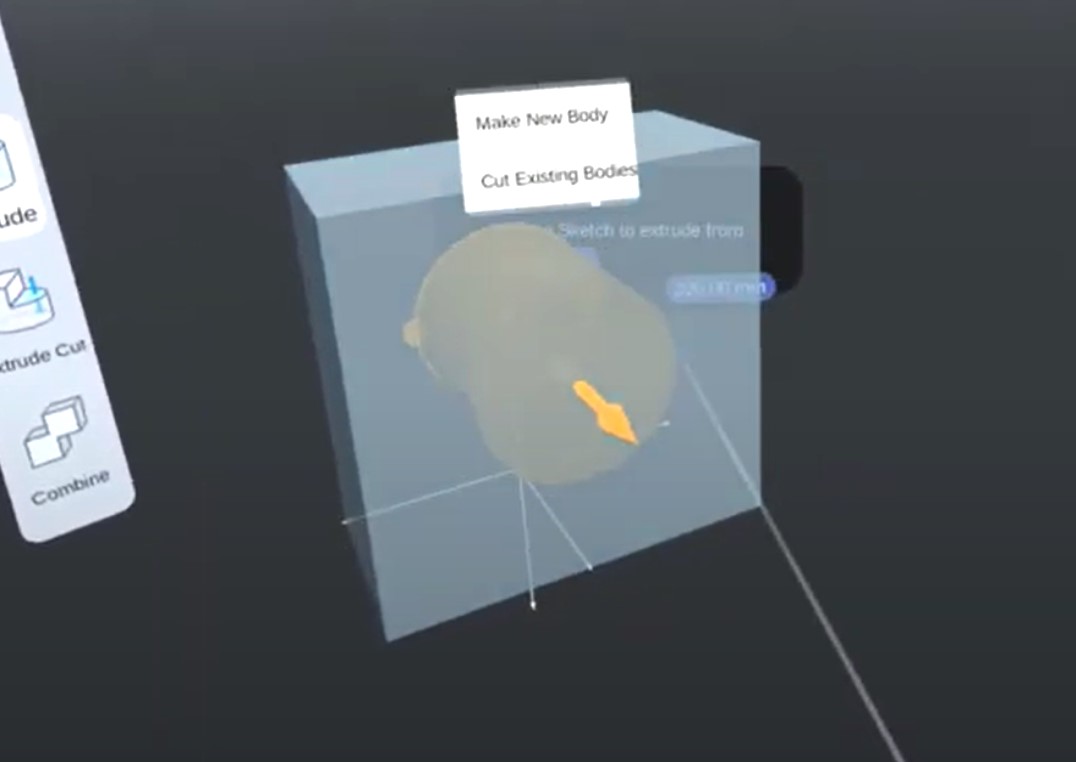
Always-On-Top Context Menu
We found that the context menus are sometimes obstructed from the view by other objects. So, we forced the application to always render context menus on top of everything else.
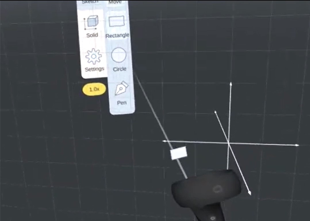
Pointing Through Planes
When the 2D "sketch mode" is activated, a transparent drawing plane might get in the way between the pointer and the menu. So, we allowed the pointer to point through planes when it is pointed toward the menu.
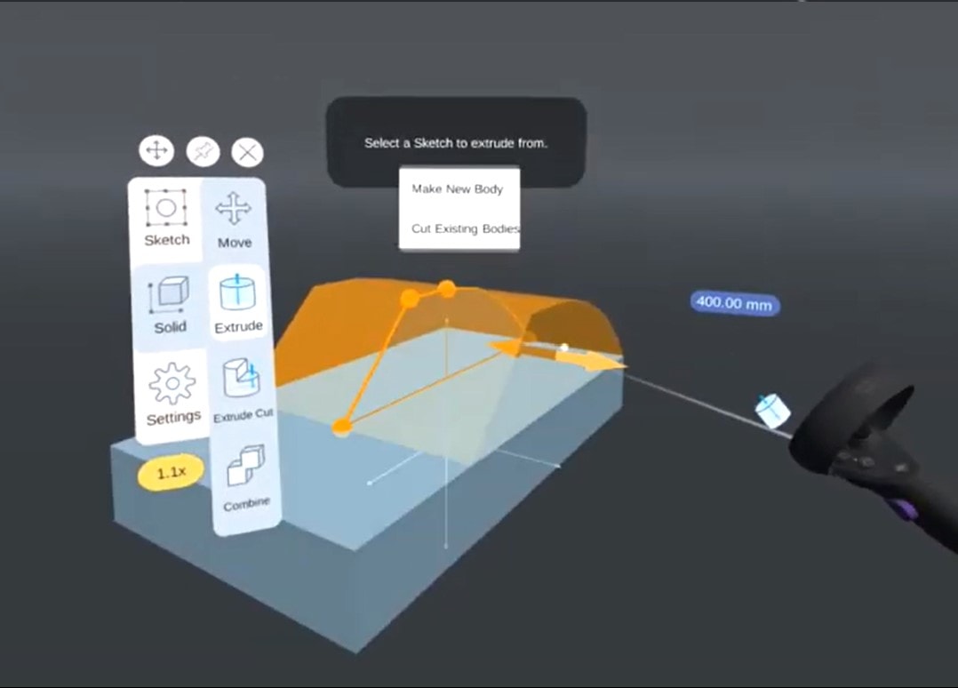
Adaptive UI Sizing
UI elements and texts in VR get visually smaller when they are far away. To address this, UI elements are dynamically scaled relative to the distance between them and the user.
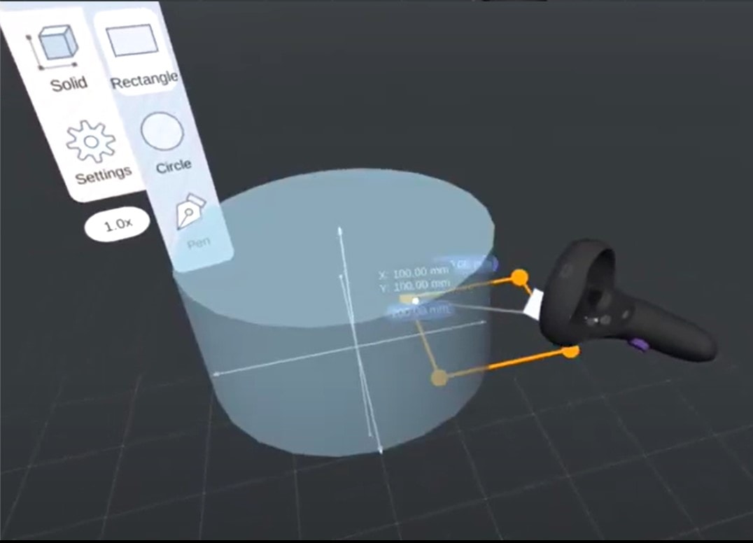
See-Through Pointers
When drawing a sketch, a user might need to draw inside of other solid objects. We enhanced the view by making the object transparent when the pointer passes through it in drawing mode.
3rd Iteration (Final) Prototype
Video Demos
Walkthrough of all tools
Modeling a toy car
Modeling a basic shape
Modeling another basic shape
Project Trailer
Evaluation
What We Planned to Do
We originally planned two main activities to evaluate our design, discover areas of improvements, and benchmark our solution against an existing popular desktop-based CAD tool.
Expert Evaluation
We planned to conduct expert heuristic evaluation with 4 experts in both CAD modeling and VR to spot design errors and get feedback on how to further improve our prototype.
Usability Testing With All Target Groups
We planned to recruit 8-10 participants from all the target user groups and expertise levels. Participants will be asked to perform a couple benchmark tasks on both AirCreate and Fusion 360. SUS scores would be collected and compared between the two.
What We Actually Did
(Thanks, COVID 😕)
Unfortunately, the global pandemic hit when we were about to start the evaluation phase of our final prototype. As a result, we had to adapt our evaluation plan into a discount version.
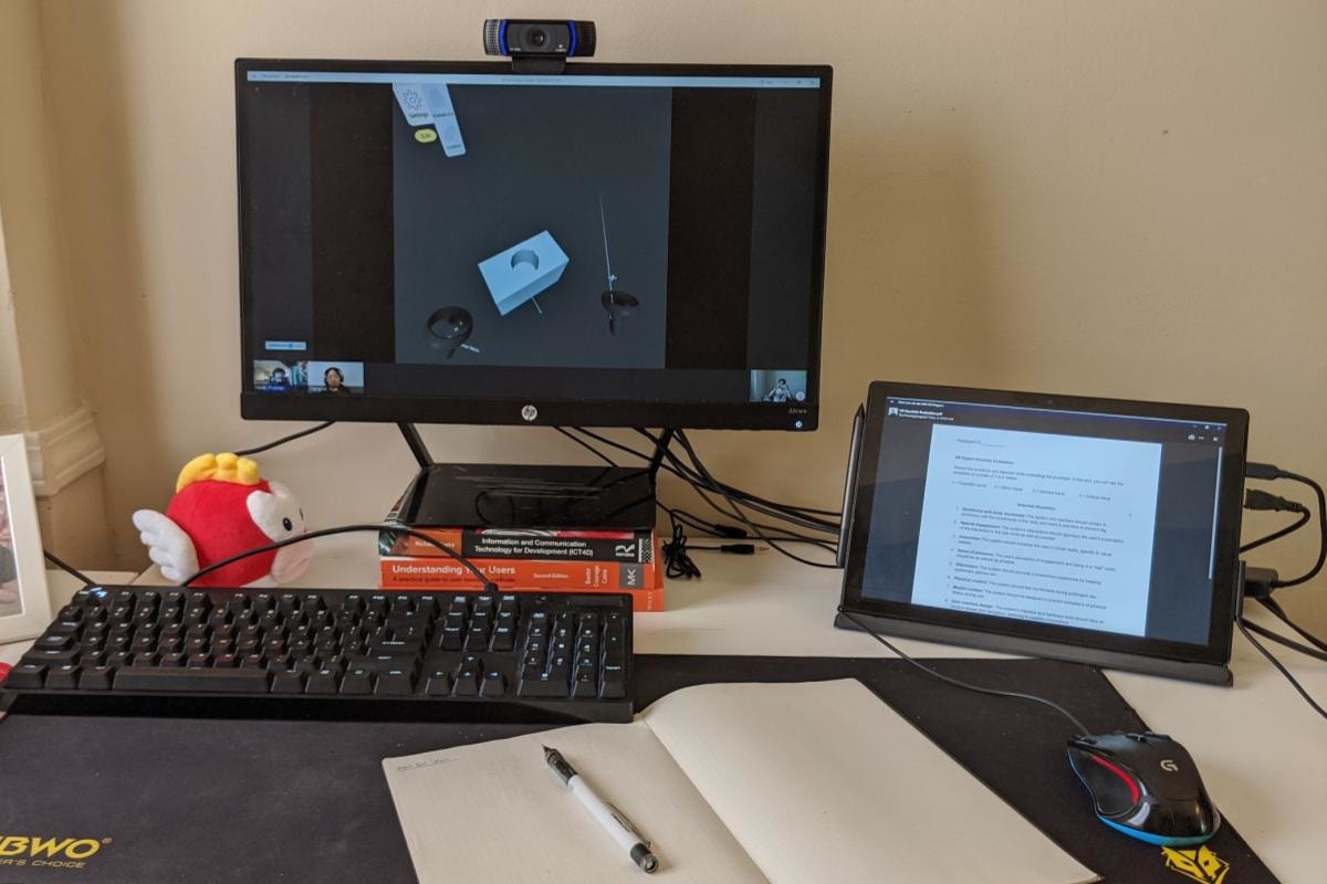
"Remote" Expert Evaluation
In-person sessions were not viable, so we prepared video walkthroughs the features and the benmark tasks and showed it to the 3 experts we recruited. For experts who also have an Oculus Quest we also asked them to install the prototype and try before the remote session.
Usability Testing With Novice Users
Due to the stay-at-home practice, we only had access to 3 of our a member's roomates who happen to fit with the novice user group. So, we could only test the prototype with them.
Findings
We collected both qualitative and quantitative data from the evaluation sessions. This section shows the strengths and weaknesses that AirCreate and VR have over desktop CAD based on the data we collected.
Over Fusion 360
What Worked
- Experts thought the prototype was easy to learn. Both participants and experts appreciated the conciseness and helpfulness of the onboarding tutorial and the menu tooltips.
- To participants, creating 3D models in a 3D environment "made more sense" than on a desktop.
- VR allowed the participants to view the model from different angles with ease.
- Experts liked the flexibility of workflow that the tools provides.
- Participants thought that the UI design was clear and straightforward.
Areas to be Improved
- Some features and button shortcuts have discoverability issues.
- Working in VR is currently not as physically comfortable as on a desktop.
- Based on this limited pool of participants, they completed the tasks slower in VR than in Fusion 360.
- Experts and participants both wished they could create sketches on more arbitrary planes.
- The prototype had reliability issues.
How Experts See Themselves Using This Tool
- Experts mentioned that they would use this tool in early stages of modeling, e.g., defining the product's form. For the complex details, they still preferred a desktop software.
- They thought that this tool was suitable for making quick and simple models. Some mentioned using it for 3D printing.
Conclusions
So, Is Doing 3D CAD in MR a Good Idea?
YES! But, ...
Going through this project has shown us that MR has a unique and highly promising place in CAD workflows.
Though with the limited data from the final evaluation, we have learned that there are benefits of using MR in 3D CAD such as learnability, usability, and natural, true-scale model visualization. Users also seemed to perceive such tasks in MR as intuitive, hands-on, and fun when compared to their 2D counterparts. However, there are factors that are currently in the way for these creative applications to florish:
We all need to get more familiar with VR first.
Compared to desktop platforms, MR is still extremely new to CAD modelers. Even though with simple applications, MR itself has a learning curve that needs getting used to before becoming fluent in any application. From the developer side, VR design "best practices" and prototyping tools are also still lacking.
Educational elements are crucial in the short term.
As designers, given the novelty of the platform, "common design patterns" cannot be taken for granted. Each application need to provide extensive educational elements, e.g., tutorials, that not only covers the application but also basic MR controls to compensate with the unfamiliarity of the platform.
Current VR has hindering hardware limitations.
Current MR hardware have limitations in terms of physical comfort. Most headsets are still too heavy to wear comfortably for over an hour. There is also a tradeoff between computing power and mobility which would become a problem especially in more computationally-intensive tasks such as CAD modeling.
What’s Next?
Design Fixes & Further Studies
No digital products are really "done"; there will always be problems for us to address and more testing to conduct in order to iteratively improve AirCreate.
More CAD Capabilities
We left out a number of CAD operations for the sake of constraints. Including more of those features, e.g. "sweep" which would benefit from drawing paths in 3D, could open new doors for CAD in MR.
From Immersive to Spatial
Transitioning AirCreate from an immersive VR platform into spatial XR ones would allow new and exciting possibilities, e.g., allowing the model to interact with real-world objects.
From Controllers to Hands
There is an ongoing effort in recent VR hardware to support hand tracking. This would make MR systems more portable. However, it also poses a very different design implications and constraints.
Takeaways
Working on this project has taught us many lessons. It has strengthened our design expertise, UX skills, as well as project management skills.
Designing 3D UIs for MR
MR is still a relatively new platform to design in with unique characteristics and constraints. Due to its novelty, high- and low-level interaction design details still needs to be considered simulteneously. Going through this project also taught me that experimentation and user testing plays a crucial role in addressing design issues for such novel platforms.
Designing a Creative Tool
I learned that designing a creative tool is very different from the usual task-based experiences in that it demands a much more flexible user flow. Such flexibility, however, comes at the cost of complex prototypes that current rapid prototyping tools such as Figma doesn't handle well since each step in the flow can branch out exponentially.
Project and Team Management
Throughout the course of this project, our team has experimented with multiple ways of keeping track of the project's progress as well as multiple communication methods. This taught us to always be observant of whether the current internal process is working and improve it when needed.
Being Adaptive
Finishing the project in a time of COVID-19 pandemic posed many unforeseen constraints upon us. Even though the global pandemic only had disruptive effect on the final evaluation phase of the project, it led us to become adaptive and creative in how we could evaluate our prototype.
Acknowledgments
Lastly, I would like to gratefully thank:
- Anusha Vasudeva and Emily Xue. We all made a great team! I really appreciate your hard work in this project.
- Dr. Chris Le Dantec, for your supervision and support throughout the project (also shout-out to the whole PPL lab at Georgia Tech!)
- Alyssa Rumsey, for helping us connect with participants from the industry.
- Noah Posner, Henry Duhaime, and Matt Golino, for helping us conduct expert evaluation for our prototype.
It's worth noting again that due to the pandemic, we were only able to recruit participants that only represent one small fraction of our target users. The results of this final evaluation has to be taken only as preliminary results.